
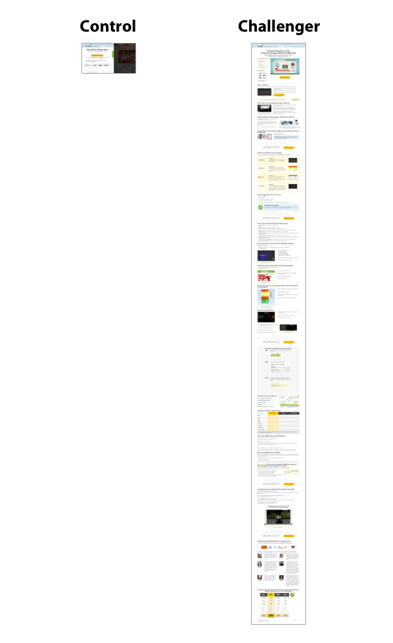
The Anatomy of a Mobile Landing Page That Converts
Do you even know them? Have you created an optimum environment for them to take out their wallets or give you their emails?
I am talking about your mobile visitors.
So, maybe you want to create a landing page for them?
Easy peasy. There are so many tools you can use to craft an elegant one without writing a single line of code.
Then, you read an article that said that mobile-optimized websites can triple your chances of increasing conversions by 5% or more. And, you witnessed Google’s launch of a mobile-friendly website update to affect search rankings.
You research how to make your landing pages responsive to accommodate your mobile website traffic.
You found that you just gotta pick one of those responsive landing page templates from articles like this one.
It’s all puppies and flowers until…
Then what’s the problem?
Conversions.
Even after using a responsive template, you find that your visitors keep on bouncing like a ball from your landing page. You’re nowhere near your expected mobile conversion rate.
You already know that mobile is a distracting medium and that people might find it difficult to use their digits on your Call to Action (CTA).
You made sure that your content is formatted properly and that your page is optimized with a big CTA button so that it’s convenient to click for a human finger.
But, the problem is rooted deeper- it’s in a mobile user’s expectations.
Ultimately you can only do so much in the limited real estate on a smartphone. People can view a smaller amount of information at once.
So, you need to weigh every single element and every word you use. You don’t know what is causing the friction and hampering your conversions.
The plethora of advice on reducing/increasing your number of form elements and optimizing your content can get confusing.
Wouldn’t you prefer that someone could break down the anxieties and motivations of a mobile user?
Or let me put it this way…
Wouldn’t it be nice if someone could give you a brief checklist for creating a high-converting, truly mobile friendly landing page?
Download this handy cheat sheet to learn the anatomy of a mobile landing page that converts like crazy.
Thought so.
So, in today’s article, I am going to do exactly that…give you a 5-point optimization framework to start meeting customer adoption of mobile.
1. Cut the chase…can you clearly communicate what your point is?
You might have read tons of articles on this ‘keep it concise’ principle already. Every word counts on mobile because the screen size is 6 inches or less.
But, if your product is complex, then you might have also read advice to address all the objections of your customers jdownloader 2 videos herunterladen. That obviously requires more words and space.
In fact I’ve previously run tests myself on the NeilPatel.com homepage as well as with CrazyEgg.
On the NeilPatel.com homepage, I found that an in-depth post (1,292 words) converted 7.6% better than the shorter version (with 488 words).
And at CrazyEgg, a 20 times longer page than the control converted 363% better.
But guess what?
This is not necessarily valid for mobile.
A smaller amount of information is visible in one shot on the small screen. And, every time a user scrolls down a page, his limited working memory comes into play. Add to this that the average session on a mobile phone is merely 72 seconds.
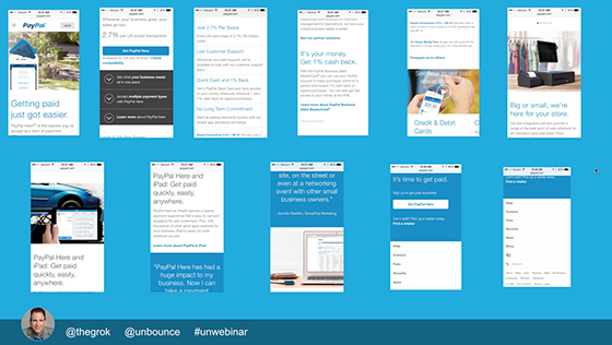
So, he probably isn’t going to scroll down 11 pages (Yes, Paypal actually has 11 of them on mobile).
So, start with performing an analysis on the keywords your audience is using to find you. This will give you an estimate of your user’s current stage in the buying cycle.
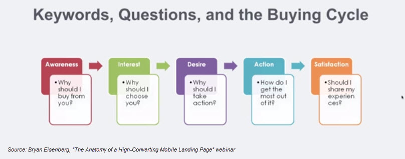
Are you of the opinion that a mobile user is mostly in the research-phase, just browsing through your offerings? And that he isn’t comfortable to place an order?
Then you’re wrong.
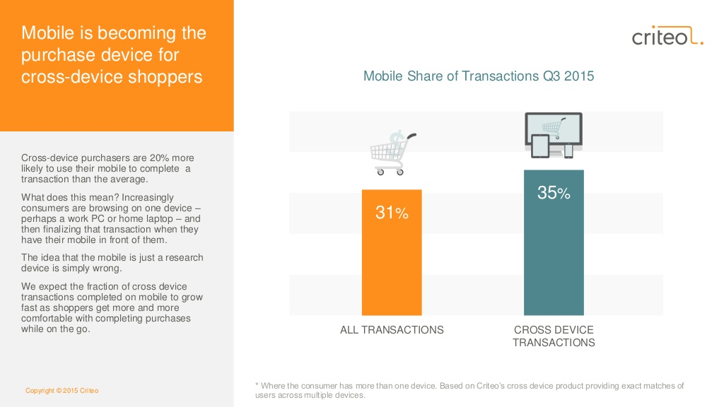
For cross-device shoppers, mobile is quickly becoming the preferred device of transaction. Criteo found that cross-device purchasers are 20% more likely to buy on mobile than on the alternatives.
You need to carefully find the right balance between:
- including necessary info about your product/offering that persuades your customer.
- not crossing the line and serving irrelevant content.
At all costs, you shouldn’t remove the basic elements from the landing page that establish your credibility – social proof in the form of reviews/testimonials and your organization logo.
Other than that, let me address a couple of common mistakes that are prevalent in mobile copy.
1. Use of filler and loose words like ‘very’ or ‘best’ – You may be ‘the best Italian restaurant in New York’ or you may be faking it.
How can your customers distinguish that you’re actually a high-quality business?
Not by your mere use of words.
But, you can get specific and talk in terms of data to establish your expertise.
Show the number of customers you’ve served and the wonderful experience they have had sounds herunterladen kostenlos. It sounds more meaningful and convincing.
Don’t underestimate the power a single word can have on your results.
Veeam software split tested their ‘request a quote’ link (the control).

With ‘request pricing.’

That’s it. Just one word change.
Want to know how it impacted the CTR?
A 161.66% jump in click through rate (from 0.54% to 1.40%) with 99.99% statistical confidence.
So delete those flabby, weak and unneccesary words from your writing. Here is a list of 297 of them by Boost Blog Traffic.
You might be amazed by the results you’ll achieve through direct writing on mobile. Either a word should add value or it should get cut.
2. Not communicating your value clearly – You need to convey your offer and address your customer’s pain point from the onset. And, I don’t think I need to tell you the importance of the headline and CTA copy in clear communication.
As an example, look at the Blah Blah Car landing page below. The logo, social proof and CTA elements are all fine. But where’s their headline and the value proposition?
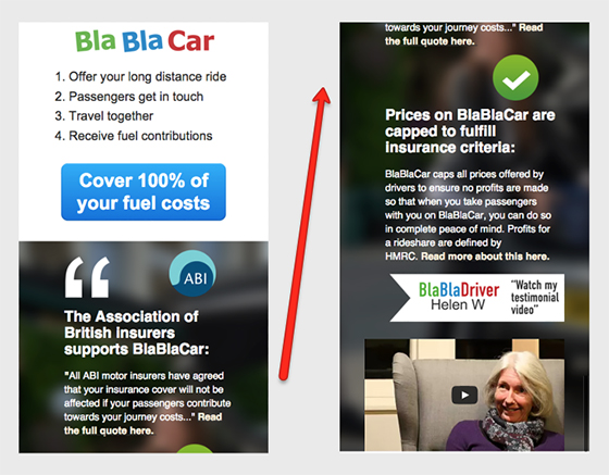
Yes, their advertisement that led people to click through to this landing page might have communicated the ‘offer.’
But as CRO expert Bryan Eisenberg says,
You need to remind the people of the value on your landing page without the context of what came before it.
Communicating your value isn’t limited to the words you use.
You also need to ensure that your fonts are size legible and that you aren’t using too many fonts that hurts the eyes. Don’t expect a mobile user to use his fingers and zoom in for reading the content on your landing page.
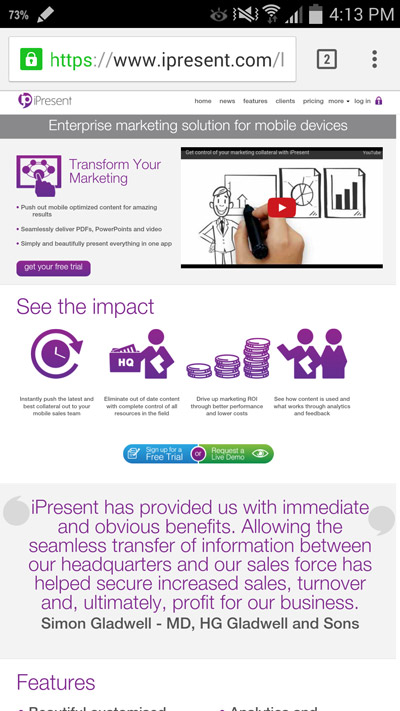
Few visitors will survive a small font-sized page like the one below. The bullet points inside the section “Transform Your Marketing” and the points under “See the impact” are barely visible.
In contrast, look at the elegant fonts used by landing page designer Jen Gordon below. It’s optimized for mobile with snippets serving as good readable sections.
And, she gets brownie points for not expecting any physical effort from the user (no pinching or zooming is required to view content).

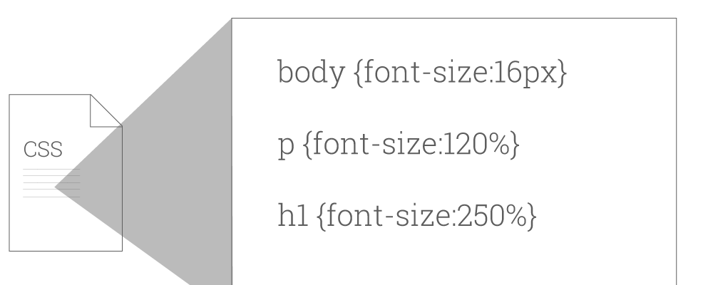
Google recommends that you to use a base font size of 16 CSS pixels. You can adjust the font size of your H1 and H2 relative to this.
You can read this article by Patrick for additional advice on appropriately setting your font size, line height and for making your content more readable.
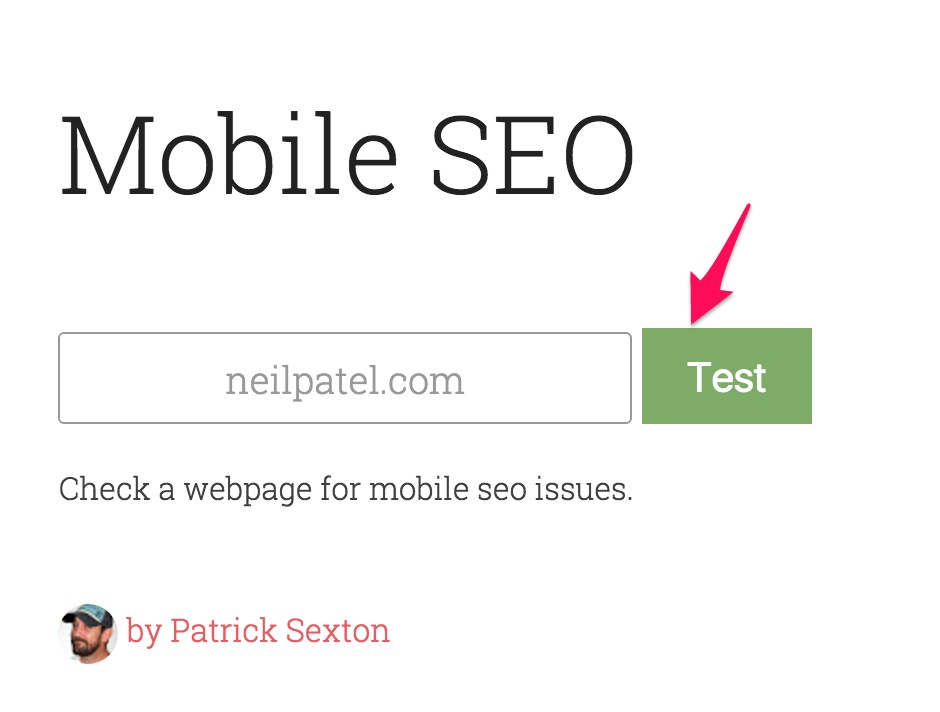
I also want to introduce you to a mobile SEO tool by Patrick.
Just head over to – varvy.com/mobile, enter your website address and click on the test button google docs präsentation herunterladen.
I ran my website through the tool. And here are the results.
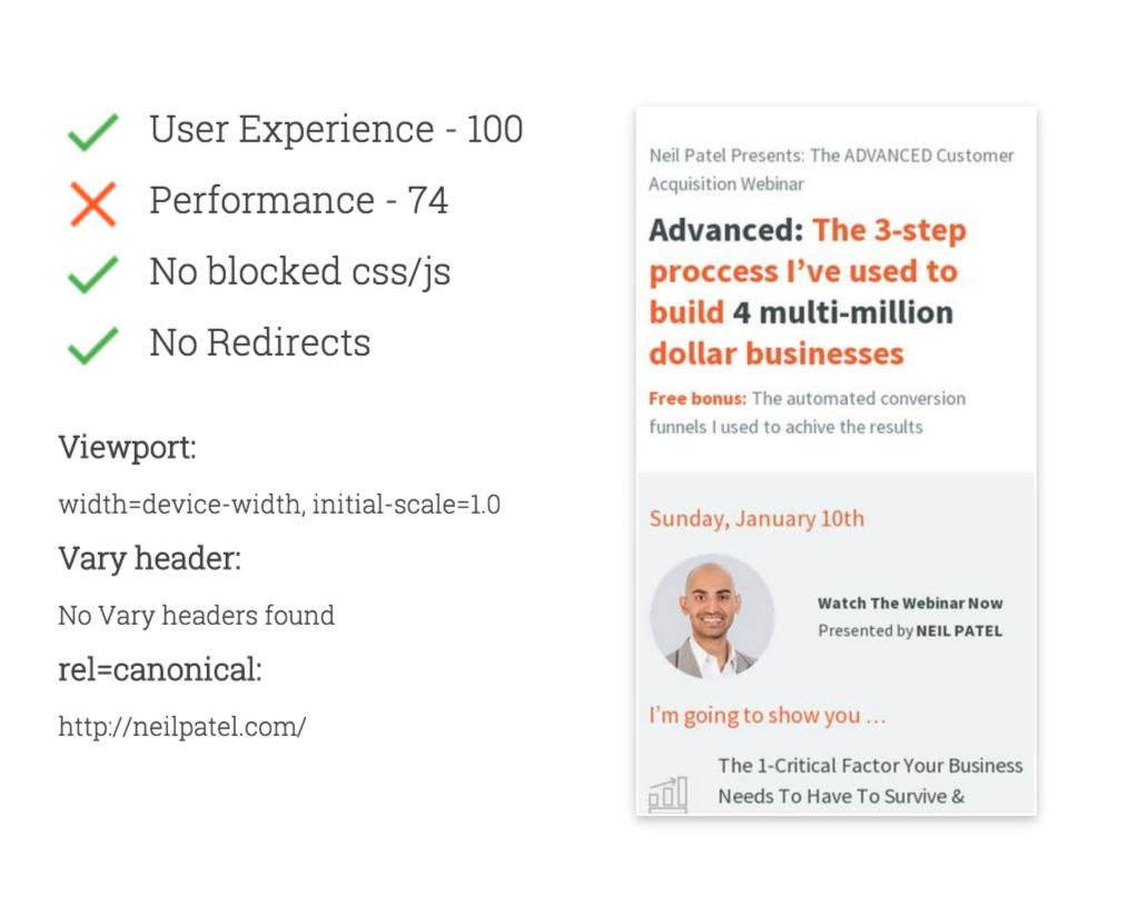
My webpage scored 74 on performance and a 100 on user experience.
As you scroll down, you’ll get more detailed results on your robots.txt, Viewport, mobile redirects, etc.
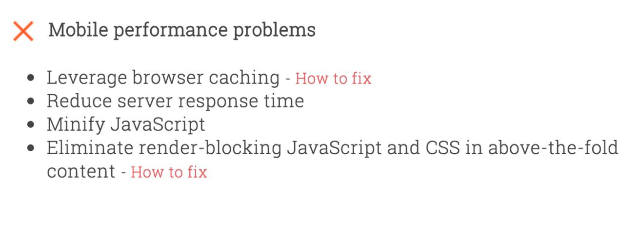
The tool has given these recommendations for fixing my performance. Fixing these issues will help in improving my score.
The last elements I want to talk about for helping you in effectively communicating your marketing message are bullets.
It’s a no-brainer to use them.
- They reduce the clutter on your landing page and let the customer get a feel for your offer in the first few seconds of their visit,
- They make the reading experience convenient by offering breathing space,
- They force you (the business owner) to very specifically address your customer’s pain points
As you make your pages cleaner with more white space, you ease the cognitive load of the customer and allow him to take decisions easily.
The mistake businesses make when using bullets is conveying features. Remember your visitors skim content (especially on mobile). They don’t want to read what your product has to offer. Just tell them how it impacts their life.
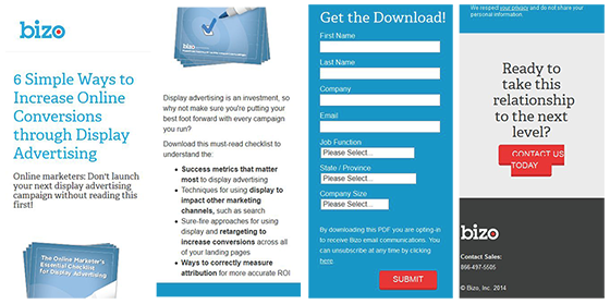
Look at the bizo landing page below. I don’t think the bolded bullets like “success metrics that matter the most” are strong.
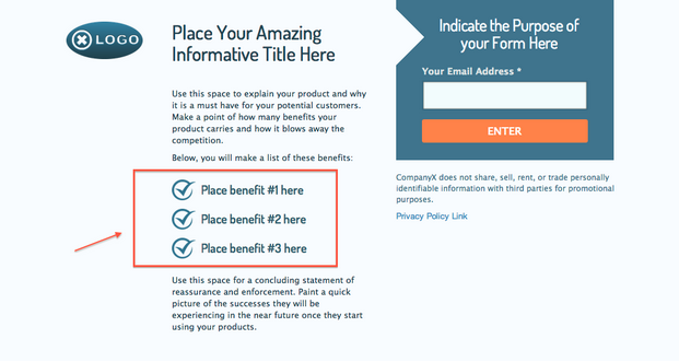
What would rather work in bullets is conveying customer benefits directly, like the Wishpond landing page template suggests below.
Similar to bullets, you can also use accordions. They are a great solution for offering more information in less space.
Not only can you conserve space, but you let your customer have a bird’s eye view of your content.
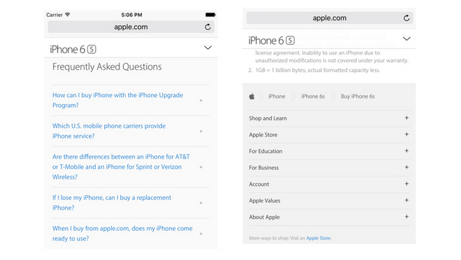
Example – Look how iPhone 6S page uses expandable accordions on its FAQ and privacy policy pages. You can get the big picture on shopping for an iPhone from Apple.com, the iPhone upgrade program and more.
Don’t worry about the word count. Instead focus on serving the most relevant content. If you focus on presenting your value using the tips I shared above, you’ll keep your customers happy.
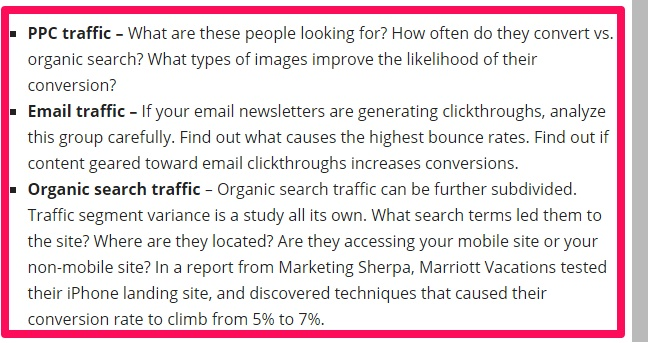
Pro Tip 1: You might consider creating separate landing pages based on your traffic source. Look at the example below of how to segment and analyze your traffic sources.
Pro Tip 2: If your landing page is big in size and requires scrolling, then don’t forget to aid your visitors with scroll cues tolino ebook downloaden.
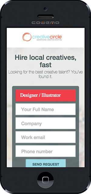
As an example look, at the creative circle viewport below. There’s nothing on the screen indicating that you need to scroll to see more content below.
As always, don’t assume that the customer will take your desired action, like scrolling down, automatically. You can hint the user’s eyes for more content by giving a sneak peak of the next section. Or giving a directional arrow to guide them.
Otherwise, clicking the back button and leaving your landing page is easier.
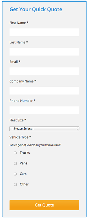
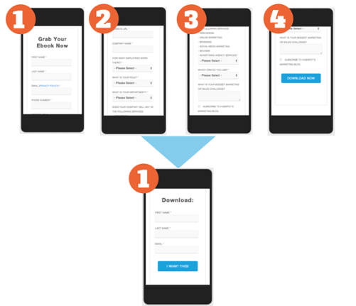
2. So you expect your visitors to fill those 10 fields?
Just imagine that you liked and clicked on a marketing tool advertisement from a PPC ad (from your mobile phone).
It’s the first time you came to know about this tool.
But, just as the website loads, you’re shoved off to a form with 10 fields.
Huh!
You’re expected to type a long form from your mobile phone.
What will you do?
I’m guessing you’ll think, “No. Thank you,” and walk away.
Expect your customers to do the same.
See, I understand that it requires extra effort from your end to mail (or call) a prospective customer for detailed information about them.
But, remember that it’s the distracted mobile medium. Your users don’t have the patience to complete such long forms with 7 fields.
Here are 5 tips for optimizing the form experience on mobile.
1. Don’t intimidate the user. Adopt an essentialist mindset and solicit only your customer’s email (or the most necessary info).
Your mobile visitors will be happy that you saved them the physical effort and the mental stress. If they liked your business, they would happily give you your required info later when you follow up.
2. If you can’t compromise on your number of fields, then at least allow for autocomplete. Chrome supports it and Safari also supports it, if the user has enabled it in his iPhone settings.
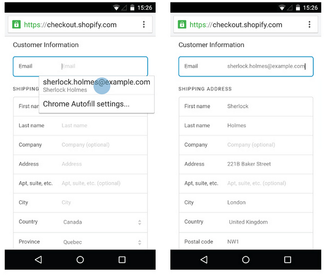
For allowing auto-complete on the email field, the HTML code is “<input type=”email” name=”customerEmail” autocomplete=”email”/>”
Here is a more detailed article on the Chrome autofill HTML attribute.
You can also try to use the smartphone’s feature like the camera, GPS, voice and contacts to fill the form fields for the user.
3. Another hack for eliminating the perceived friction in completing more form fields is eliminating the space between them.
This way, the form will appear shorter and the user won’t need to make the conscious decision of scrolling down to entering his data.
As an example, look at the degoo example below with unnecessary space between form fields untis mobileen.
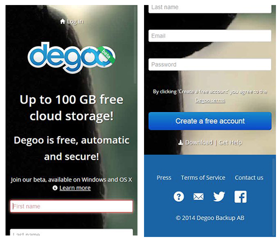
I know that there needs to be sufficient space in between fields for convenient typing using fingers and accommodating those big thumbs. I am only recommending that you find the right balance. A ¼ of an inch is a good space to start with. You can test and find out what happens if you lower it even more.
4. Suppose your user has gotten interested in your product and starts filling in your form. But, he makes a mistake in filling a form field. It’s inevitable.
How can you still keep the experience delightful and get the user to finish?
You encourage completion by using error messages that clearly indicate the mistake committed by the user. But, the message should also encourage the user to try filling in the form again.
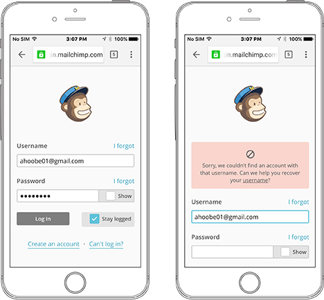
As an example, look at the MailChimp error message below. They prominently display the error message above the form field. And they also offer help to the user with recovering their username.
If you want more tips on form error message design, then you can browse through this discussion at Stack Exchange.
5. Remember that I told you about using appropriate space between your form fields? Alternatively, putting clickable links, images, buttons and fields too close together is a sin.
Remember that you’re designing for the touch (thumb) and not a mouse click. So, if your fingers are landing in between your form on mobile, then you need to redesign it.
Users hold mobile phones in these 3 basic ways as per research by UX Matters.
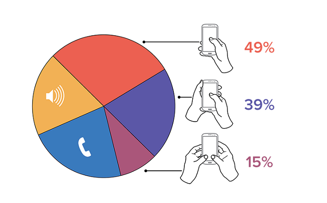
As you see the thumb plays a vital role in the touch interaction with the user. Always consider putting your form fields and buttons in those areas where it’s comfortable to reach.
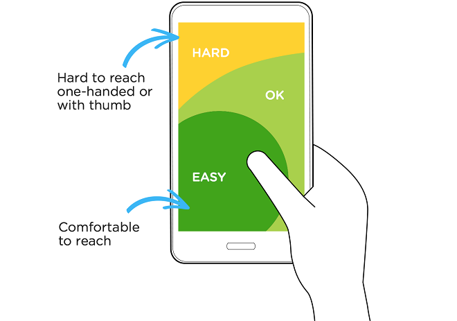
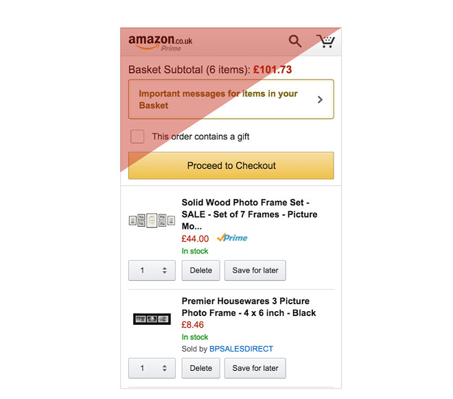
Look how Amazon places its action buttons in the easily reachable zone. In the red zone, they have placed their logo.
For a more detailed insights, I suggest that you to check out NNGroups’s 14-point checklist for ensuring a superior mobile input field experience.
3. It’s not 2010…you need to rock your audience’s world in 2 seconds.
How many objects does your landing page request? How many design elements have you used to craft an elegant page?
Every additional element affects the performance of your page. And it annoys the user iphone app filme downloaden.
You know what’s easier?
Dropping off your page.
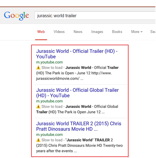
In fact, 43% of users are unlikely to return to a slow-loading landing page and 85% of mobile users expect the page to load as fast or faster than a desktop which takes 2 seconds to load.
Google has now even started showing results with a ‘slow to load’ warning label in their search results. That‘s another CTR killing factor.
I’ve already written a lot about making your website load faster using a Content Delivery Network(CDN) and leveraging your browser cache.
But, I want to focus on two things.
While mobile-specific CDN may help you to shave off a second in rendering time on mobile, they might not provide a good ROI for the high investment.
Kent Altsad performed a series of treatments to measure the effectiveness of CDNs for the mobile users.
But, CDN could also only shove off under a second in loading time, from 7.059 seconds down to 6.245 seconds.
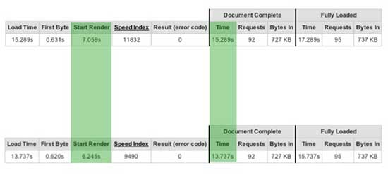
He didn’t find using a CDN worth the investment and he raises these valid questions on using CDN on mobiles.
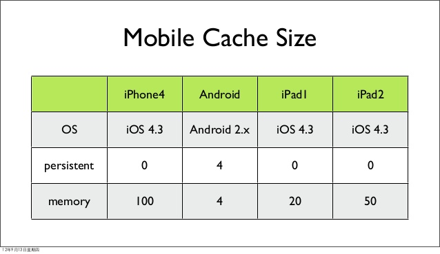
While leveraging browser cache can help with faster loading times on desktop, they aren’t created the same way for mobile. One major reason being that mobile caches are much smaller in size than those of desktop (just look at the numbers below).
As an alternative to solely relying on browser caching, you’ll need to use the HTML localStorage specification. Or, you can also rely on automated mobile acceleration solutions like RadWare’s Fastview.
In the visual dominant internet you might serve heavier and higher-resolution images on desktop. But, for creating an enriching mobile experience, you’ll need to trim the resolution and image file size. Here are 4 specific tips for image optimization.
- Choose correct image format – JPEG is generally the best, as it’s supported by most browsers. PNG is ok to use, but you need to stay away from BMPs or TIFFs.
- Use image editing tools – If your page width is 600 pixels, then crop your images to get them to the appropriate size. Don’t just upload a 1500 pixel picture and set the width parameter to 600. This will help you in reducing the file size and simultaneously improve user experience.
- Compress images – A plugin like WP Smush on WordPress works great without affecting image quality. Here is a list of alternative image compressing solutions herunterladen.
- Eliminate any unnecessary image metadata – The EXIF data is used by almost all new digital cameras to store image information like date taken, camera model, flash used, GPS position, etc.
Obviously, unnecessary info leads to slower loading time.
Moreover, if you’re using third-party images, the stored data can be used by Google for helping people find information about an image and even use it as a potential ranking factor.
You can use the website the Exif.er to edit your image’s meta data before uploading it. You can even change the data and make the photo appear like you own it.
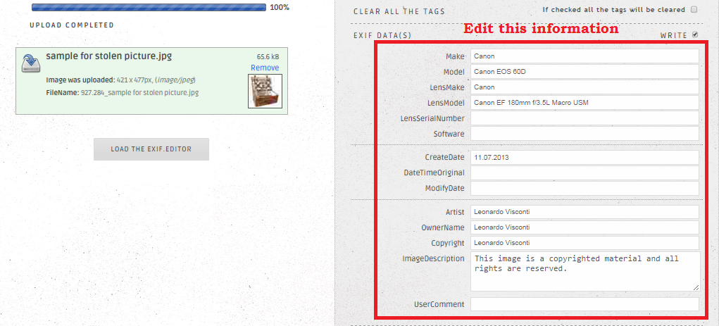
But, since you’re after improving your website speed, you’re better off just stripping the inessential info.
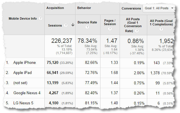
Finally, you should log into your Google Analytics dashboard and check the connections that your mobile visitors are using.
It can be found under Audience > Technology > Network. You can also create a custom report.
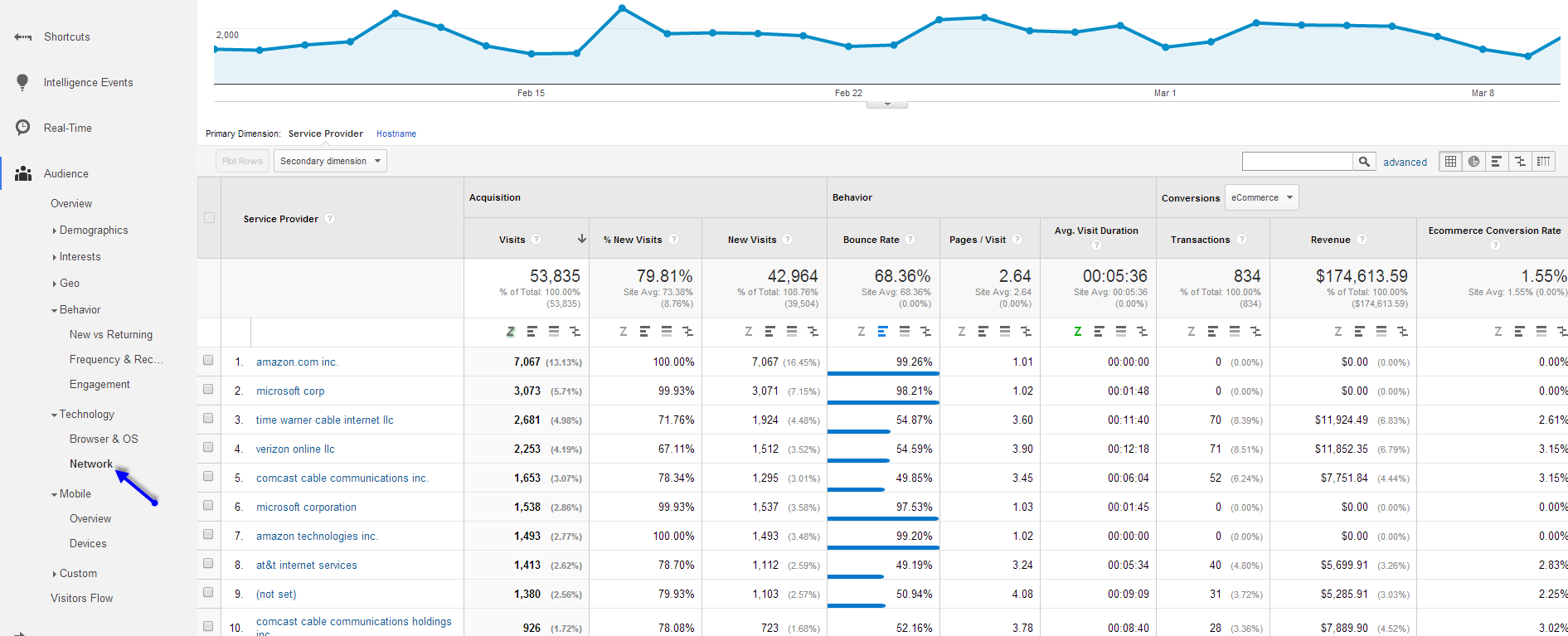
If they aren’t on a 4G network (which is most probable), then the loading speed of your website will be even slower. So you need to factor in 2G and 3G connections when you test your website speed with tools like GTMetrix.
4. Don’t even think that your mobile visitors are going to take two actions
On mobile, persuading your customer to take just the one action requires considerable effort, let alone two.
Look at the Comcast landing page below. Asking users to ‘share the offer’ and ‘Learn more’ in the limited mobile real estate isn’t intelligent.

Every image, word, action button and other element on your landing page should contribute towards your primary conversion goal.
Which brings me to 5 best CTA practices for improving your conversions.
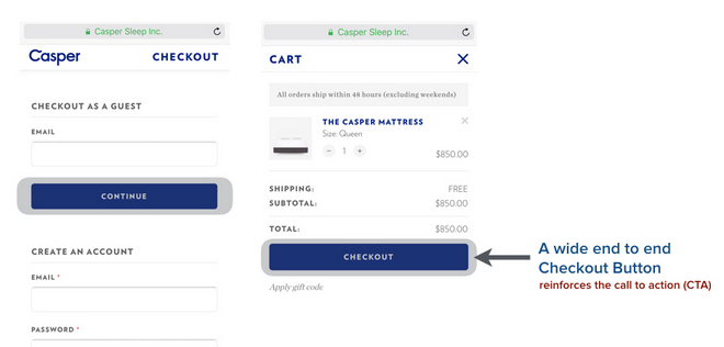
1. Design one large CTA button (comfortably clickable by thumb) with compelling copy.
As per research by MIT Touch Lab, a human thumb’s average width is 2.5 cm (72 pixels) and that of index finger is 1.6 to 2 cm (45-57 pixels).
Ensure that your CTA is full width – at least 44 pixels.
2. The CTA button needs a contrasting color scheme with the page surrounding srf herunterladen.
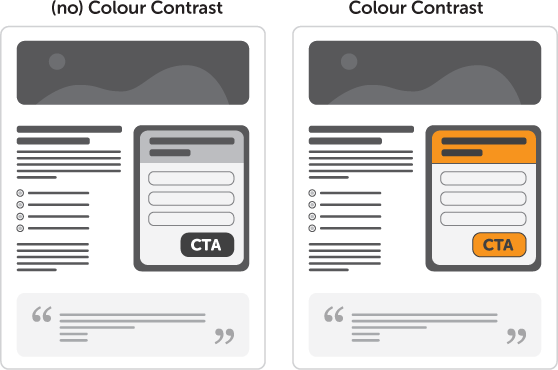
Same color buttons as the background (like the one below) are a big blunder.
Another example is the Ideal Shape Smoothie Recipe form below. Since the CTA actually blends with the surrounding, I don’t think the user is actually going to ‘Start Blending.’

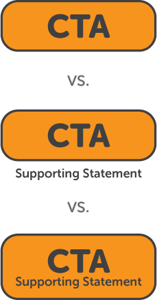
3. A great piece of advice from Oli Garden of Unbounce for avoiding a blending situation and getting clarity is:
Designing your form in isolation.
That makes sense because in the limited space on mobile your headline, sub-headline and CTA won’t necessarily appear simultaneously.
You need to remind your visitors of your offer consistently, seamlessly and nudge them towards your conversion goal.
This is especially valid for a long landing page. Repeating your CTA will keep the conversion goal in customer’s sight.
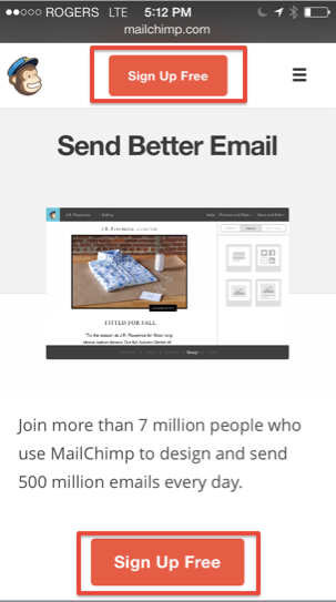
Look how MailChimp reminds you to ‘Sign Up Free’ twice.
4. If you absolutely need two CTAs, then keep the primary conversion goal action at the top of the page. Then, delay the secondary one to a position further down the page.
5. You can also test a phone number as a CTA, preferably at the top of the page.

Since your users are on a mobile device, dialing a number with a single tap is convenient. Also, phone calls are high quality leads that can convert even better than your online leads.
It can help you in resolving last minute shopper anxieties and conveniently offer a checkout option to those who don’t want to purchase online.
You can enable this click-to-call functionality on your landing page by using this HTML code that uses the tel protocol (just set the bold parameters according to your business):
< a href=”tel:your number” class=”clicktocall”>CTA link text < /a>
It’s good practice to include your number in the CTA copy to be transparent.
When your customer makes the call, you also need to ensure that the call quality is superlative. And, you need to actually answer the phone.
5. Do a final check by getting in your customer’s shoes
You want the overall customer’s mobile journey to be delightful and frictionless, right?
Then here are 2 tips to replicate their experience.
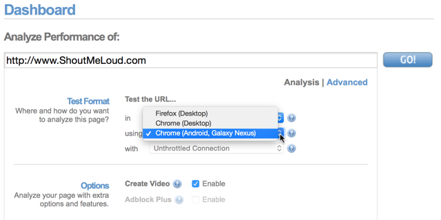
1. Start with a tool like the Mobile Phone Emulator.
You’ll first be asked your actual screen size. Next, you need to key your website address in the ‘Website to emulate’ section.
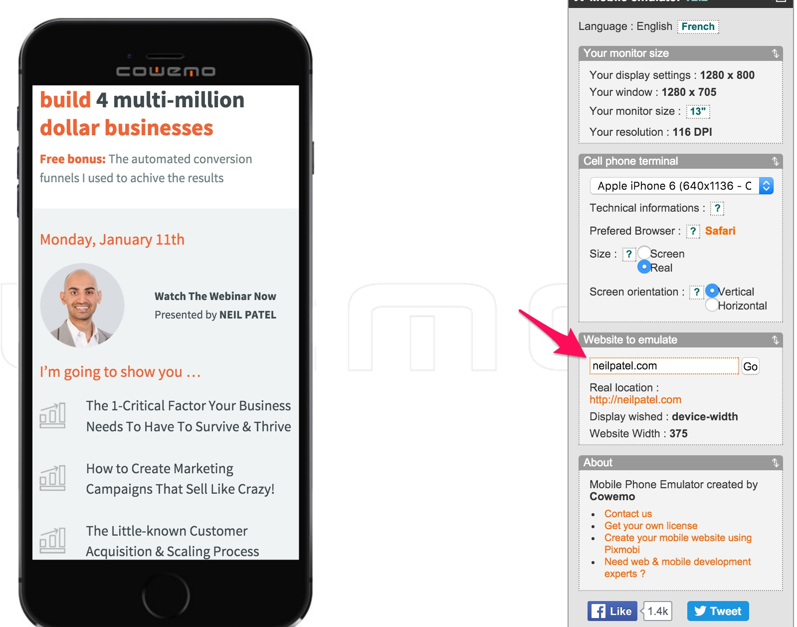
In the cell phone terminal section, you can even change your mobile handset and your preferred browser herunterladen.
2. Next, you should dig into your Google Analytics reports to find the most prevalent devices your customers are using.
Then, test to find if there are any bugs in running your website on the 2 to 3 most used mobile devices.
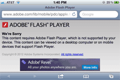
Note: At all costs, you should avoid using flash and frames on your landing pages. They’re not accessible on mobile and lead to a poor user experience.
Look at HubSpot. They performed a rigorous mobile landing page test with the aim of ‘solving for the user.’
In the process they used smart content to create a more relevant experience for their mobile users by shortening their display for mobile users.
They started with tightening their content and optimizing their images.
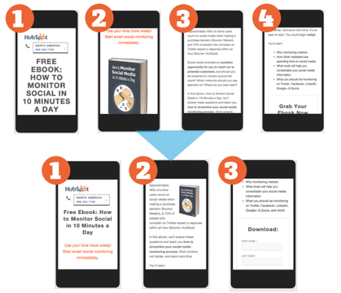
And then they reduced the number of form fields with the help of smart content.
The result?
Their bounce rates declined by an average of 27% in the mobile smart form test.
And the mobile optimized content test saw a 10.7% decrease in bounce rate.
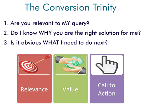
As a final checkpoint, I would recommend that you to use the conversion trinity by Brian. Every landing page improvement will usually come from one of these 3 factors.
- You need to serve a relevant offer (maintaining scent) based on your visitor’s source.
- Communicate your value proposition clearly.
- Make the next step (your conversion goal) obvious for the visitor. You can use social proof to increase confidence.
Conclusion
Crafting high converting landing pages on mobile involves working on the perceived and physical friction of the users.
Understand your audience by performing thorough research. Then, just give them the essential dose of information based on their intent. No less and also no more.
I Hope that my 5-point optimization framework has opened some new optimization possibilities for you. I would highly recommend that you pick one element from your low-converting mobile landing page and start split testing today.
Have you got any additional tips to increase conversions on mobile landing pages? And if you’ve performed any tests on your landing page recently, would you mind sharing your results ältere firefox versionen downloaden?


I am looking for this type of articles from many days, found your website recently. i had bookmarked your blog for regular updates.Thanks for sharing the valuable information.