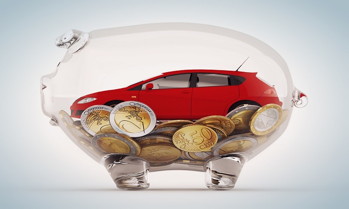
5 Ways to Improve Checkout Page Conversions Using Psychology
Did you know that in 2014, 68.07% of us abandoned our carts when shopping online?
This means that even though we’re comfortable with spending $1.2 million online, every 30 seconds, many of us still don’t complete our online purchases.
So what’s going on?
In many cases, it’s because online stores have checkout pages and processes that drive potential customers away.
However, these issues can be easily fixed by understanding the psychology of those who reach your checkout page.
If you’re a business owner, I’m sure you’ll agree that the numbers above represent a huge pile of money that is being left on the table.
In this article, I’m going to show you how you can use the power of psychology to become an outlier when it comes to cart abandonment statistics.
Once you know how to fix your website’s checkout issues, you’ll be able to massively improve the amount of online revenue your business generates.
Running an Ecommerce site or selling digital products? Use these 5 methods to improve your checkout page conversion rate.
Let’s take a look at what can be done.
1. Make buyers feel secure by minimizing their risk
Buying items online can be a risky thing to do.
It’s your job to let buyers know that you’ve taken care of the risks involved and made it so that the decision to buy your product amounts to an easy yes.
There’s no one, ‘knock out strategy’ available for those who want to minimize risk for their customers.
There are, however, a few reliable tactics that have worked for many companies in the past and will continue to work in the future.
First, you can provide a refund option/guarantee.
Physical goods — When it comes to buying something online, e-commerce shoppers are taking a leap of faith.
They’re hoping that their perception of the image shown on the screen is going to match up with the product that they receive.
However, some people don’t trust their own judgment enough when buying online.
Maybe they’re just naturally this way, or perhaps they’ve been burned before when they bought something that looked differently on arrival than it did online.
You need to make it clear that if they don’t like your product, they can easily send it back to you.
You can do this by displaying a guarantee or refund policy on your site.
That way, they won’t mind buying something from your online store, as they know that they can return the good if there are any problems.
Because of this, you’ve allowed them to not question their judgment anymore, as there is an easy solution if they’re unhappy with what they receive.
Virtual product — If you’re selling information products, or something virtual, such as a SaaS platform, you can still implement this strategy by providing a ‘’30 day guarantee.’’
Are you worried that everyone will take advantage of you and ask for a full refund after having downloaded your stuff?
Don’t be.
Most people don’t ask for a refund, even if the option is open to them.
You can also reduce risk by providing free shipping (for refunds too).

Hate the idea of providing free shipping battlefield 5 pc download?
What if I told you that 93% of online shoppers would be willing to buy more products if free shipping was an option?
Would that change your mind?
Let’s take a look at what makes free shipping so influential.
First, people love to get stuff for free. It’s one of the best words you can put in a headline if you want people to click on it.
But, from a psychological vantage point, the word ‘free’ also signifies that there is no downside.
You’re getting a great offer, so why not take advantage of it?
It’s also an issue of knowing that you’re not being conned when you see something listed at a great price.
Most of us have been stung by that retailer who drew us in with an amazingly low price, then later asked for us to pay high shipping costs.
People hate hidden costs — out of all of the people who abandon carts online, 28% do so because of hidden costs.
We’ll speak more on the topic of trust later, but the option of free shipping subconsciously suggests that the buyer is being upfront with you and that the price you see is the price you’re going to pay.
But, I want to ask you something — can you really afford to not provide free shipping?
After all, a great deal of us (as consumers) think that shipping is something that we shouldn’t have to pay for.
Logically, we know that someone has to pay, but a lot of us feel that ‘someone’ shouldn’t be us.
Some of this belief probably comes from the good old days when we all shopped in brick and mortar stores, where paying for shipping would have been a foreign concept.
But, a big reason why this is happening is because there are so many companies out there, in a variety of verticals, that are already providing free shipping.
Even if your direct competitors aren’t providing free shipping — you need to be, because companies in other industries are doing so and your customers are getting used to it.
Just watch what happens when I Google ‘buy shoes online.’
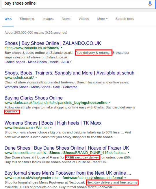
See how many companies are providing free shipping?
Now, of course, this example uses shoes. But people have gotten so used to stores like Amazon providing free delivery, that they now expect it for everything else.
Just look at what happens when I use another random example of ‘mattresses.’
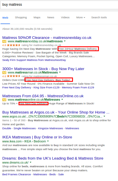
Free delivery is something that people expect. If you’re an online retailer, you need to find a way to offer it.
If you’re providing online software, such as a SaaS platform, you can’t really provide free shipping.
However, you can still mitigate the risk that comes with buying into a SaaS offering.
Let’s imagine a potential scenario that many people go through when looking at a new SaaS platform that they think might be worth investing in.
The new platform on offer might be better than the one that is currently being used. It might be faster, cheaper and it may look a heck of a lot better.
But, a potential customer might not become a customer of the new SaaS platform because all of their data is logged in their current solution and they really don’t have the time to transfer everything across herunterladen.
In the eyes of a busy person, the risk here is the loss of time.
If your offering is for business people, you’re probably aware of the fact that they can’t afford to lose a whole day to implementing a new SaaS solution.
They’re also probably deathly afraid of losing years worth of hard earned data and contact information.
You need to tackle this by letting them know that you’ll do all of the heavy lifting for them.
If your platform is not cloud based, you could do this by simply providing free installation.
Panda security does this, to some extent.
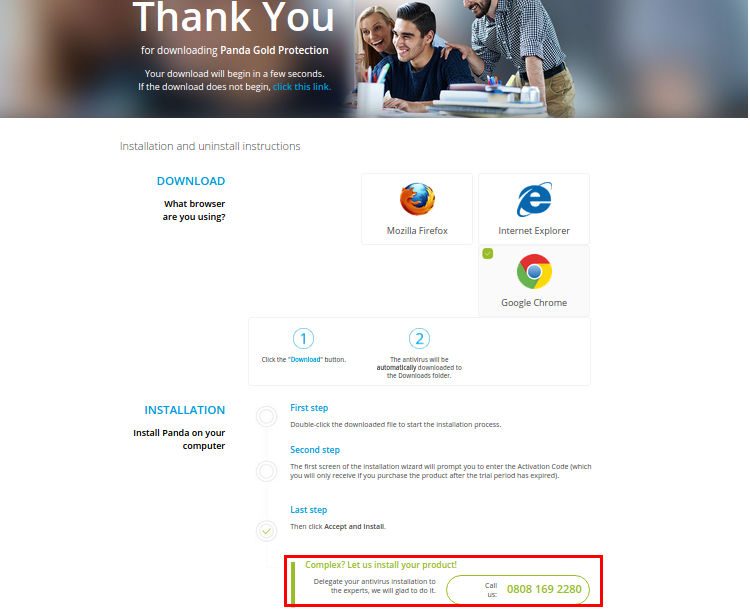
You can also minimize risk by providing a data migration service. That means you take the data that can be found on their previous SaaS platform and use it to populate the your own offering.
If you make it clear on your checkout page that you’re able to provide this service, buyers might feel as though they’re less likely to incur any kind of risk as a result of engaging with your offer.
2) Give buyers a reason to trust you
It can be hard to trust a company that you’ve just recently discovered on the internet.
That’s because. in most cases, you don’t really have a reason to trust the company you’ve just discovered.
When people don’t trust you, they don’t feel like doing business with you. You probably feel the same way.
So what can you do?
There are a few tried and tested methods that you can use in order to build trust.
It is important that when you are using these strategies, you do not lie or falsify your information.
Not only is this unethical, but it also defeats the purpose of what you’re trying to do.
One way that you can build trust is by exhibiting social proof on your website.
Social proof is one of the most powerful sources of psychological influence in the world. It essentially means that people are more likely to do what they see others doing.
Social proof is so powerful that it can cause people to sit in a room that is filled with smoke and not move, if nobody else is moving.
It exerts a strong influence.
We’re going to take a look at two ways you can use social proof to improve checkout page conversions.
- Testimonials.
- Greyed out ‘used by’ logos.
Testimonials — One way that you can use social proof on your checkout pages is by displaying some testimonials.
By using testimonials, you’ll be able to increase the amount of trust that potential customers have in you.
I’ve tested testimonials before. I found that on my checkout page, conversions were 6.38% better when a testimonial was included.
However, you can’t just use any old testimonial.
You need to provide testimonials that potential customers can relate to.
Let’s take a look at the key features of a great testimonial.
Feature 1: Speak to the desires and fears of the people that belong to your target market.
Your testimonials need to explain what life was like before the customers found you and how life became better as a result of using your product herunterladen.
While talking about your product, the testimonial needs to point out certain, specific issues that were resolved as a result of your offering.
A great way to emphasize this effect, is by highlighting certain parts of the testimonial and bolding or italicizing bits of relevant text.
The highlighted parts will attract the eyes of those who are on the checkout page and provide them with the reassurance that they need during the last mile of the buying process.
Feature 2: Use pictures of the people who supplied the testimonial.
Human images on websites are known to boost trust.
You can make your testimonials even more trustworthy by adding a small avatar image of the person who actually supplied the testimonial.
You might not think that a small image does much, but showing a human face can really add to the credibility of your testimonial.
If someone is willing to put their face next to a testimonial, there’s more believability to it.
Feature 3: Get testimonials from people that potential customers can relate to.
People like people that are like them. As a result, you need to make sure that your testimonials come from people that represent your target market.
There’s no use in displaying a testimonial from a fortune 500 CEO if your product is designed to help housewives launch their first business. No matter how good it is, it won’t connect.
So, how can you actually get good testimonials?
Even though they may love your website, most customers might not be that great at providing a brilliant testimonial. This is simply because of the fact that they’re not aware of the points mentioned above.
As a result, it is essential that you ask questions, rather than bluntly requesting a testimonial.
These questions don’t have to be leading. A great one would be to ask, ‘What was life like before you used our product and what is it like now?’
By asking questions, you’ll be able to draw out the best of their experiences and not have to deal with a mediocre testimonial that doesn’t pack a lot of persuasive power.
Greyed out ‘used by’ logos — Another form of social proof that you can use on your checkout page is a series of greyed out ‘used by’ logos. These logos are almost like highly simplified testimonials. Greyed out logos are often used to showcase some of the big name clients that you might have.

If you’re a potential customer, the simple fact that big name companies are happy to be associated with the company you’re looking at lets you know that they must be worth checking out.
Customers might think ‘If it’s good enough for them, it must be good enough for me.’
You can also improve trust by displaying 3rd party trust badges on your site.
You’ve probably seen them before while shopping online. They may have even influenced your decision to trust a website and buy from them.
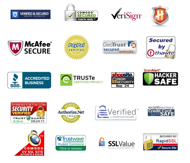
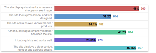
If you have been influenced by trust seals, don’t feel left out. It was found that 48% of people decided to trust a website if a ‘trust mark’ was displayed sky go herunterladen 1510.
You may not even know what these logos mean, but the fact that they’re there reassures you.
However, not all trust seals are the same. A study conducted by the Baymard Institute found that the ‘Norton Verisign’ logo was the most highly trusted.
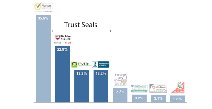
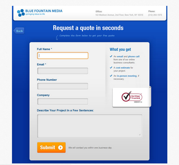
And, there’s evidence to suggest that this means something too, as Blue Fountain Media discovered a 42% increase in conversions after using a Verisign trust seal (Norton trust seals are now Verisign trust seals).
If you want to use trust seals throughout your checkout process, it helps to place them near form fields where the visitor is required to enter sensitive information.
The presence of trust seals in such locations will reassure visitors that their data is not under threat.
You don’t have to use these trust seals in isolation either.
However, when combined, conversions skyrocketed to 31.6% — essentially, a six figure rise in revenue.
Another way that you can improve trust is by providing a live chat option or a by making a phone number highly visible.
People like to use live chat. It scored a high 73% from people who declared a reason why they were happy with the support they received. This is higher than all of the other forms of communication used for customer service.
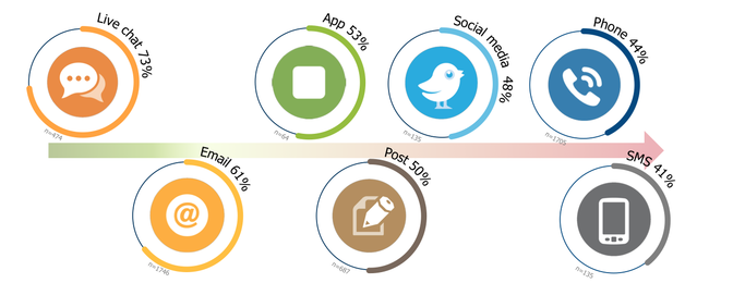
Of course, you don’t have to provide only live chat. You can also provide a phone number.
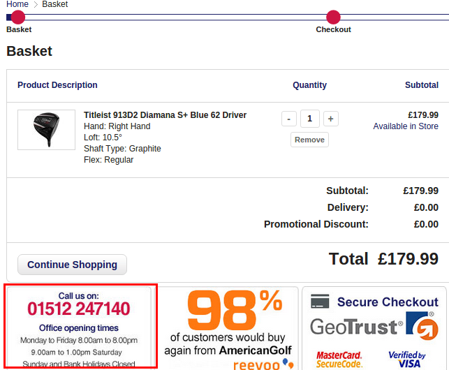
Very few people will probably call this number. But, the fact that it is there showcases that you don’t have something to hide and promotes the fact that you are a ‘real business.’
It also provides your website with a more humanistic aspect.
Visitors will feel like they can trust you more, because they can speak to someone if something goes wrong.
On top of that, the ability to contact you provides customers with a way to deal with any last minute questions that might have stopped them from clicking on the buy button.
3) Remove friction by tackling the buyer’s psychological resistance.
Some companies make the process of buying things online, really, really difficult.
This tends to happen if a checkout page has too many points of friction, which cause potential customers to feel overwhelmed and in a hurry to click the back button.
People prefer instant gratification over delayed gratification.
If you can make it so that your checkout process brings customers closer to instant gratification, you’ll be able to boost conversions albums download youtube.
In some cases, the online retailer is not at fault, as some checkout processes can’t be avoided by the customer.
However, that doesn’t mean that we can’t make the process easier for those who want to do business with us.
Imagine that you’ve just found an awesome product online and can’t wait to buy it.
You then click the ‘add to cart’ button and head for the checkout page.
And, what do you see?
A page filled with dozens of form fields asking for your personal data.
Still feel like buying that product that got you so excited?
The funny thing about form fields is that people don’t really like to fill them in.
It’s your job, therefore, to reduce the number of form fields that people have to fill in to get your offering.
Sure, you have to ask for email addresses and physical addresses.
But, are there any form fields that really don’t need to be there? Even the smallest reduction in form fields can have a massive effect on your conversions.
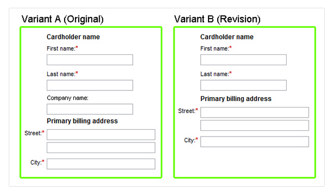
Experian managed to boost their revenue by $12m by just removing ONE field.
There are a couple of reasons why this worked.
First, by removing the ‘Company name’ field, the form looks simpler and easier to fill in. Because it looks simpler, people don’t feel bothered or overwhelmed when seeing it.
For most people, more notably, the ‘Company name’ field was a redundant field for them. They didn’t need to fill in this field because it didn’t apply to them.
The fact that it was there made people feel as though they should have filled it in, even though it does not have an asterisk next to it noting that it’s required.
When the ‘Company name’ field was removed, there was a reduction in the amount of work that the visitor had to do, making the sign up process easier.
50.3% of all of the traffic that e-commerce websites receive comes from mobile devices.

This means that if your checkout process is not optimized for mobile, you’re making life hard for nearly 50% of your customers.
When you make their life hard, they’re less likely to buy from you.
So, how can you make their life easier?
One way you can reduce resistance is by setting your checkout up so that the right keyboard appears for each of the fields.
This means that if someone clicks on a section where they need to enter a phone number, the number keyboard is automatically displayed to all mobile buyers.
This might sound like a small adjustment, but it makes the checkout process more seamless and helps to reduce friction.
You could also minimize friction by providing a tick box that lets buyers state that the billing address and the shipping address are the same.
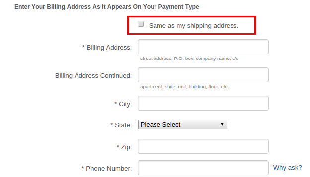
Chances are good that when people are going through your checkout process, they’re going to keep the billing address and the shipping address the same wie kann man minecraft mapsen.
This a fast way to reduce the amount of forms that need to be filled in, as they don’t need to enter the same information twice.
A lot of the time, websites ask customers to register before they can go through the checkout process.
Visitors don’t like jumping through these extra hoops. All that they want to do is buy the thing that they’re interested in.
Because of this, it helps to provide a guest checkout option instead of asking people to register.
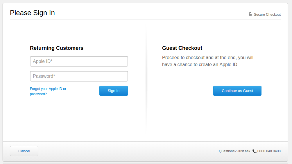
Asos managed to halve their cart abandonment rates by introducing a guest checkout option.
By providing a guest checkout option, you reduce the amount of work a potential customer has to go through in order to get the product that they want.
Some companies have also managed to reduce resistance by varying the number of checkout pages.
A multi page checkout makes the signup process seem easier, because each page asks for small commitments.
When commitments, in the form of data entry fields, are all piled onto one page, the checkout process can seem a little bit overwhelming.
That’s how the theory goes.
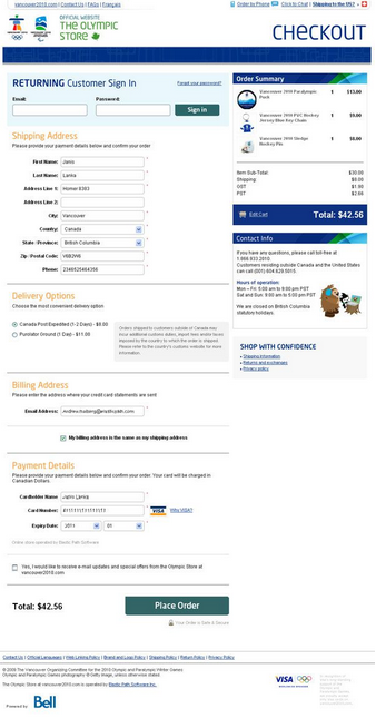
However, I would suggest that you test single page vs. multi page, because some companies have found single page checkouts to work better than multi page checkouts.
For instance, the Vancouver Olympics Store found that a single page checkout lead to 21.8% more conversions.
However, other companies have found that doing the opposite worked also.
For CrazyEgg, we discovered that a three step checkout process boosted conversions by 10%.
Test it and see what works for you.
But, consider this — When it comes to identifying friction points, who better to ask than the people who are going through your checkout process?
Thanks to tools such as Qualaroo, you can implement some exit pop-ups on your checkout pages that will ask visitors why they’re leaving.
You can also deploy user testing services, such as Peek, to get some feedback on your website buyer experience.
Let’s first take a look at how you’d create an exit pop-up that asks users why they’re leaving the checkout page.
Note: You’ll need the ‘PRO’ version of Qualaroo to do this. You can follow the steps below and then sign up for a ‘PRO’ account.
First, go to Qualaroo.com and become a member.
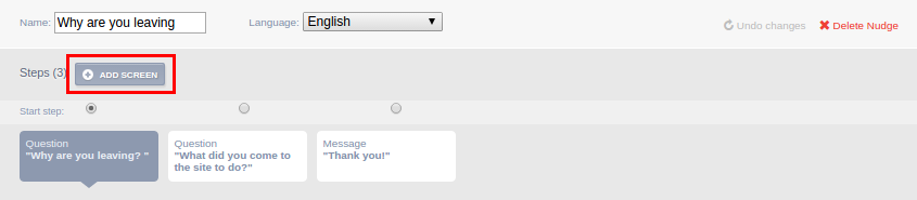
Once you’ve become a member, you’ll see this screen.
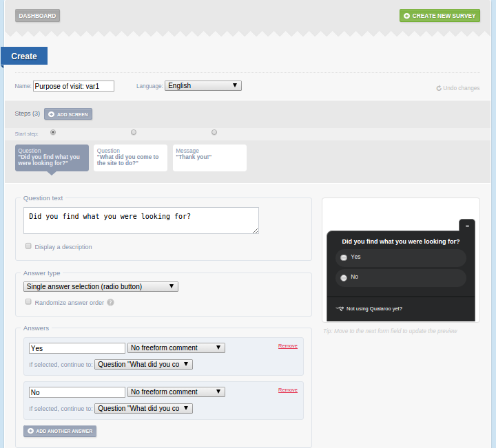
Enter some text in the question box that is related to the purpose of your survey — I chose ‘Why are you leaving?’
I’ve provided four potential answers that can be selected as a reason for leaving the checkout process whatsapp downloaden op ipad.
These are —
- Too many forms to fill in
- Need to register
- Not mobile friendly
- Just browsing
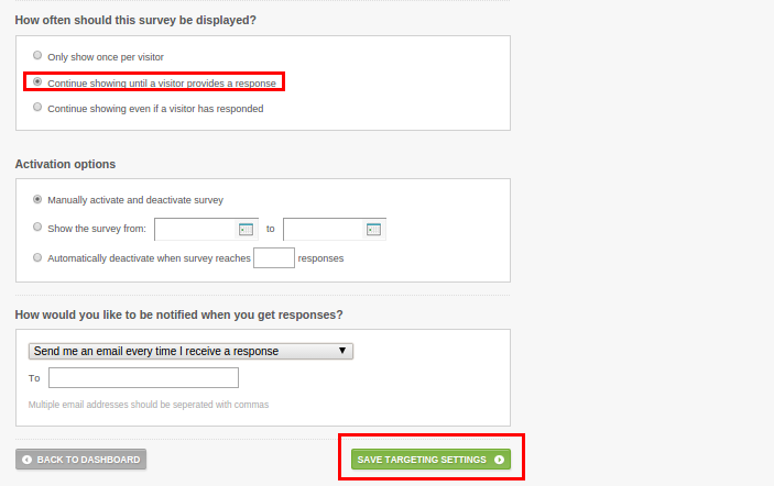
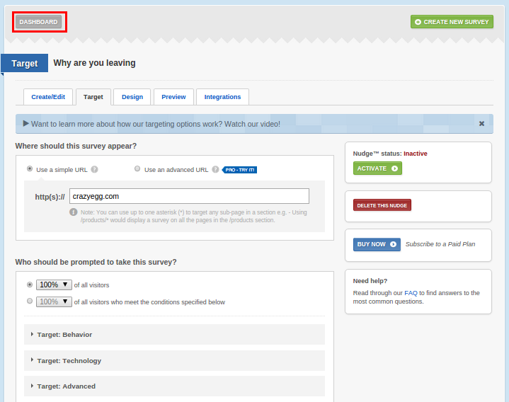
Once you’ve entered these questions, click on the ‘Save’ button and then click on the ‘Target’ tab.
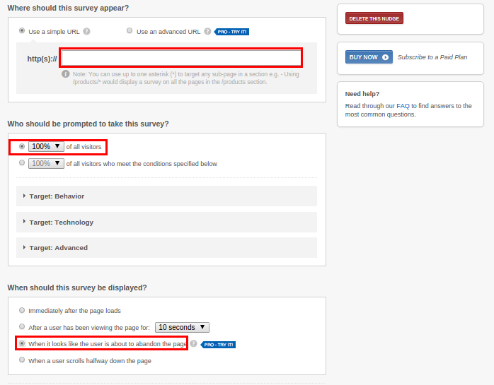
Type in the URL of your checkout page and set it so that it is shown to all visitors.
Under the ‘When should this survey be displayed?’ option, select ‘When it looks like the user is about to abandon the page.’
Then, scroll down and click on ‘Continue showing until a visitor provides a response.’
To keep things simple, leave the activation options as they are.
Provide an email address so that you can get the responses. Then, click on ‘Save Targeting Settings.’
Click on ‘Dashboard,’ as shown above. You should then see the screen below. Click on ‘Install code’ and implement the code into your site.
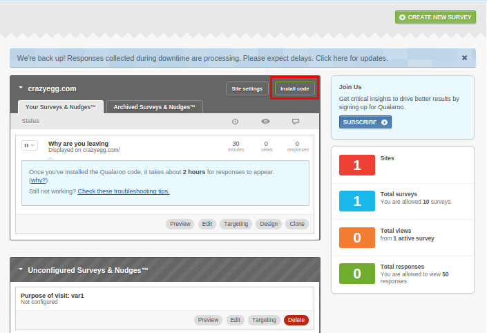
The exit survey will now appear when people are leaving your checkout.
You can see how exit surveys can be used to find out why people are not engaging with your checkout process.
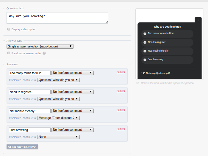
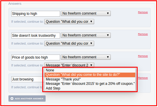
Let’s just cover another point, too — Imagine that you weren’t focusing on friction points, but instead you wanted to find out why people weren’t completing the checkout process.
To do that, all you’d have to do is change the options you’re providing on the exit survey, as shown below.
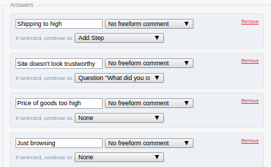
Here, I’m providing the following answers that visitors can choose in order to explain why they’re leaving —
- Shipping is too high
- Site doesn’t look trustworthy
- Price of goods too high
- Just Browsing
You have the option of providing a solution, then and there, for those who are thinking about leaving your checkout page.
If someone picks the ‘Price of goods too high,’ answer, you can provide a coupon code for that person immediately.
To do that, just click on ‘Add screen’ on the ‘Create/Edit page.’
Provide a discount code using the text box.
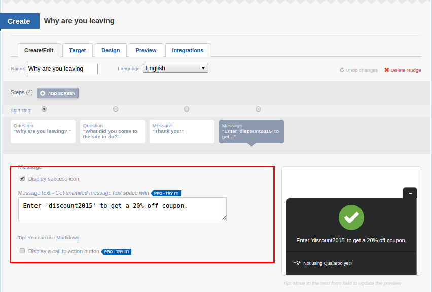
Save the changes and then click on the ‘Create/Edit’ tab again.
Scroll down and set it up so that the coupon is displayed if the ‘Price of goods is too high’ option is selected.
Then, install the code in the same way that I described above.
Note: Your e-commerce solution needs to be set up so that it recognises the discount code that you use.
The other way that you can identify friction points in your checkout process is by using a user testing platform such as Peek.
These platforms let you set a task for someone to carry out on your site. You may, for example, ask them to buy a certain product.
You’ll then be able to get a video of them going through the process, as well as some feedback on what can be improved.
The issue here is that you might not get a lot of volume, in terms of feedback on your website.
As a result, your website feedback might not be that accurate and some outliers may create a bit of bias. This may result in making irrelevant changes that don’t result in positive changes.
4) Understand the buyer’s point of view so that you can remove uncertainty.
Empathy goes a long way when you’re looking to improve checkout conversions.
Being empathetic will allow you to spot stages of the checkout process that are going to make potential customers feel uncertain.
Uncertainty can manifest itself in a variety of ways. But, if you want to bring it down to its essence, it generally has its roots in unanswered questions.
It may be that people don’t know how long the checkout process is going to take or what will happen when they click on the ‘next’ button fahr simulator kostenlos downloaden.
They might also have some uncertainty in terms of how long it will take for the product to reach them.
Uncertainty is bad and it can kill conversions.
Therefore, we need to take action and remove as much uncertainty as we can from the checkout process.
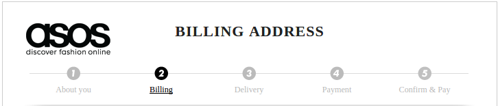
A progress bar, like the one used by Asos, has the capacity to reduce the amount of uncertainty a potential buyer experiences.
Progress bars work because—
i) They motivate you. Because you know what needs to be done and completion of each step gives you a sense of progress.
ii) They let you know what’s coming next. You don’t have a fear of accidentally clicking the ‘next’ button and ordering your item. You know that you’ll have a chance to review your order before completing your purchase.
As you’ve probably guessed, a progress bar is best used on a multi-page checkout process.
If you’re using a single page checkout process, you might be able to achieve the same effect by using an accordion style checkout page.
When visitors reach your checkout page, they may still have some objections related to actually buying your product.
Objections are just sources of doubt. People might not want to buy if you can’t quell these feelings of doubt.
Objections occur, in most situations, where something is being sold. So, don’t worry, as all you need to do is deal with these objections in a clear and simple fashion.
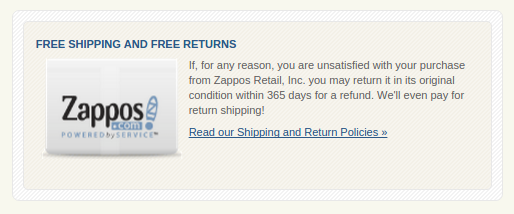
For some, the objections might be as simple as not wanting to buy because they’re not sure if there is free shipping and refunds.
Zappos addresses this objection by making it clear what their policy is.
Sometimes, objections might simply relate to the FAQs that are based around your product.
If you list the top five FAQ’s for your product on your checkout page, you’ll have another way of dealing with uncertainty.
You can use the Qualaroo tool that I mentioned earlier to find out what objections people have when they reach your checkout page.
Once you’ve collected data on what makes people click away, you can address those objections on your checkout page.
Potential buyers can also have uncertainty if the copy on your checkout page is not clear. Visitors need to know what is going on at all times and what is going to happen next.
Ideally, you don’t want the buttons to just say ‘next.’ You want them to say what’s going to happen next. And, you want the buttons to be in locations that are really easy to see.
Customers also want to know exactly what they’re going to be buying and what they’re going to be paying for their items.
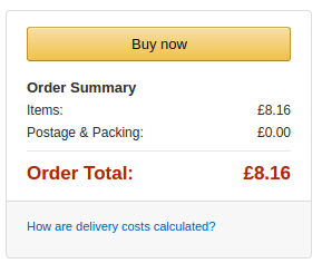
The checkout page on Amazon is very easy to understand. You know exactly what you’re paying and why you’re paying that amount.
Though I didn’t rely solely on copy to do this, I managed to increase conversions by 28% by placing an image of my course above the ‘add to cart’ button.
The additional clarity resulted in a rise in conversions.
5) Create urgency and remind buyers why they need to take action now
When people say that they’re just browsing, they might feel as though they have plenty of time to come back and buy the thing that they want later russische ebooks download kostenlos.
In other words, they may not feel as though they have to take action.
You can change that.
By introducing some urgency into your checkout process, you’ll be able to push a percentage of those who are in ‘just browsing mode’ into ‘buying mode.’
If you were interested in buying something, but knew that there was only one item left, would you wait to buy it on another day?
Many people wouldn’t. The fear of missing out is something that a lot of us deal with — especially when it comes to making purchases.
If you make it clear what your stock levels are, people might be more inclined to purchase once they reach the checkout page.
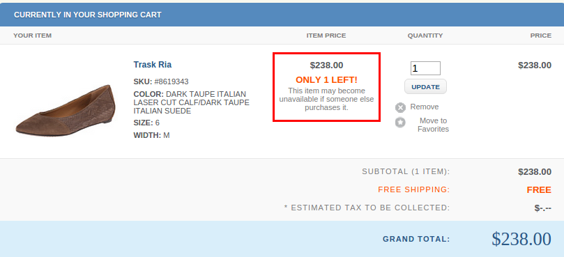
Zappos does a great job with this. See how they’ve highlighted that there is only 1 item left of the product that is in my cart?
They’ve emphasized this more than anything else on the page, by making the text red, bold and larger than of the other bits of text in the checkout box.
They’ve also made the interesting decision of essentially saying that ‘’if you don’t buy it, someone else will — and from that point, we don’t know when this product will be available again.’’
If your potential customers are in ‘just browsing mode,’ this is an incredible way to inject some urgency into their life and inch them closer to clicking the buy button.
In addition to providing information on stock levels, you can also provide people with a deadline.
Deal sites do a great job at this. They’re always encouraging people to act against the clock.
Because of this, they’re able to create a buyer frenzy as people start to worry that they’ll forget about the offer and then miss out on a good deal.
Even if you’re not running a deal site, you can still use the concept on your own checkout process, especially if you’re offering a coupon code.
As we mentioned earlier, people prefer gratification sooner, rather than later.
Consider what would happen if you gave customers a way of getting the product the next day, as long as they took action within a given time frame.
Don’t you think that they’d be more inclined to buy?
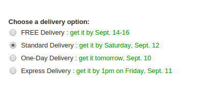
This is a type of urgency that is masterfully used by Amazon
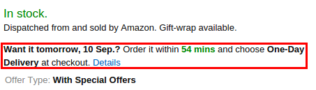
They tell you when you can get an item (they even provide you with a date) and they give you a countdown timer.
The timer is gnawing away at you, telling you how long that you have to take action before the order loses its ability to be delivered the next day.
They remind you of this fact on the checkout page too.
By appealing to the human need for instant gratification, you’re able to shift people from a passive state into an active buying state.
You could also use an exit pop-up on your checkout page. You can display the pop-up when someone reaches your checkout page and then clicks the close button or back button.
Just as they’re about to click the close button, an exit pop-up can be displayed.
This exit pop-up could explain that there is a discounted offer available.
When visitors close the pop-up or click on the discount button, you could create a timer that tells them how long they have left until the offer expires.

This will then create urgency, because they will want to take advantage of this special offer before it is no longer available to them.
Conclusion
Our psychology plays a major role in why we make the decisions we do.
As marketers and website owners, we can influence the psychology of those who visit our websites so that we can improve the conversion rates on our checkout pages itunes download windows 10 kostenlos deutsch.
If you want to maximize conversions on your checkout pages, you’ll need to take a multi-faceted approach.
Sure, you can just introduce a little bit of urgency in isolation, but wouldn’t your checkout page be more powerful if you used social proof too?
When you bring together all of the elements of psychology that have been discussed, you’ll have a checkout page that rivals the likes of Amazon.
What strategies have you found to be useful when using psychology on a checkout page?