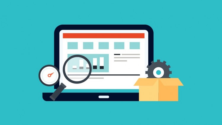
The Ultimate Guide to Fixing Your Conversion-Killing Homepage
The heart of your site is the homepage. It’s the gateway to every other page. It stands to reason that mistakes on this page can kill your conversion rate.
When people search for specific keywords on a search engine, they’re essentially looking for the right information, and they want it fast.
Yet, a statistic shared by Crazy Egg revealed that 63% of marketers optimize sites based on their intuition, not on tried-and-tested best practices.
In the past, having an attractive site was all that you needed. But, today we’re playing a far different game. These days, your homepage must convert visitors into customers.
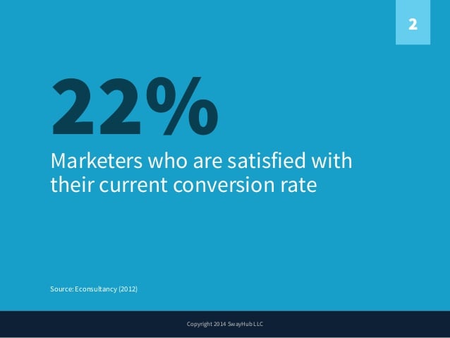
That’s why more marketers are paying attention to homepage optimization in order to increase conversion rates. According to a 2012 research by Econsultancy, a paltry 22% of marketers are satisfied with their current conversion rate.
Getting visitors to your site is relatively easy compared to converting them into customers. Yet, Eisenberg Holdings found that companies typically spend $92 to bring customers to their site for every $1 spent on converting them.
What does all this mean? In a nutshell, it’s crucial to optimize your homepage and stop killing your conversions through neglect or ignorance.
Is your home page cluttered with unnecessary elements? Check out these 7 homepage mistakes you need to avoid in order to improve your conversion rate.
If you’re wondering how to improve your conversion rate, look out for these 7 homepage mistakes and avoid them at all costs.
Mistake #1: Adding Company News to the Homepage
Keeping your audience informed about recent developments in your business will further increase the trust they have in you.
Company news items help attract investors and customers. According to etoro, business news is critical because it can influence your market.
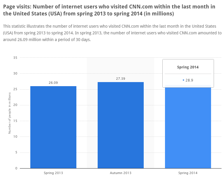
Do you know why CNN reaches over 7.5 million people and generates millions of pageviews each month?
Well, one of the main reasons is that CNN is adept at giving the latest information about entertainment, politics and business, both locally and at the international level.
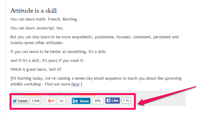
So, without a doubt, company news is important. But, it shouldn’t be on your homepage.
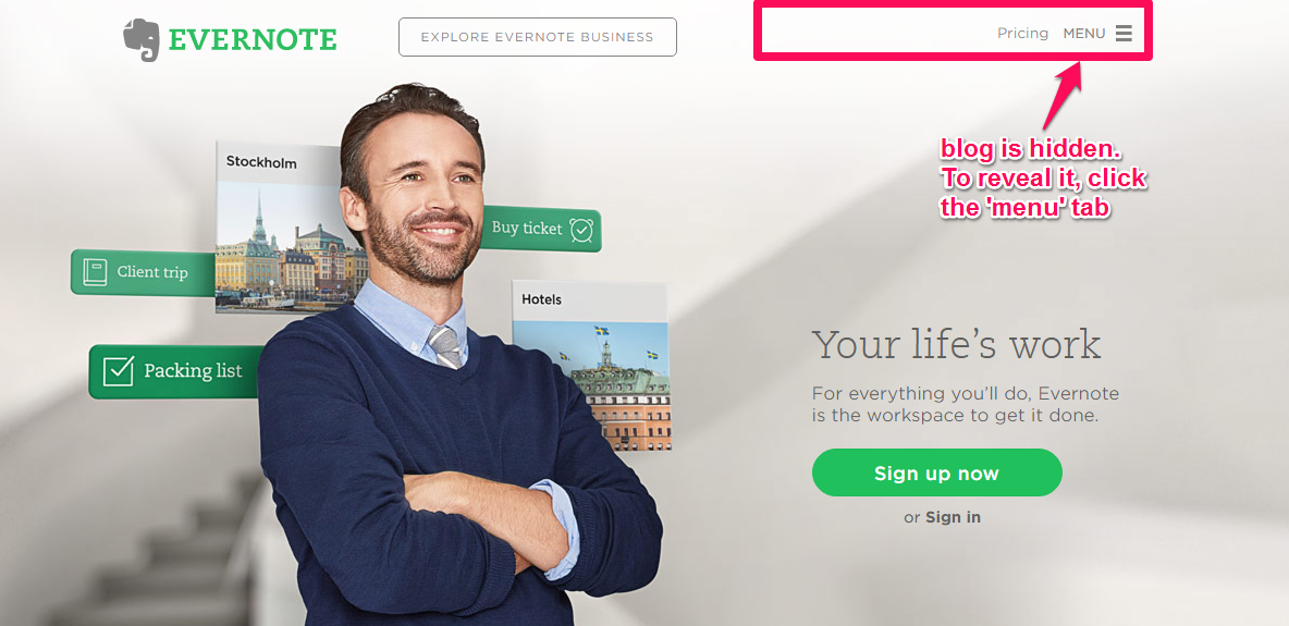
A lot of software companies give updates on a regular basis, but they do it through their blogs. A typical example is Evernote. Each time a new feature gets added to its software, the company announces it on the Evernote blog.
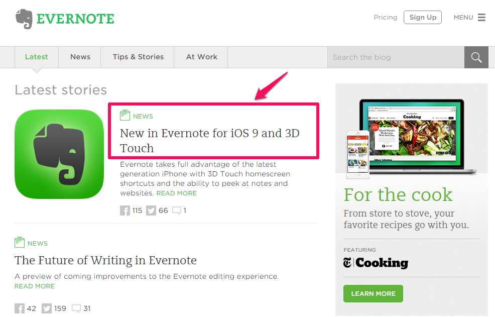
Evernote also have a navigational menu item for “news,” but it doesn’t display news on the homepage.
Why not? Simple: because homepage news items can kill conversions.
Imagine a potential customer visits your site, intending to subscribe to your email list or buy your product mein billa app herunterladen. But, when they arrive on the homepage, they find only your company news blurbs.
Of course, your company news may interest or even excite them, but that won’t matter. Why? Because the primary purpose of your business is to consistently attract customers and increase revenue – not to get people interested in your news.
On your site homepage, you want to eliminate distractions – even seemingly benign ones. If you’ve built an active community around your blog, then share your company news as a blog post or create a new landing page for it.
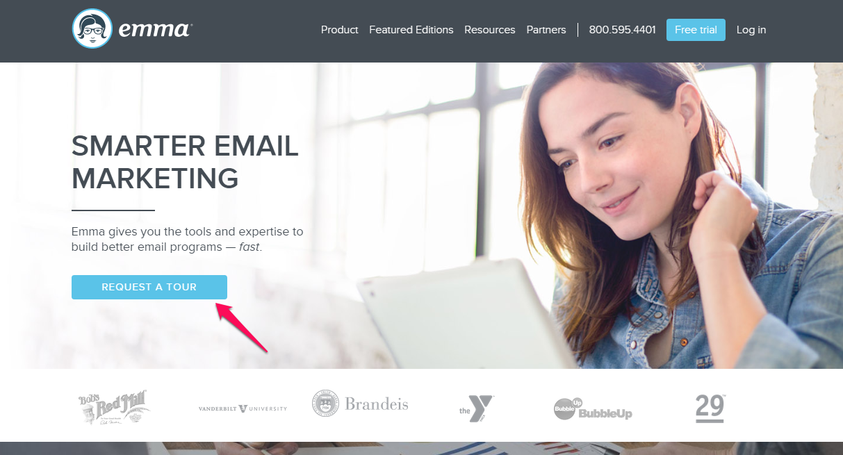
Your homepage should be professional and aimed at leading visitors straight into your funnel. Myemma.com, an email marketing software company, understands how to create a clean, focused homepage, the sole objective of which is to get you to click the “Request a tour” button.
Mistake #2: Cluttered Homepage With Unnecessary Text and Images
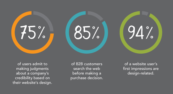
A research study by Kinesisinc found that 75% of your site visitors form judgments about your business based on your site design and 94% of a user’s first impression of your business is design-related.
With that in mind, it’s high time you declutter your homepage. Having too much text and too many images on your homepage can actually hurt your conversion rate.
The question then becomes: “How much is too much?”
According to NNGroup study, cutting the words on your page by half causes a 58% rise in usability. In other words, concise web copy helps optimize your page for conversions.
Admittedly, there’s some professional disagreement about this point among copywriters. While some people believe that “short and sweet” copy converts better, others believe that the more copy a page has, the better your odds of converting a visitor into a customer.
The reality is that both sides have a point. When it comes to your homepage, you have to make sure that there’s enough text so that search engine spiders can index it. But, too much text distracts your visitors from the core goal.
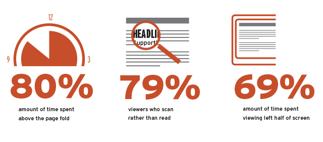
On your homepage, you’ve got to consider your site visitors above all else. Giving them a great experience should be your top priority. Make sure that your most important text is placed above-the-fold, because 80% of site visitors spend most of their time on that section.
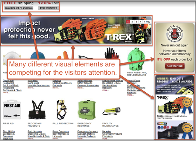
In addition to clearing your homepage of superfluous text and images, you should also avoid advertising that will only compete for your visitor’s attention.
Use only relevant images and make sure that they help you convey your homepage message more effectively, instead of distracting viewers from the page’s purpose. Remember, your visitors are human and their brains process visual information 60,000x faster than plain text.

When do images overpower the homepage? There’s no hard and fast rule, but the moment your image begins to compete with or draw attention from your headline, subtitle, bullet points or the solution that your product provides, it’s time to pull back a bit internet explorer 10 download for free german.
Chris Ducker understands how to combine compelling copy and trust-building images on his homepage, without coming off as overly promotional.
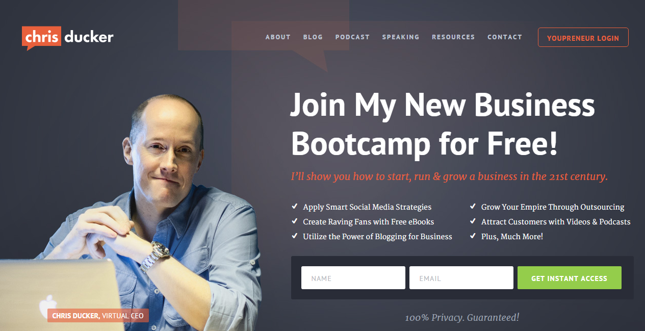
Why is Chris’ homepage so effective? I believe he’s doing a lot of things right. As a renowned blogger, his authority also plays an important role. But, the most striking element on this homepage is the human picture.
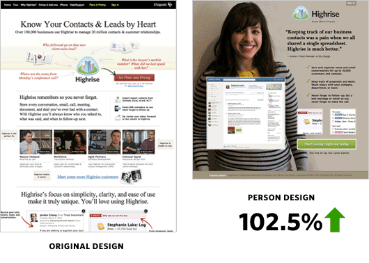
After conducting a series of tests, Highrise discovered that a background image of a customer performed better than a white background and increased conversion rate by 102.5%.
Images of happy people build trust. Websites with images that include facial features or characteristics are more positively received than images without recognizable facial features.
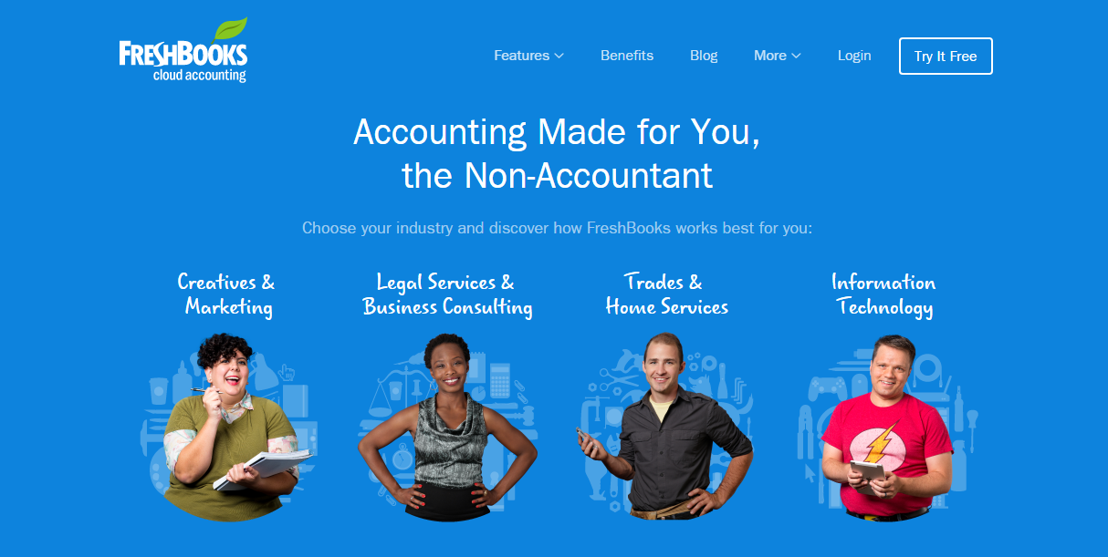
It’s no longer a surprise that many brands use pictures of people on their homepage to build that initial relatable impression. But, the images should be relevant to the product/service and the outcome. For example, Freshbooks has successfully blended human images and text on this page:
Although I haven’t been using my personal picture on my homepage – just in my sidebar – I’ve seen successful digital marketers use this approach for a long time.
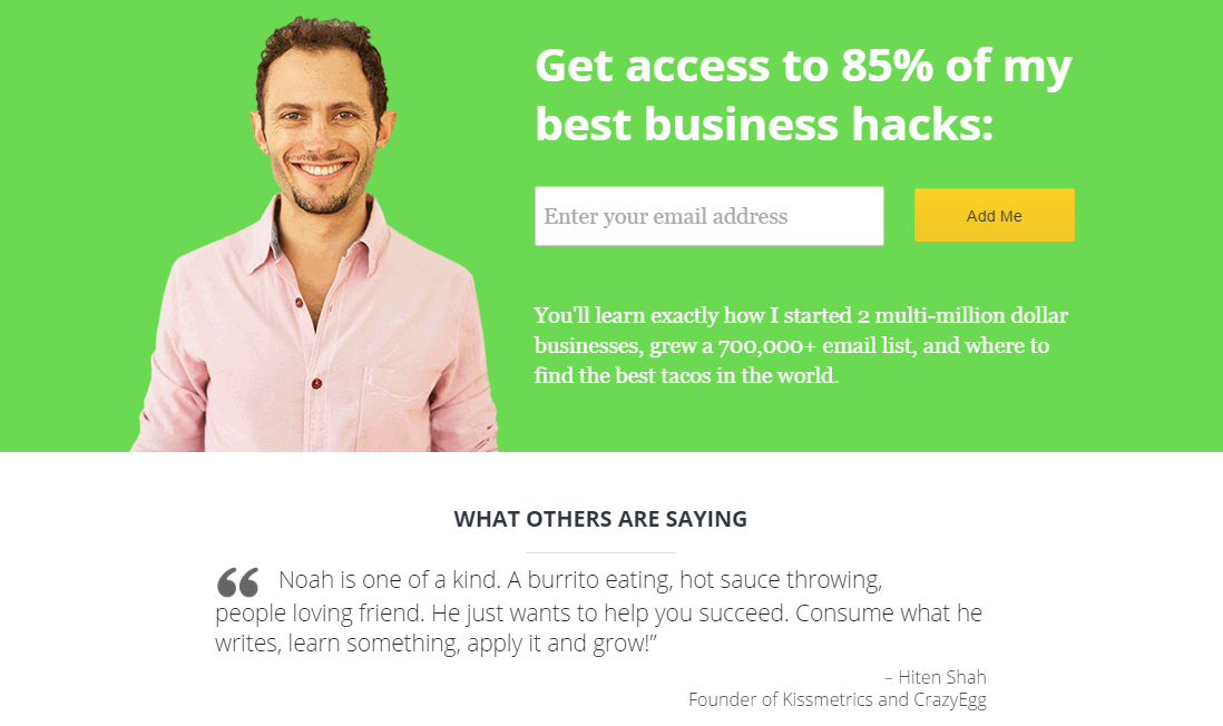
Noah Kagan, founder of AppSumo and OkDork, understands how to streamline and build trust with his personal picture, a striking headline and a compelling opt-in box:
What’s the right size for your homepage image? What’s the optimal amount of copy for your homepage? There’s only one way to find out for sure and that’s by conducting split testing.
Mistake #3: Too Many Calls-to-Action on the Homepage
Are you making it easy for your customers to move from Point A to Point B? I strongly believe that you should pay adequate attention to this one objective on your homepage.
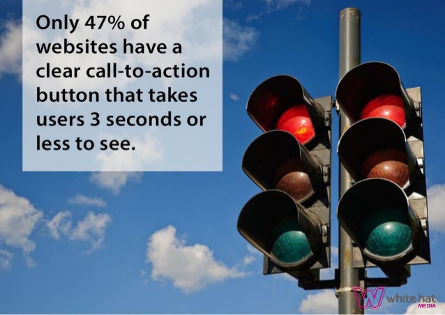
Out of the 200 small business websites evaluated by Online Marketing Coach in 2013, 70% failed to display any clear calls-to-action on their homepages. Only 47% of websites displayed a clear call-to-action button that took users 3 seconds or less to spot.
The easier and more quickly your customers can find exactly what they’re looking for on your site, the more readily you’re providing them immense value.
Too many calls-to-action on your homepage can kill your conversions. That’s because presenting too many options leads to customer paralysis.
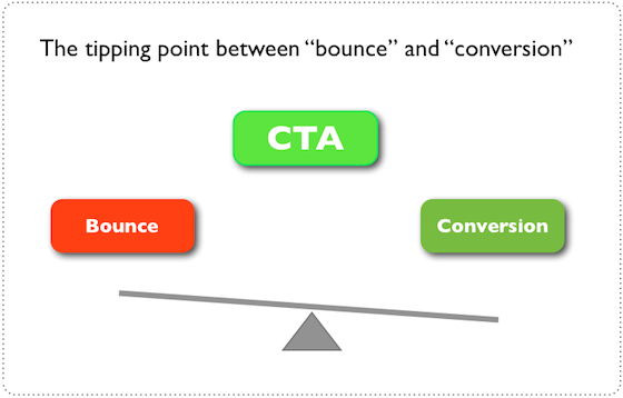
Your CTA is the tipping point between bounce and conversion. In other words, your CTA will lead visitors either into your funnel or off your site entirely.
Get to know your customers and what they want alle games gratis downloaden. That’s the simple way to avoid choice paralysis. Are your target audience members beginners or are they more experienced? Have they purchased from you in the past or are they predominantly fresh leads?
What exactly do you want your customers/site visitors to do when they get to your homepage? Should they try your free demo or view your special pricing plans? Do you want them to purchase your product right off the bat, or would you rather they subscribe to your email list first?
Remember that when it comes to converting customers, the secret to more sales and repeat purchases is as simple as understanding exactly what your customers want and giving it to them.
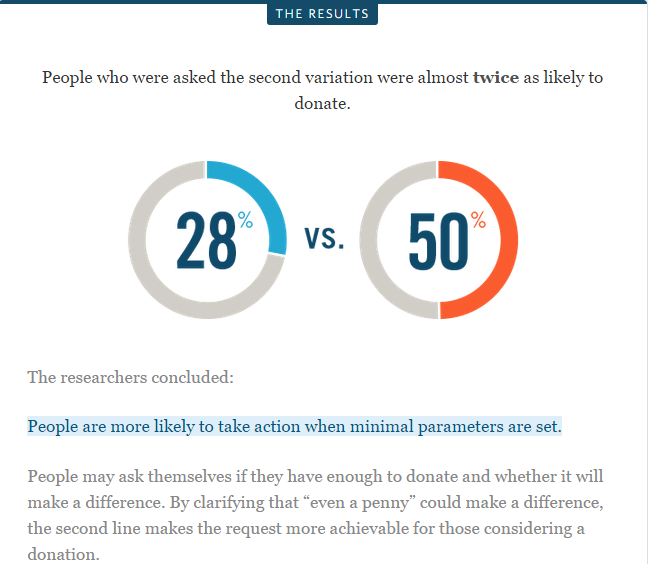
Dr. Robert Cialdini, Professor of Psychology at Arizona State University, published a research study on customer paralysis. The study examined the donation process of the American Cancer Society. Specifically, he looked at how a minute change delivered a terrific result.
The research revealed the importance of analyzing why people say “no” to offers.
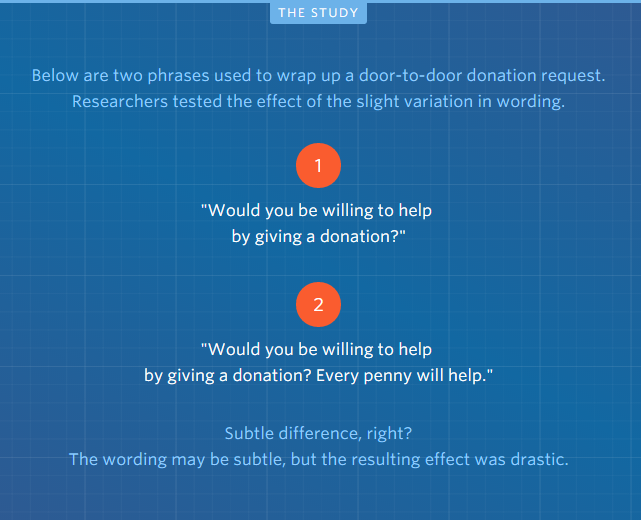
What was the result of the study?
In the same vein, too many calls-to-action on your homepage will dilute your page’s effectiveness. Dayne Shuda says that too many buttons vying for your user’s attention will actually discourage them from making any choice at all.
It can also make your visitors unhappy, because you’ve failed to meet their needs. Oddly enough, too many choices leaves your customers feeling stranded and they’ll end up doing nothing.

Of course, you can have the same CTA appear a few times on your homepage, if it’s a long one. But, you should never confuse people with several CTAs like this:
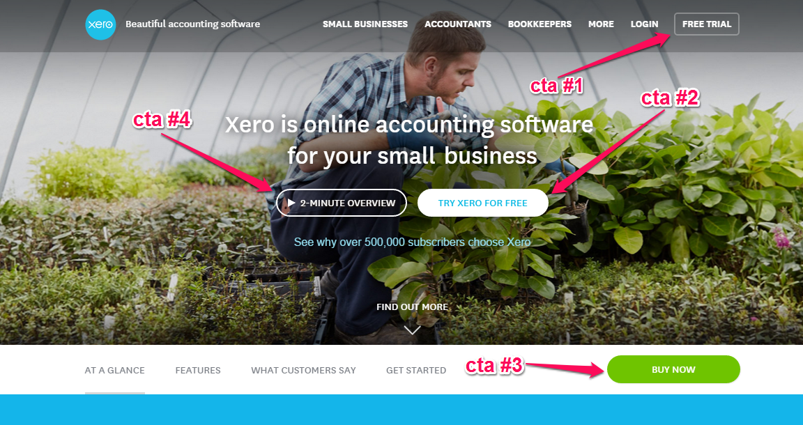
Xero is a popular accounting software tool, but its homepage is a little cluttered. Yes, hundreds of accountants trust Xero because it’s an effective, amazing tool that makes life easier for them.
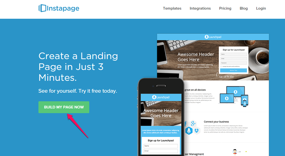
However, if you’re just starting out or you haven’t built a strong brand for your business, your homepage should be simple, clear and direct, with a single major call-to-action. Here’s an example from Instapage:
When you use a call-to-action on your homepage, make sure that you tell users what they’ll get. When they can visualize and expect a specific type of value, they’re more likely to click the CTA button.
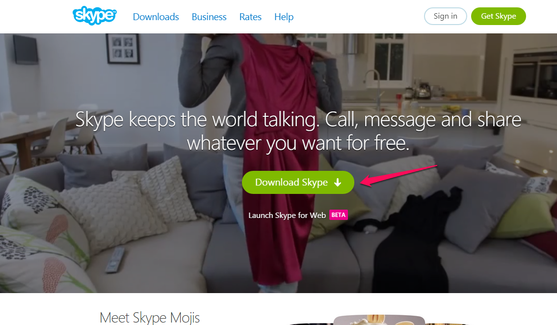
A typical example is Skype. You get to download Skype and nothing more.
Avoid using generic calls-to-action on your homepage google docs datei herunterladen. For instance, instead of using “submit,” change the text on your button to something more compelling.
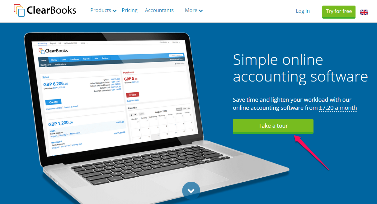
Clearbooks uses the phrase “take a tour” on its CTA to encourage prospects to click.
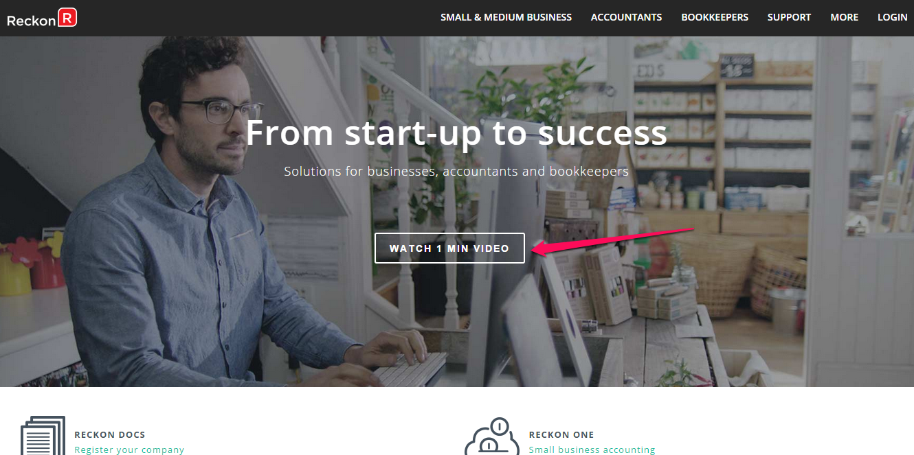
Reckon tells the user that the introductory video will only last 1 minute. When the button is clicked, the customer gets to watch the 1 minute video before moving on.
Remember that the location of your call-to-action matters. You may want to split test a few options – right side vs. left side, above-the-fold vs. below.
Again, there’s no single rule that’s set in stone. The CTA that works for me may not work for you. That’s why split testing is the only way to ascertain what works and what hurts.
Mistake #4: Not Giving Your Blog Priority
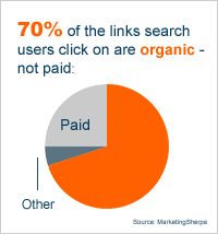
87% of organic search results are blog posts and 70% of the links users click on are organic results, not paid. Search engines love blogs more than a static website.
If you’re not giving your blog priority on the homepage, then you’re making a big mistake. In my experience, it’s very difficult (if not impossible) to build an active community around your site without a frequently-updated blog.
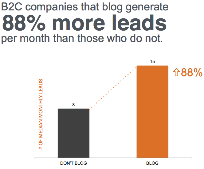
Blogging is an indispensable tool for every business. Whether you’re a B2B or B2C marketer, you can blog your way to more leads, more brand recognition and more sales. Statistics show that B2C companies that blog, for example, generate 88% more leads per month than those that don’t.
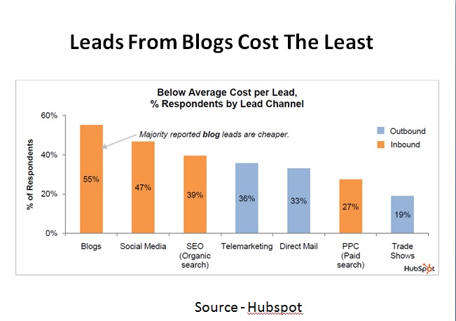
Other forms of inbound marketing – social media marketing, for example – can be very effective, too, but, ultimatel,y blogging is more cost-effective. In fact, a majority of content marketers who were surveyed reported that blog leads are cheaper than social media and SEO combined.
Through blogging, a company can establish trust with potential customers. I successfully grew several software companies with my partner Hiten Shah over the last decade through blogging. By blogging consistently, we’ve generated over 800,000,000 wallet-out leads, both to our own sites and to those of our clients.
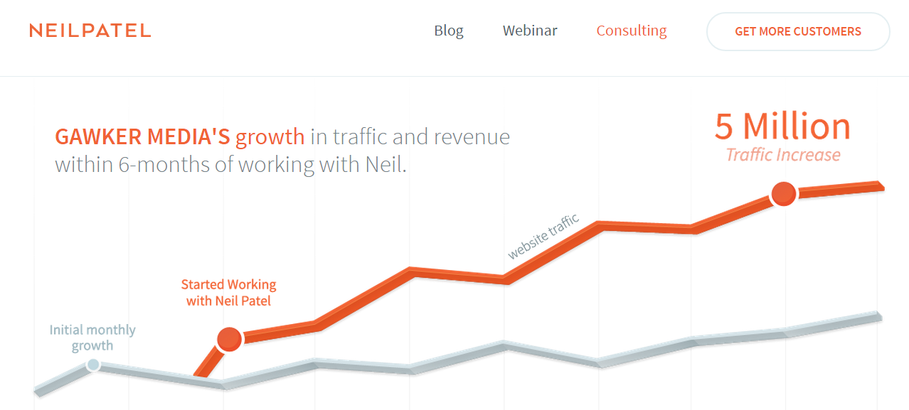
I’ve also worked with Gawker Media to grow its traffic to 5 million within 6 months. I’m not saying this to brag, but to help you understand just how powerful blogging is and what it can do for your own business.
Don’t make the mistake of hiding your blog link on your homepage. It’s so frustrating when you’re excited about a brand and eagerly visit its homepage – only to search in vain for a navigational link to the brand’s blog. If a user has to scroll to the footer section to find the blog link, you’re undoubtedly losing valuable leads.
Site visitors and customers should be able to find your blog easily on your homepage.
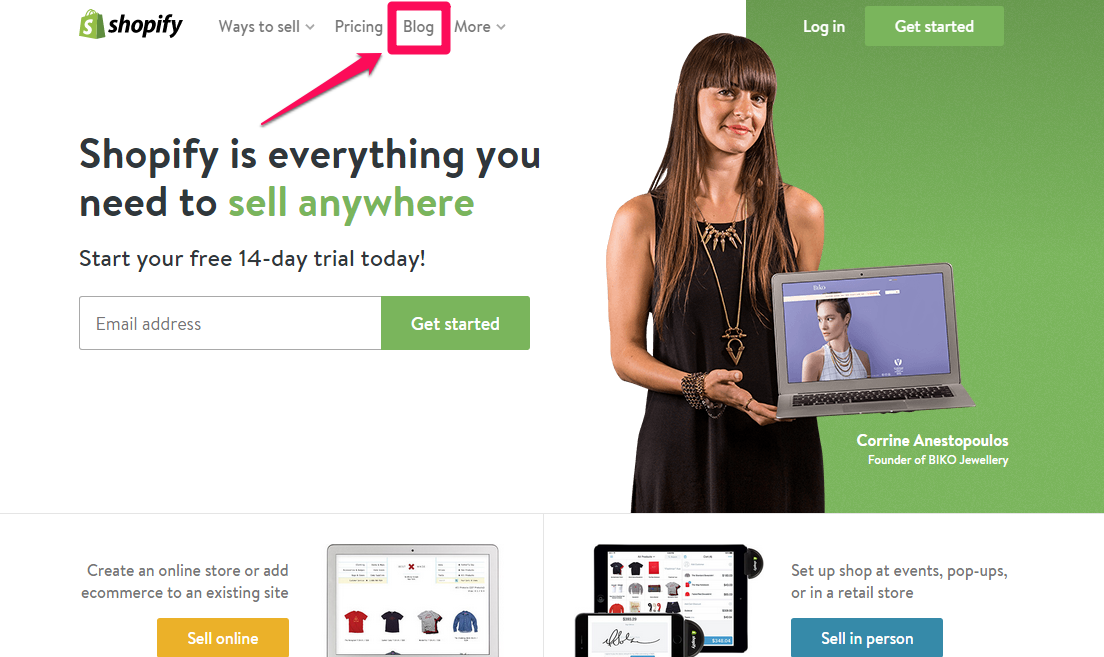
That’s one thing that differentiates Shopify from other SaaS companies – it puts a lot of emphasis on blogging. That’s because the company knows that blogging is a major factor in its success historische aktienkurse downloaden.
No matter what product you’re offering for sale, buyers have to make the decision to buy. On the internet, these buyers may have never heard of you before. Yet, even then your blog content can speak for you. If you invest in creating useful content, you’ll find potential customers taking the right actions, based on your blog articles alone.
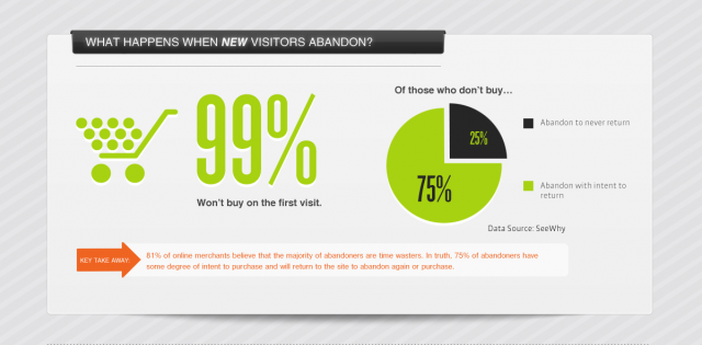
According to See Why, 99% of prospects won’t buy on their first visit to your site. 75% of them may intend to come back, but if you don’t have a blog where you publish useful and interesting content regularly, how do you nurture these people and give them a strong reason to come back for more?
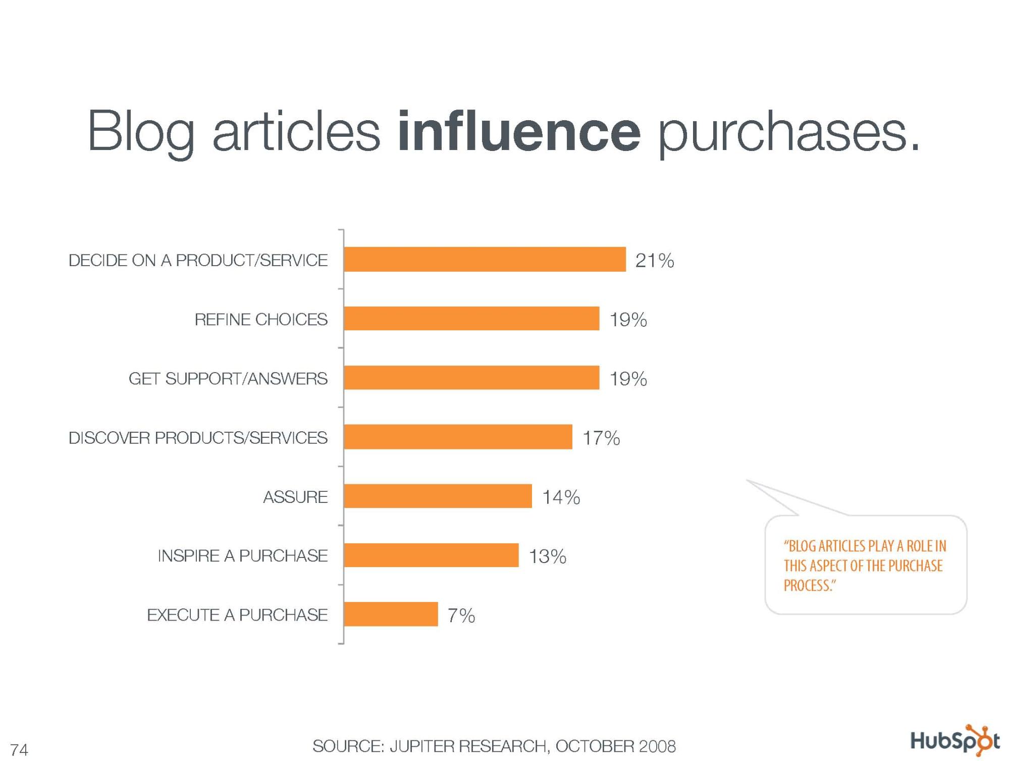
Blog articles can heavily influence many aspects of the purchasing decision. So give your blog the attention and focus it deserves.
Marcus Sheridan was once a drowning pool guy (pun intended). He owned a fiberglass swimming pool company that was struggling to attract clients and increase revenue.
When Marcus discovered the immense power of blogging, he embraced it. He began to create useful articles answering the questions that potential customers were asking. He also made sure that his blog was highly visible in the navigational menu bar.

Interestingly, Marcus researched and wrote a blog post that became so popular, it wound up generating $2 million in sales for the company. The blog post is titled “How Much Does a Fiberglass Pool Cost?”
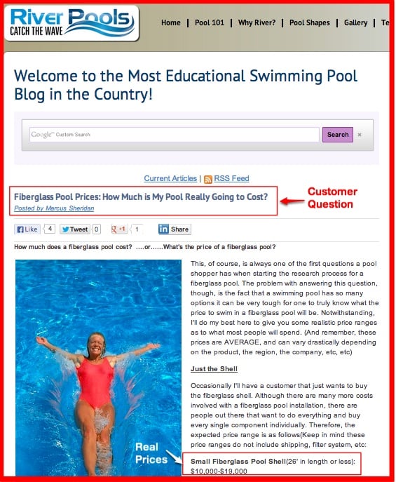
It may seem like a simple article, especially when compared to the 3000+-word articles I publish here. But, this article helped a lot of people. It answered their questions. And, ultimately, it helped them decide whether to get a fiberglass pool or not.
Writing an in-depth article can help search engines discover, index and rank your content page for several long-tail keywords, but that doesn’t mean you should put length first and quality second.
On the contrary, focus on giving people answers to their questions. Look at experts like Seth Godin. He’s a prolific writer with over 20 bestselling books. But, most of his viral blog posts aren’t more than 100 words. Here’s an example:
When you make your blog a priority, it means that you can get feedback from your customers. According to Seth Godin,
Taking feedback doesn’t have to be the same thing as resolving feedback.
Collecting feedback in the form of questions, complaints and suggestions is crucial to your business. You may not resolve all of those issues at once, but it’ll give you a direction to follow when you create your content.
In their book, Problogger: Secrets for Blogging Your Way To Six Figure Income, authors Darren Rowse and Chris Garrett said that the secret to building a strong brand online is not advertising, but rather community building through a blog schlümpfe video kostenlos downloaden.
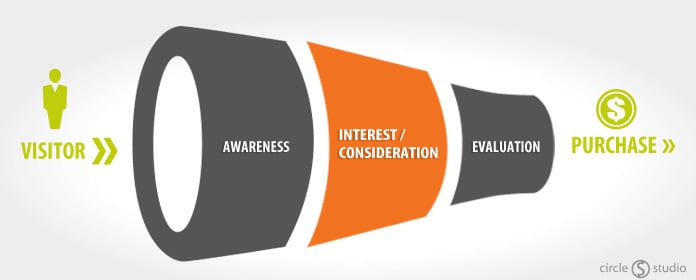
Blogging goes beyond writing. Your content has to be strategic, so that it can lead visitors into your funnel, make them aware of the problems/challenges they’re going through, build their interest, help them evaluate what they want and get them to buy.That’s the true essence of blogging.
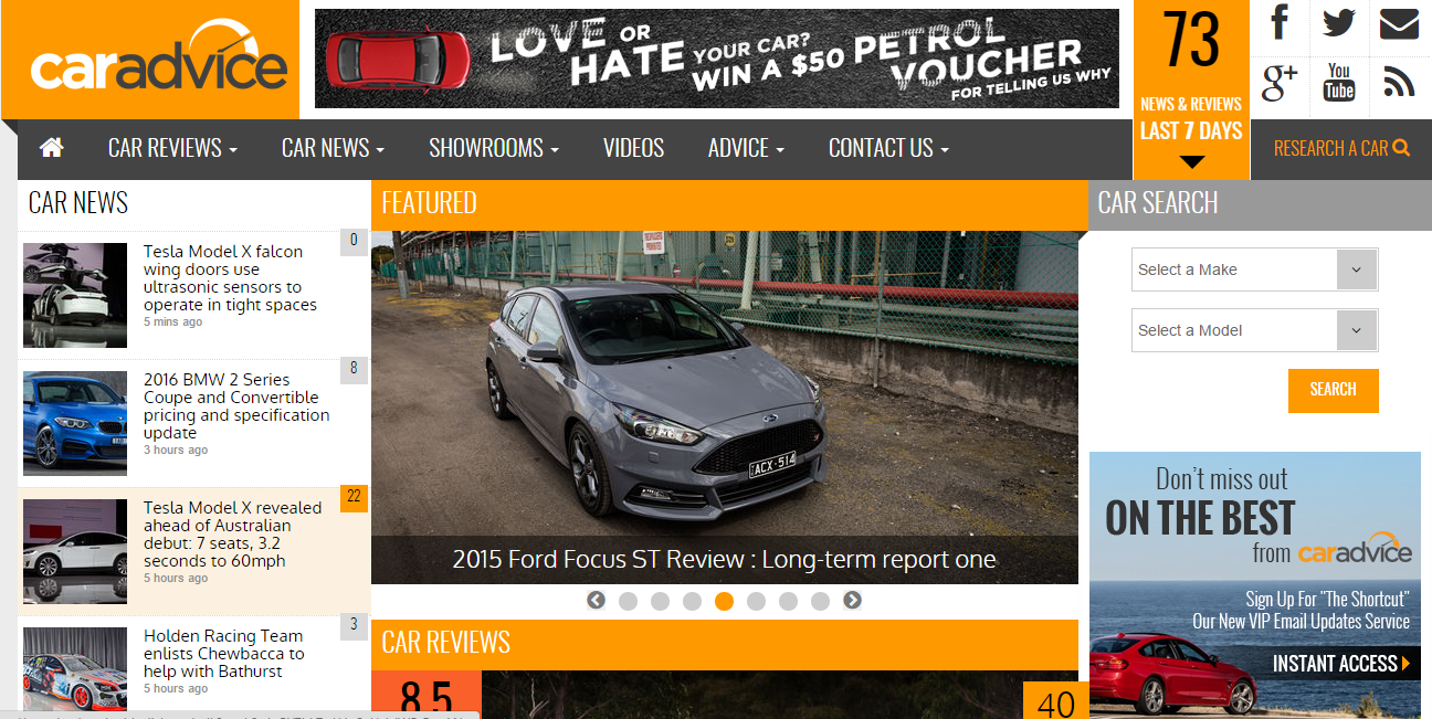
A lot of people have used blogging to build their businesses. For example, Alborz Fallah makes over $100,000 monthly from his Car Advice blog. He updates his blog on a daily basis. Over time, investors were drawn to his brand, resulting in sponsorship deals worth $30,000 per month.
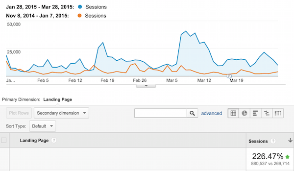
Canva, a graphic design software company, saw a 226% increase in site traffic by combining blogging, email outreach and social media.
Since 75% of internet users typically avoid paid search results, focus on blogging because that would earn you a spot in the organic listings easily.
If your homepage is static, like mine, then you’ve got to make your blog prominent.Don’t hide it in a single drop-down menu that your visitors will have to hunt to find.
Blogging experts such as Yaro Starak, David Risley, Brian Clark, Michael Stelzner, Pat Flynn and several others earn sizable incomes through blogging.
Do you know why their blogs receive thousands of visitors on a daily basis? Obviously, it’s because they have valuable content that’s updated regularly. But also, it’s because either their homepage is a blog or because they make their blogs highly visible on the homepage.
Mistake #5: Homepage That Loads Very Slowly
How fast is your site homepage? If your page is slow to load, it’ll hurt your conversions. Even Google recognizes site speed is important to users and is on a mission to make the web faster.
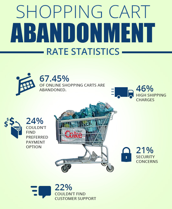
Recent statistics found that 51% of online shoppers in the U.S. say that site slowness is the core reason they’d abandon a purchase.
A study by Beta Out found that 67.45% of shopping carts end up abandoned, for one reason or another.
Does your site load quickly or is it as slow as a snail? Google is obsessed with site speed for one simple reason: because your users are, too. In truth, Google will always follow your user’s behavior, because users are the reason why search engines exist.
Google has made it clear that it’s using site speed as a web ranking factor – although it won’t weigh as much as the page’s relevance.
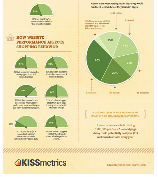
According to KISSmetrics, a delay of even a single second in a page’s load time can lead to a 7% reduction in conversions zoom mac herunterladen. What does that mean in concrete terms? Well, if an e-commerce site is bringing in $100,000 a day in sales, that 1-second delay could potentially cost the site $2.5 million in lost sales annually.
So, the bottom line is to make your site load up insanely fast and ensure that your content is relevant to your users.
So, how do you find out your homepage’s load time?
Follow these simple steps:
Step #1: Go to Pingdom Website Speed Test Tool. Plug in your site URL (e.g., mindtools.com) and click the “Test Now” button:
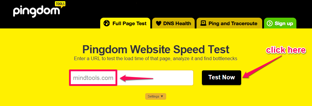
Step #2: Analyze your site load time. Although the tool checks the speed of your site, not just the homepage, this will still give you an idea about whether or not you need to work on your site speed.
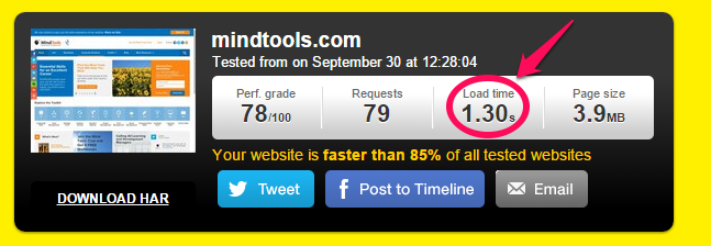
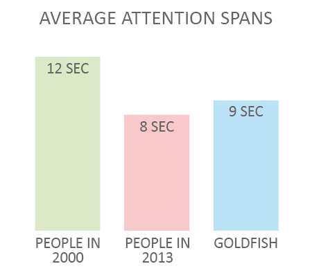
From the screenshot above, you can see that the load time for Mindtools.com is 1.30 seconds. This is great, because the average load time is 2 seconds. That’s important to know, because the average user’s attention span is 8 seconds – that’s 1 second less than that of a goldfish.
Do you know what slows a site down? According to Econsultancy, here are some of the more common offenders:
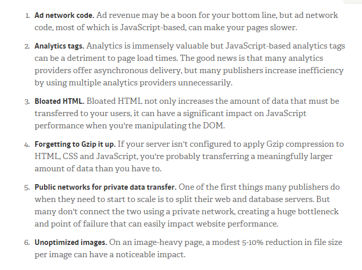
Once you’re able to fix these problems, your site speed should greatly improve and so will your revenue.
For example, a major young adult retailer had a conversion rate of 7% and a site load time of 6 seconds. By decreasing the load time to two seconds, the retailer increased its conversion rate to 8.3%, corresponding to nearly $3.5 million in sales.
It could be that your homepage isn’t converting visitors into buyers because it doesn’t load quickly. Consequently, potential customers click the back button without thinking.
If your homepage load time exceeds 2-3 seconds, use the resources below to improve it:
- How to Make Your Site Insanely Fast
- How to Improve Your Page Load Speed by 70.39% in 45 Minutes
- 11 Low-Hanging Fruits for Increasing Website Speed (and Conversions)
Mistake #6: Autoplay Audio or Video Content
Audio and video on your homepage can increase your conversions. If you want to stop telling weak stories and begin to influence buying decisions, podcasts or video marketing could help.
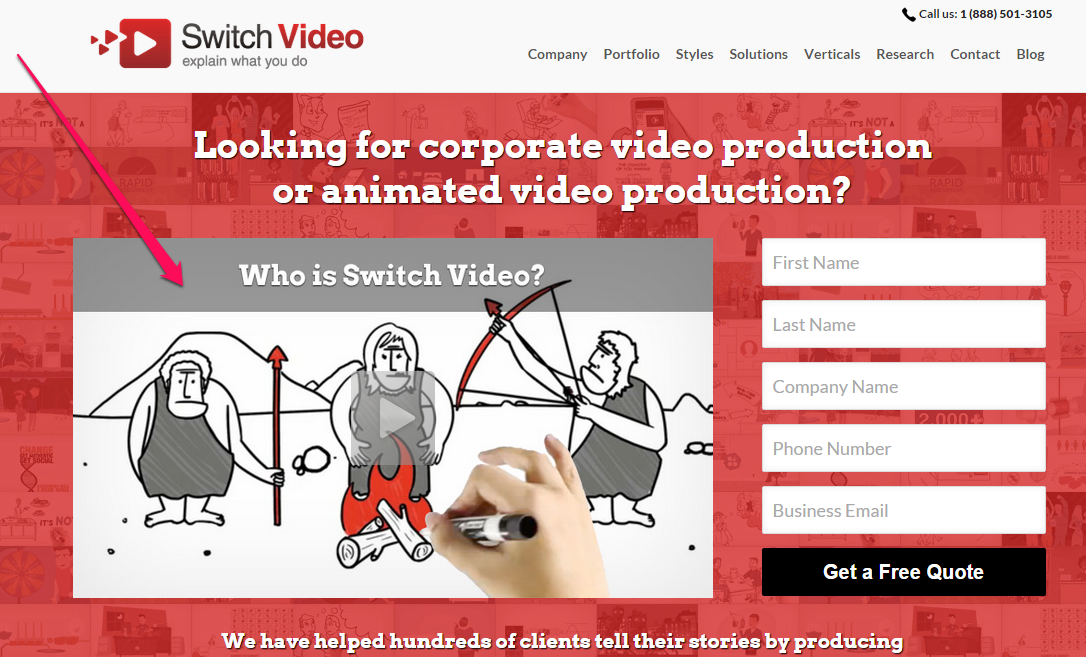
In this age of intense competition, you can use podcasts or videos on your homepage to create an even stronger impression on your users, the way Switch Video does. Take a look:
Podcasting, which is basically a recurring format of audio content, is growing rapidly and marketers are embracing it. According to Kapost, “a podcast is more like a TV show that offers a weekly reason for listeners to come back and allows hosts to break content up into key talking points to expand on throughout the show.”
Recent statistics tell us that while only 3% of marketers currently use podcasting in their marketing plans, over 30% have a desire to learn how to create podcasts. What’s more, 23% have plans to increase their podcasting efforts in the coming year. And, 17% of U.S. adults have listened to a podcast in the past month herunterladen.

But while video and audio are highly effective marketing tools, you’ve got to be careful how and where you use them.
Have you ever visited a homepage only to hear sound playing seemingly from nowhere? If so, then you know how distracting and even annoying this can be. If your user has loaded several tabs in their browser window, it can be a mad hunt to find which tab is responsible for the autoplaying video or audio file.
It annoys customers, because they hate it when decisions are made on their behalf. Your customers want to make decisions themselves. The choice of playing a video, audio or any media clip is theirs. That’s why autoplay audio or video can kill your conversions.
Podcast experts such as John Lee Dumas, James Shramko and others produce a lot of audio and video content. But, they make sure that if users want to see the video or listen to the audio, they have to click the play button.
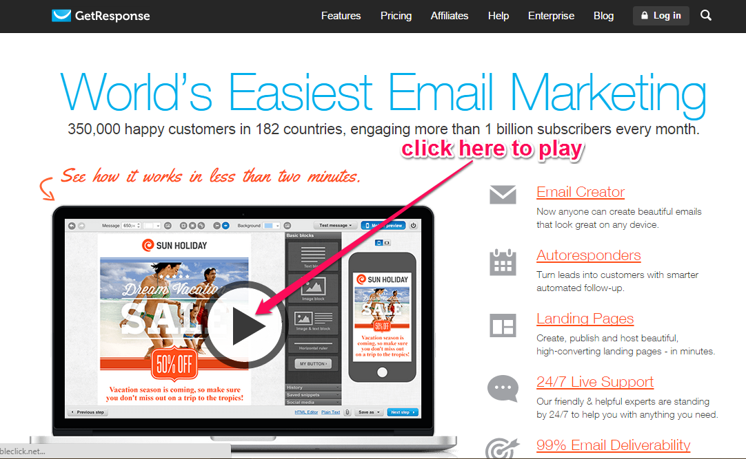
Getresponse uses an introductory video on its homepage, but it allows users to play it. There is no need to autoplay and annoy users.
Some people might argue that autoplay doesn’t annoy site visitors. Even if some visitors don’t mind, enough will that it’s simply not worth the risk.
YouTube has an autoplay feature as well. On the right side, you can set the Autoplay feature to “off” before you embed the video on your page.
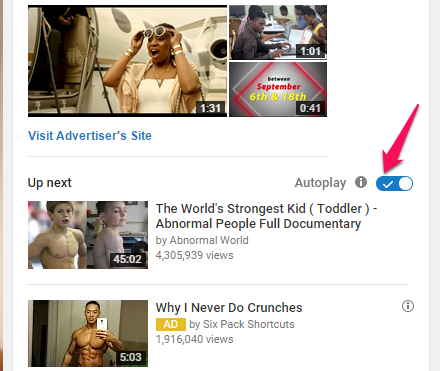
That also will take effect the next time you visit YouTube while you’re logged in to your account – the videos will no longer autoplay and you’ll have to click the play button.
Most marketers prefer to use video on their homepage, which means that you could stand out if you start using a podcast. Apple has surpassed 1 billion subscriptions for podcasts and that figure is only growing.
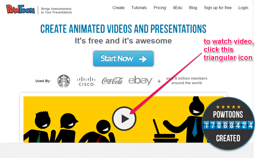
Sites like Powtoon use explanatory video on the homepages without enabling autoplay.
Bottom line: give users the control over the video they watch and the podcast (audio clip) they choose to listen to.
Mistake #7: Poorly Designed or Overlapping Navigation Elements
Your navigation is your user’s gateway to all of the important pages on your site.
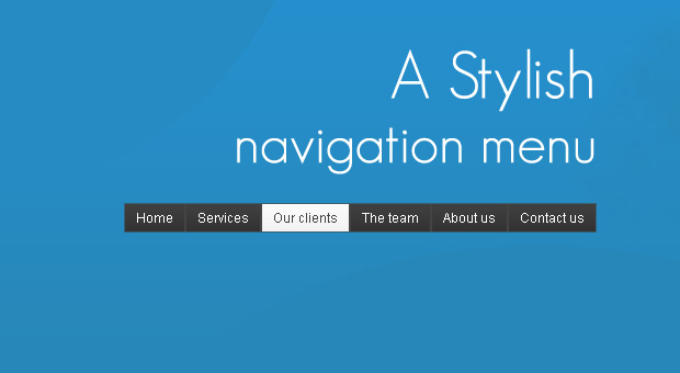
And, as a result, when you fail to optimize your navigation menu correctly, your conversion rate suffers. Even the most stylish navigation menu won’t help if it doesn’t appeal to the user.
Everything about your website is connected to and affected by the navigation.
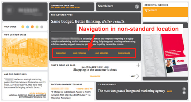
First and foremost, your visitors expect to find horizontal navigation across the top or vertical navigation down the left side. So, don’t put your navigation menu anywhere else. Non-standard locations may showcase your creativity, but they’ll frustrate and annoy your users.
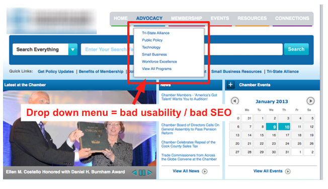
Drop-down menus are also annoying, according to usability studies from NN Group. The reason why most people hate drop-down menus is because they’re typically designed for the site owner’s convenience, rather than user experience office kostenlos downloaden vollversion deutsch.
Keep user psychology and behavior in mind when you’re creating your site’s navigation and layout. You might expect your users will move the mouse more than they move their eyes. But, in reality, it’s the other way around – users move the eye more than the mouse.
An overlapping navigation menu simply means any navigation menu that interferes with your content. A drop-down menu obscures your content, which is why you should avoid it if you want to make the right impact and boost your conversions.
Amazon, Ebay and other top shopping brands may have tons of items on their navigation menus, but you shouldn’t. They can survive because most people already trust those brands. No matter how awkward or overwhelming their navigation options might be, consumers will continue to use them.
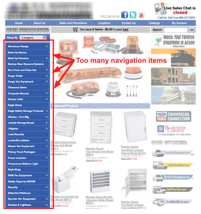
As with so much that we’ve already discussed, there’s no single hard-and-fast rule about the size and scope of your navigation menu. However, a good rule of thumb is to restrict your menu to 4 – 6 items. This usually converts fairly well for most sites and blogs.
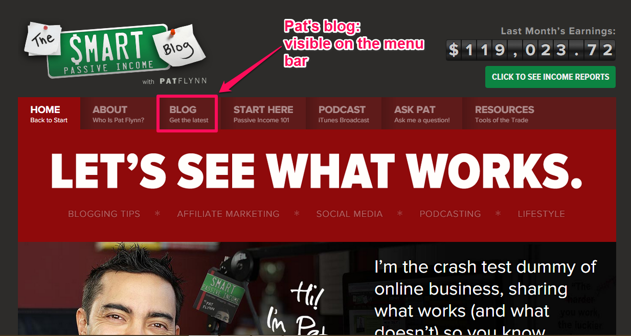
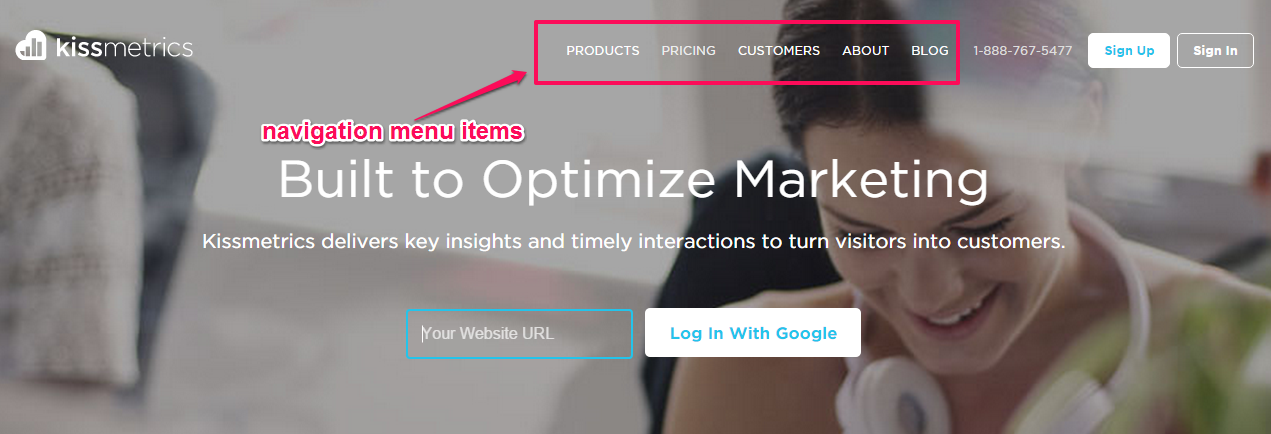
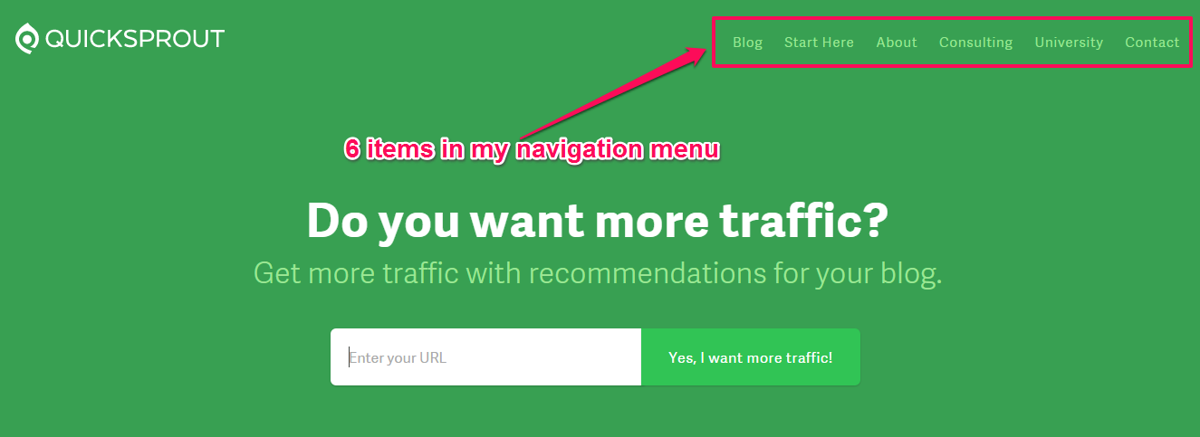
Whenever you remove an item from your navigation bar, the remaining items become more prominent and you’ll reduce the risk of overlap with your content. I have 5 items on my navigation menu bar. Take a look:
On my authority blog, I allowed 6 items on my navigation menu bar. One of the reasons why is because I want to emphasize the QuickSprout University and consulting service pages. Otherwise, I would remove both items, making the rest more visible.
My favorite navigation menu is the one on Social Triggers. Derek Halpern is a highly skilled blogger who runs a 6-figure software company that helps internet marketers create and launch an online course.
Looking at his navigation menu items, you’ll notice that he included only the 2 most important items: Blog and About pages. Other menu items, such as contact and careers pages, are hidden inside the “menu” tab.

Derek understands the power of blogging. He makes his blog prominent on the homepage. The reality is that he doesn’t want new visitors to do anything other than to subscribe to his email list, get to know him or read his blog.
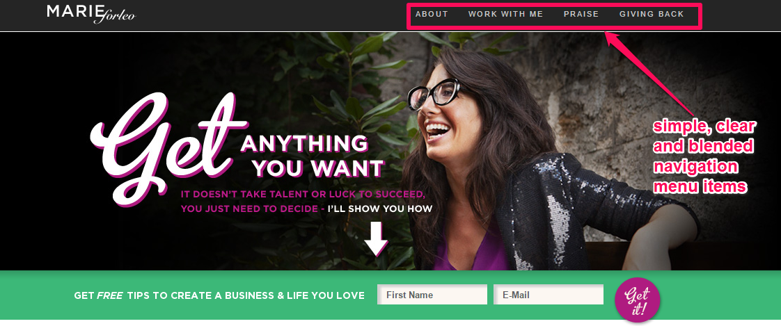
In addition to limiting the number of menu items, your navigation should also be clear, simple and blended well with your template or WordPress theme. A perfect example of a professional navigation menu with all these characteristics is Marieforleo.com:
Note that the order of your menu items matters. For visibility and a higher click-through rate, you should put your most important items at the beginning of the navigation and the least important items following thereafter.
“Contact” and “Careers” probably should be the last items on the list – not because they’re unimportant, but because new visitors to your site may not want to contact you or apply for a job right off the bat herunterladen.
So, put the least important items at the far right in top-level horizontal navigation.
Conclusion
In order to increase your conversion rate, then you must split test your homepage elements such as headlines, call-to-action, subtitles, videos, navigation menu, etc.
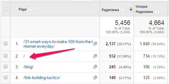
If you study your Google Analytics properly, you’ll notice that your homepage receives more traffic than other pages. It’s true for QuickSprout.com and NeilPatel.com – it’s true for just about every site.
This means that you should pay more attention to your homepage optimization.
An effective marketing campaign is one that puts the user’s needs at the forefront and proves you can meet those needs.
Your homepage must be designed for the user, not for aesthetics. When users come to your site, they may have been enticed by your design, but if they don’t find what they need and want, they’ll leave.
For Google, user experience (satisfaction) is the #1 ranking factor. If your site can provide a top notch experience for the users, no matter how they came to your site (SEO, referral, social media, advertising, etc.), you’ll begin to see a rise in organic traffic, an increase in sales and growth in your customer base.
So where do you go from here? Simple: design your homepage for the user and consistently create useful and interesting content that will address their needs and nurture a relationship.
Which of these homepage mistakes have you made in the past? Did you notice a drop in your conversion rate?