7 Ways to Increase Your Form Field Conversion Rate (by Up to 672%)
Pop quiz: How do you generate leads?
Answer: By placing a high-converting lead generation form in a landing page.
From there, you begin to nurture the leads—persuading them to buy your product. A SalesForce study found that “companies that excel at lead nurturing generate 50 percent more sales-ready leads at 33 percent lower cost.”
The gateway between your site and the visitor is the lead generation form. As you already know, a form that’s placed on a landing page with offers visitors can’t resist always performs well.
But how do you ensure that your lead generation form is optimized for the user?
That’s a big challenge for Internet marketers. According to the B2B Technology Marketing Community, “61 percent of B2B marketers struggle to generate high quality leads.”
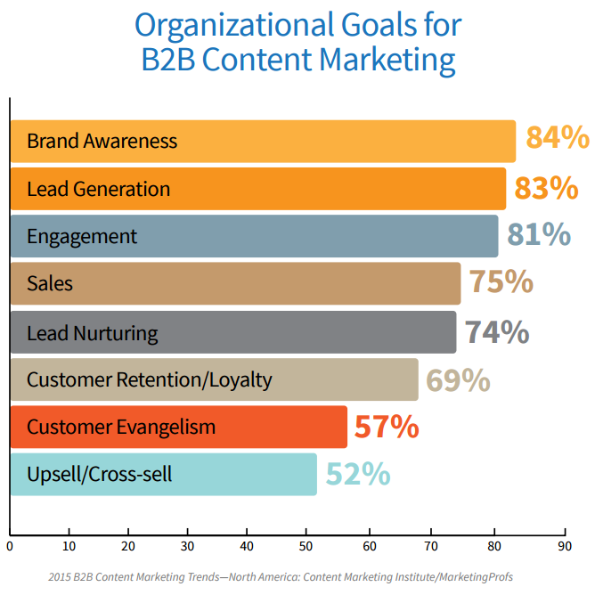
This is the second most important goal of B2B companies: to generate leads. B2B companies are using several strategies to achieve this. But no matter the strategy, a lead form is required.
So let’s dive in and learn how to optimize a lead generation form, so that you can capture the majority of visitors to your site. Follow the steps below and you may see a 672% life like I did.
Download this cheat sheet of 7 ways to increase your form field conversion rate.
1. Place the form above the fold
Everything we do on a landing page is to increase engagement and to get the right people to trust us. It’s about influence.
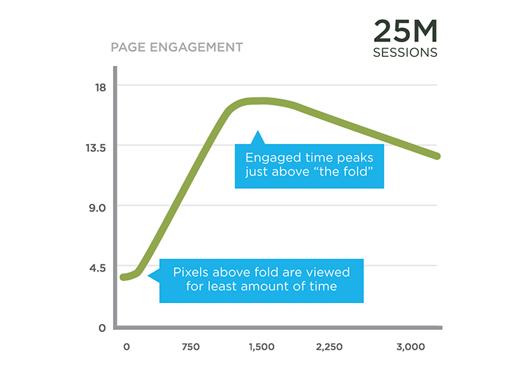
Engaged time usually peaks above-the-fold. So, placing important elements such as forms, CTA, etc., in this initial real estate will get maximum exposure where you want it. Engagement is initiated above-the-fold—while below-the-fold builds on it.
When it comes to optimizing a lead generation form, most people know that placing the form above-the-fold usually yields results because the placement instantly draws your visitors’ attention to your CTA. This in turn leads to great conversions.
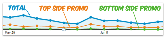
Ben Hunt got 876 clicks on the top promotion when he placed call-to-actions on his sidebar above-the-fold.
There are instances where placing your form and CTA above-the-fold is necessary
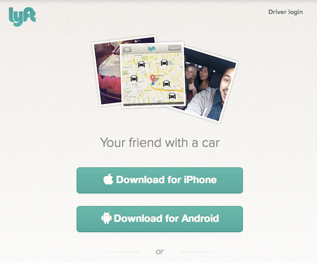
For example, if your product is a simple software or app, you would use a compelling headline, minimal but persuasive copy, a preview on how the software works and a CTA button. Check out this landing page created by Lyft below:
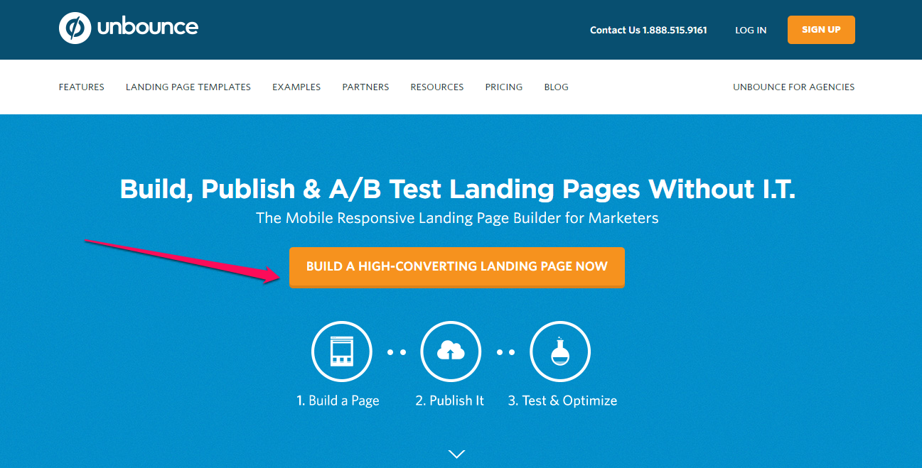
Unbounce saw a 41 percent increase in conversions by placing the CTA button next to the various plans they offer. Unbounce’s homepage includes a CTA button that redirects to the form above-the-fold.
The prospect sees the information above-the-fold before they scroll down. What appears in this space will always influence user experience.
In this technological age, we have lots of devices and platforms for accessing web pages. Consequently, screen sizes are constantly changing. Users want a great experience whether they visit your landing page with their iPhone, iPad, Samsung Tab or PC.
A study by Nielsen Group found that regardless of screen size, the average difference in how users treat info above- vs visioen mac. below-the-fold is 84 percent.
It all boils down to user behavior. How people interact with your site depends on the structure of your fold. Because the fold still exists: the top, middle and below folds hold your information and each should be tested.
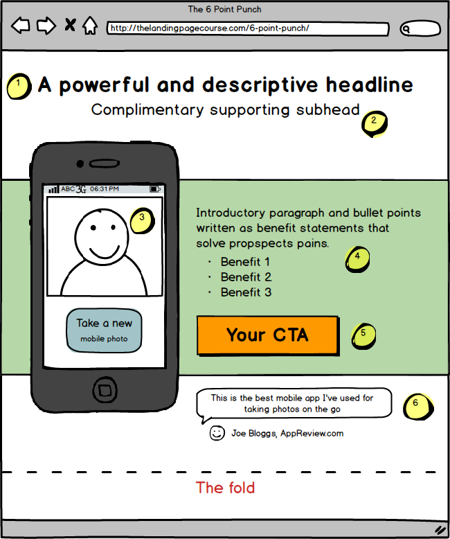
With the lead generation form and CTA above-the-fold, you have little convincing to do and little risk for the prospect. Once you can follow this 6-point punch in designing your landing page, the above-the-fold approach will work.
Split testing is the only effective way to determine whether above- or below-the-fold will perform better.
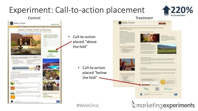
I’ve seen cases where placing the form and CTA below-the-fold generated better results. In one case, below-the-fold delivered a 220% uptick in the conversion rate.
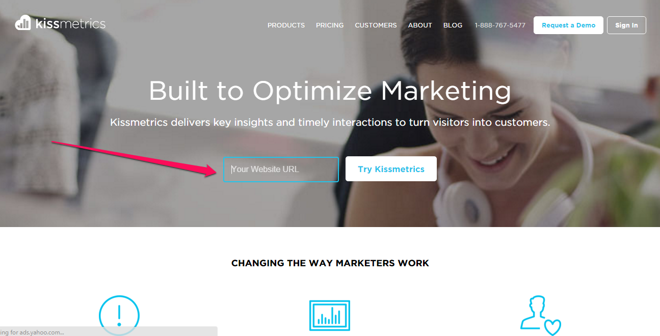
Top brands include calls-to-action above-the-fold of their landing pages. For example, KISSmetrics and CrazyEgg follow this pattern; they engage above-the-fold for maximum impact.
2. Ensure you have a strong call-to-action
It still surprises me: 72% of B2B marketers don’t have any calls-to-action on their interior pages.
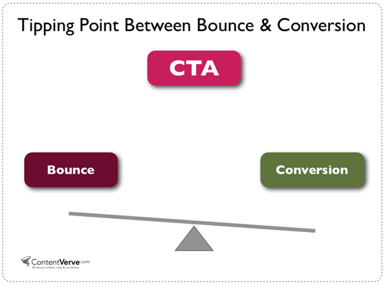
If you do have a CTA, it must be strong and catchy. The call-to-action is the tipping point between conversions and bounce. In other words, any step you take will either convert your visitors or send them away.
You need a strong call-to-action if you don’t want to face the challenge of chronically generating new leads.
This study found that 61% of B2B marketers identified generating high-quality leads as their biggest lead generation challenge. People fail to optimize the CTA for many reasons. But you should learn how pro copywriters do it.
A strong CTA compels people to click on it. It leaves a memory in the user’s mind even when they’ve exiting the landing page.
You’ll find a perfect CTA example that pulls you in and instantly shows you immense value, in Brian Dean’s landing page.

Although Brian uses a single word, “DOWNLOAD,” in his CTA copy, it’s clear and specific. There’s nothing else to expect the moment you input your email address but the e-book.
Another example of a strong CTA can be found at Videofruit.com. This is actually a redesign from Ryan’s old home landing page. But this time, the call-to-action copy, “Start Class Now,” tells you exactly what you’ll get.

The CTA copy is as important as the color, placement and shape of your call-to-action buttons herunterladen. Looking at these two buttons. Which one would you click on?

That’s exactly the same situation prospects usually find themselves in when they land on a page with too many buttons. You have to be clear on what your offer is about—and the copy has to show it.
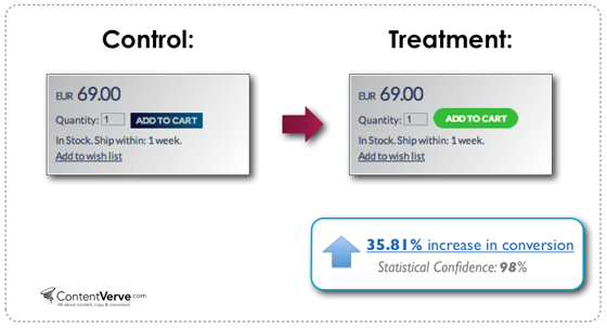
Let’s see a real world example:
A major European e-commerce site that sells hand-crafted porcelain increased sales via product pages by 35.81 percent. All they did was change the color and shape of the CTA from blue to green.
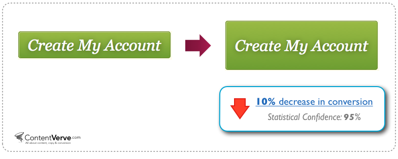
The most important lesson you will ever learn is that there is no “ultimate button” that works in every case. The truth is that call-to-action buttons come in different sizes, colors, and shapes.
In one instance, a company made their CTA button bigger and saw a 10.56 percent DECREASE in conversion.
A tweak in the copy will affect conversions, too.
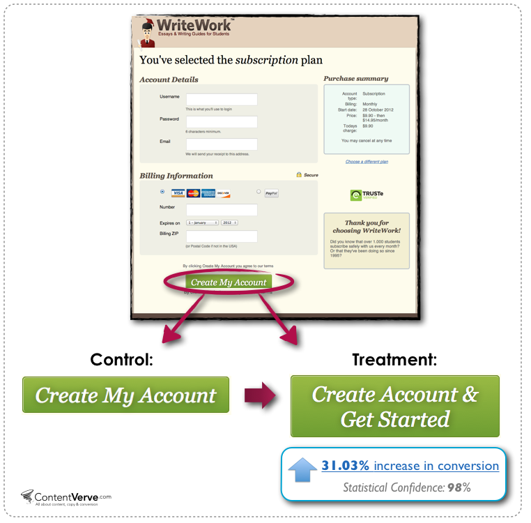
For example, Content Verve ran a test on the WriteWork.com payment page. They tweaked the landing page and added the command, “Get started.”
This increased conversion by 31.03 percent. And because this is the last phase in the conversion funnel, these conversions were money in the bank.
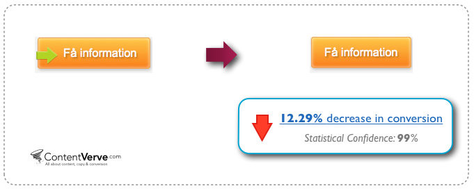
Interestingly, just by removing a green arrow that’s acting as directional cue from the orange button, a B2B website saw a 12.29 percent decrease in conversions.
3. Include your privacy policy to remove all doubts
I’m not talking about too-good-to-be-true privacy statements. Prospects aren’t fools and they can tell immediately what the marketer has in mind. Of course, ignoring the privacy policy in this case will get you a better result.
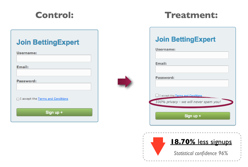
But that doesn’t mean you should totally forget about users’ privacy. Beyond getting higher conversions, you want this for the sake of transparency.
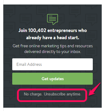
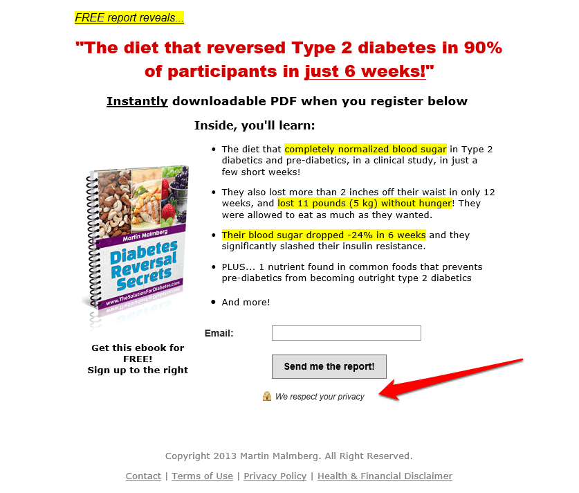
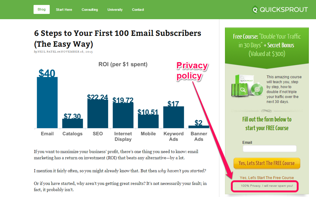
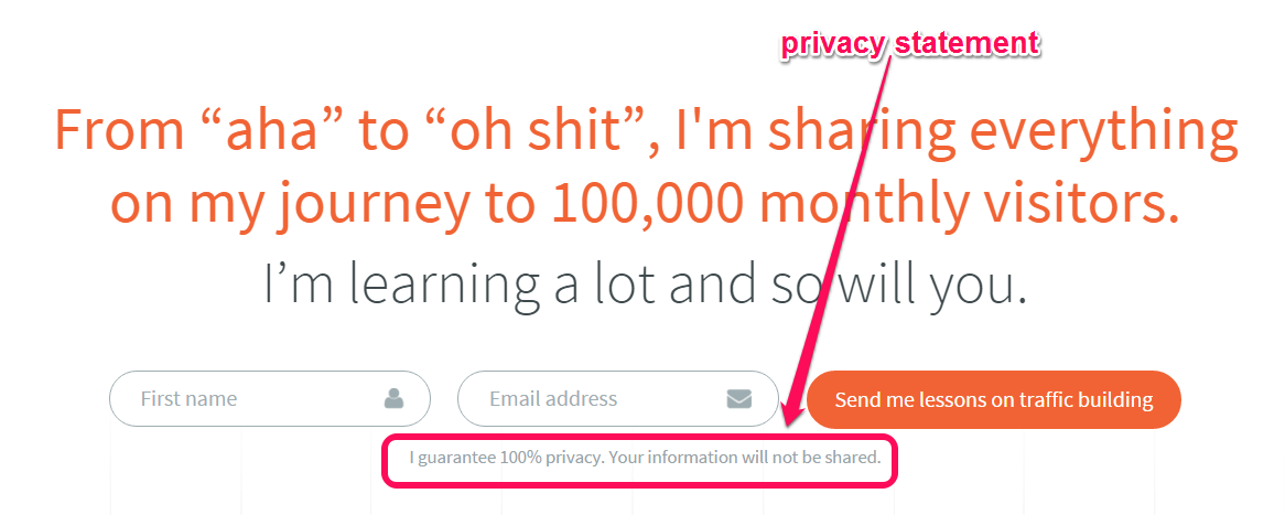
You can be creative, though, in your privacy statement. Instead of using the typical “100% privacy—we’ll never spam you,” that’s become a cliché, you can make the phrase relevant to your offer.
Admit it: you like Shopify’s privacy statement.
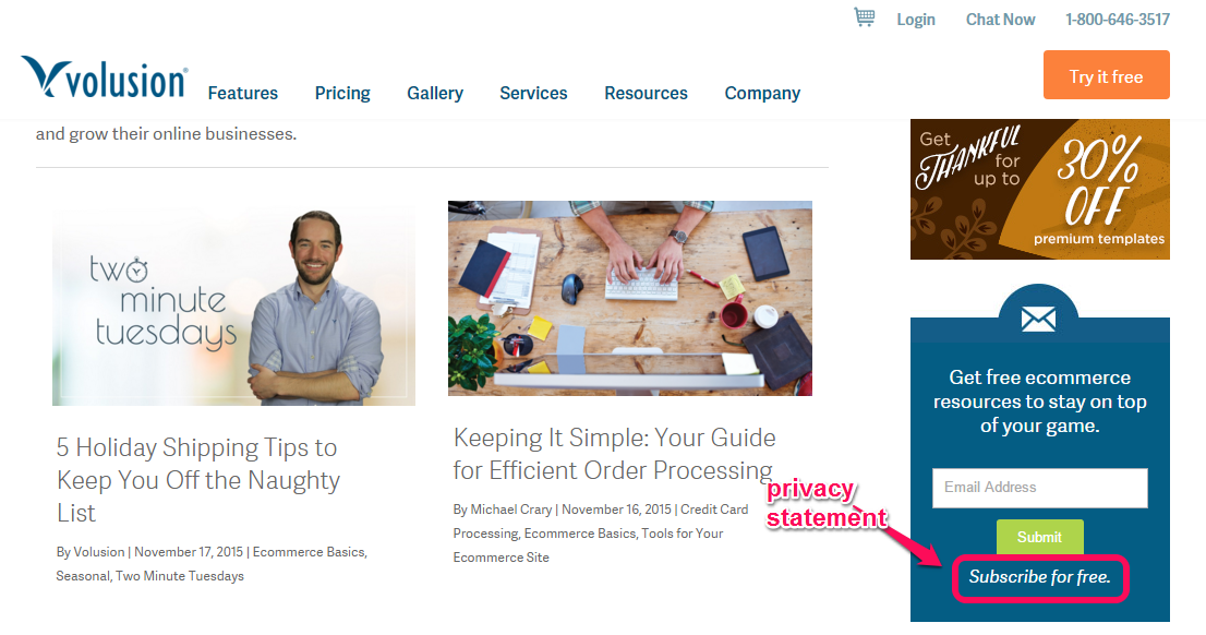
Volusion, an ecommerce shopping cart solution, also follows the same trend when declaring their privacy policy. They didn’t use the typical verbiage, but got creative. Take a look:
More than likely, we fail to optimize call-to-actions for many reasons. These reasons are irrelevant, though, because the needed changes are minor, but the impact can be significant.
Do you include privacy statements in your form and CTA? Prospects are becoming smarter and know that most privacy statements don’t live up to what they promised. But including a simple privacy statement wouldn’t hurt elterngeldantrag sachsen herunterladen.
If prospects don’t trust you, they won’t convert. Sure, you may have good intentions, but it doesn’t count unless people develop a level of trust in you.
To a large extent, you need to convince people to give you their personal information, because while to them it may be a small step, to your business it’s big.
Generally, you want to avoid footer links, because it’ll take attention away from the form, but retain the privacy policy. I use my privacy statement on the lead generation form.
I also included a privacy statement on my personal blog lead generation form.
Privacy policies are essential for legal reasons. But beyond that, it’ll help you to be transparent as you connect with site visitors and build trust with them. Even if you don’t collect delicate information from users, you should include a privacy statement and operate your business by it.
Your site visitors and prospects may not know how trustworthy you are until you assure them that their information is safe.
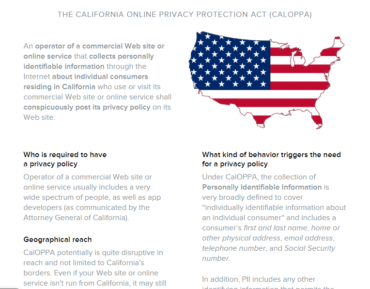
The California Online Privacy Protection Act (CALOPPA) makes it clear that if you collect personal identifiable information from a commercial website or online service you run, you need to post your privacy statement for everyone to see.
4. Minimize friction in and around the form
The advice, “use power words to persuade people to subscribe to your list,” isn’t always the right approach for optimizing lead generation forms, even if it often works.
More than likely, the form isn’t the problem, but the events that happen around it are.
At the heart of every landing page, the lead generation form stands out. If you put too many elements around the form, you’ll probably lower conversions.
“Friction” simply means conflict or resistance that one surface encounters when moving over another.
Truly, so many different things happen on a landing page simultaneously. The visitor will be making judgments on whether or not the offer is right for them, the words are persuasive and the design is there to help build strong interest.
A lot of friction—different elements of a landing page conflicting against each other at the same time.
When you make it easier for people to make the right decisions, you’ll get more clicks on your call-to-action button.
You can send prospects to your landing page and still see them do nothing because of friction. If you don’t want that to happen, here are things that you can do in order to minimize friction in and around your form:
i) Allow white spaces: Most marketers work hard on their sites (especially their homepage and blog), but still aren’t satisfied with the results.
Working too hard and seeing no results is the worst feeling ever, considering that 33% of small business owners work 40–49 hours per week herunterladen.
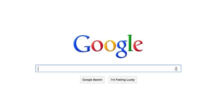
That said, if you want to avoid wasting time and increase lead generation form conversions, allow plenty of white space. Google does it well:
You want your form to draw people in, get them excited and incite them to click. White space allows for scannability and readability.
It’s difficult to engage people with content on a busy background. It’s little wonder authority sites use white backgrounds and leave white space around their lead generation forms.
Speaking of readability, lab research conducted by Wichita State University showed that white space helps people to read and understand, though it may decrease reading speed.
Carla Rose noted that white space guides your eyes from one point to another on a page. It helps users navigate the page.
This means that if you want users to fill a form, and click a call-to-action button, plenty of white space will reduce their hesitation. The friction that usually stands between the customer and the form will be removed.
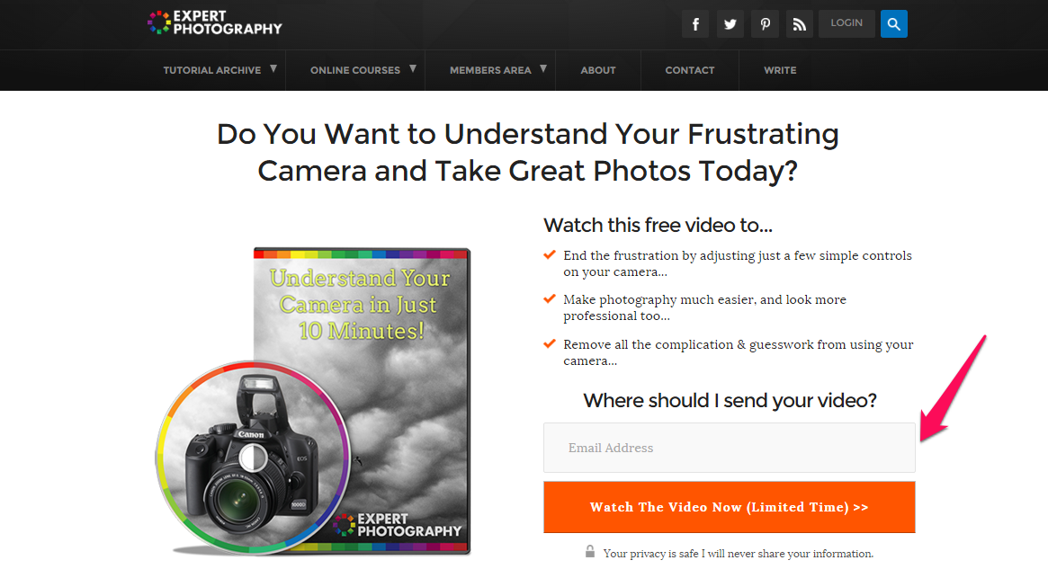
Not too long ago, ExpertPhotography.com redesigned its homepage, placing more emphasis on the form.
But this time, they used a white background and also used a bright attention-grabbing color for the call-to-action button, while leaving lots of white space.
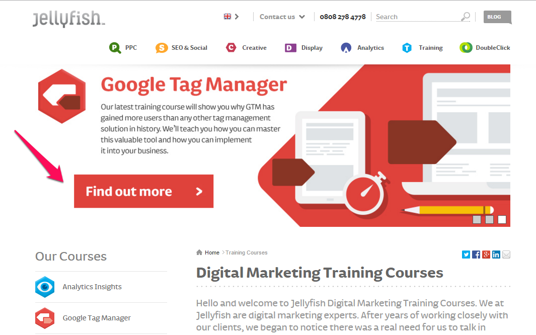
Jellyfish.co.uk, a UK-based marketing training agency, understands the psychology behind white space in web design. They allow a fair amount of white spaces around their form, thus redirecting people’s attention to the form–and nothing else.
It’s essential to leave white space around your lead generation form. This will not only lead to more clicks on your button, but will also enhance how prospects/customers perceive your offer and brand.
ii) Make some form fields optional: When it comes to form fields, less is definitely more.
Content that converts uses only the right words, right sentences and right formats. When you choose your words wisely, you’ll generate leads. After all, 86 percent of B2B marketers use content marketing for lead generation.

To be on the safe side, make some form fields optional. Less motivated leads who otherwise would never fill out your lead generation form might find this suitable, because you’re making it easy for them.
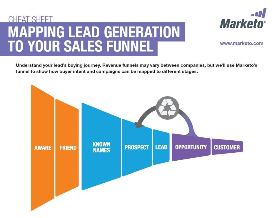
As prospects navigate your sales funnel, they’ll move from being aware to discovering new opportunities that will benefit them.
From personal experience, I’ve learned that a long form presents a large amount of friction giphy gif. People perceive that you’re asking too much–and, like I said earlier, those who are not very motivated or don’t trust you enough will click the [x] button on their browser and switch to another site.
Making some form fields optional at least shows the prospects that they’re not under a strict obligation to fill out everything. They just have to make decisions on what to do, especially after filling in the required fields.
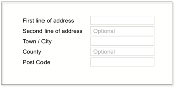
One important point, though: always label optional fields, not required ones. This is a must if you have both required and optional fields on your form. Most web designers and marketers use red asterisks to mark the required fields:
On the other hand, you should mark optional fields accordingly. Most form builders allow you to have the word “optional” inside the form, like this:
It gives them an advantage, because they know that you’re not asking them to fill all the forms before they can receive your offer or get involved with what you do.
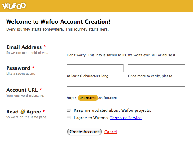
iii) Use a two-step process: Creativity is required if you want to capture most of your site visitors.
When new people visit your landing page, they don’t trust you enough yet to give away their personal information. You need their permission first.

But you can use a two-step process. Start by requesting the basic information in that first step. You could request the first name only. Then, in the second step, request their email address, phone number, etc.
It’ll be hard for the person to say no, because they’ve already crossed the first hurdle and are just looking forward to the offer.
Better yet, in the first step, request the email address only. If the prospects are not able to provide the required information in step two, you already have their email address to follow up.
When you follow up, you deliver useful content as you lead them through the buying cycle.
By the time they get to the purchase decision phase, you’ll have proven your value. They’ll be more motivated to provide the necessary information.
iv) Sync the surrounding text/image with the form: If you need to accelerate your lead generation form conversion rate, you have to sync the text and images that appear around the form.
If you have a product image, make sure that it doesn’t overlap with the form and call-to-action. The synergy between the text, images and form needs to be obvious.
Of course, you need to leave white space, because this extra space is what will give life to those elements around your form.
The copy has to be relevant, useful, and in synergy with the form. A perfect example is Copyblogger’s:
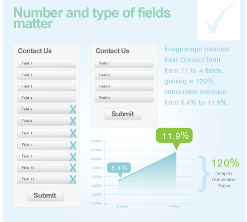
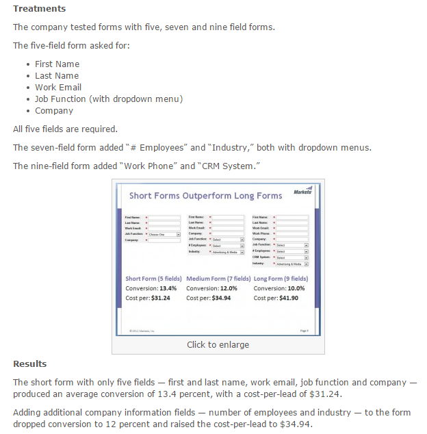
5 amazon probe herunterladen kaufen. Include the right number of fields, remove unnecessary fields
We have different forms on our pages. I used to think very little of them until I boosted my conversion rate on NeilPatel.com by 26 percent just by removing one form field.
ImageScape reduced its contact form from 11 to 4 fields, and increased its conversion rate by 120%.
According to the 2012 MarketingSherpa Lead Generation Benchmark Report, email is the most important form field, across different industry sectors.
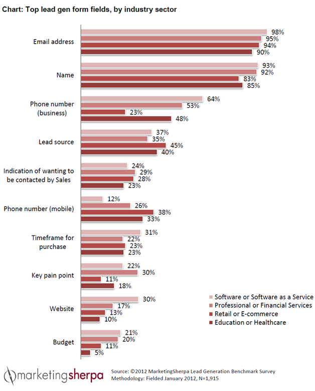
Does “residential address” apply when you’re collecting leads? Well, it depends on what business model you’re in.
For digital marketing, it’s not necessary. What counts is the email address, If you can get their phone number, that would be awesome (for cold calling).
When I drove 518,399 visitors to my landing pages, I converted 16,394 into leads from 77 webinars. This was partly due to the way we optimized the webinar landing page form and call-to-action.
In many things, being simple wins over complicated or complex things. “Simple can be harder than complex: You have to work hard to get your thinking clean to make it simple.”

Do you know that if you take away one thing from your form, it can significantly increase your conversion rate?
To prove this point, Dan Zarrella at HubSpot recently researched the contact forms of 40,000 of their customers and found that conversions increased by almost half when the number of form fields are reduced (from 4 to 3).
Study your form today. It doesn’t matter where you have it- on the landing page, squeeze page, homepage, about page, contact form or someplace else. Ask yourself this question: what should stay and what must leave?
Remember, though, that testing the position of your form fields is just as important as the information you’re requesting. You’ll see results the moment you start to request only the necessary information using fewer form fields.
Several studies show that requesting phone numbers decreases conversions. Chris Hofmann, Director of Marketing at The University of Wisconsin-Extension conducted some research and found that requesting a phone number on a given form field was hurting conversion rates.
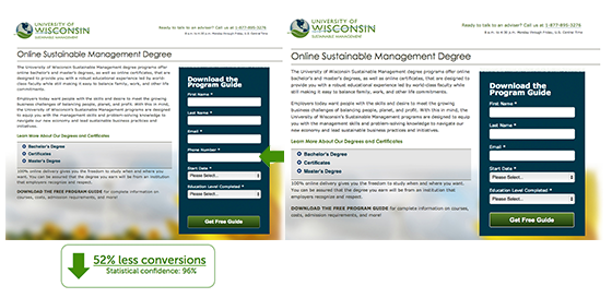
In 24 hours Chris measured and reported a 52% drop in conversion with a 96% confidence rate, when a phone number was required on the landing page form field.
In line with the study above, MECLABS decided to test it out, too. They moved the phone number field from the first step to the second on a landing page and conversion rates on their form increased by 68 percent.
Collecting leads from your site is important insta pb hd herunterladen. And you can achieve it by placing lead generation forms on important pages: homepage, about page, contact page, resource pages, etc.
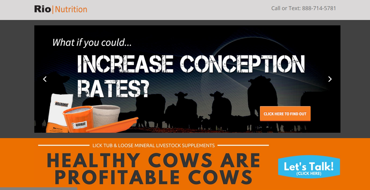
Rio Nutrition generated 6x more quality leads in one month using Formstack. But more than that, they placed the forms at strategic locations on their high converting landing pages and saw results.
6. Split test to determine the best lead-generation CTA positioning
According to DMNews, the three most common lead generation strategies are: email marketing (78%), event marketing (73%) and content marketing (67%).
However, when you’re generating leads through any of these strategies, you have to ensure that your call-to-action is well positioned.
You do this via split testing.
One good test is worth a thousand expert opinions.
–Wernher von Braun
Question: Where on your web page should you place your lead generation form?
Answer: There is no single right or wrong answer.
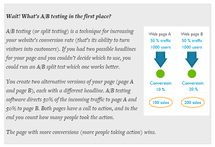
Let’s start by defining A/B testing.
When it comes to form positioning, expertise, experience and intuition are important tools that you can leverage. But they’re not good reasons to ignore split testing.
The only way to unarguably tell whether placing your lead generation forms and CTA above-the-fold, right or left side or beneath the copy is to test it out.
A simple tweak on your form field length can make a big difference. For example, Marketo conducted a test on form field length. At the end of the experiment, they had reduced their cost per lead by $10.66.
When split testing your form placement, you have to ensure that other elements of a landing page have been taken care of. Your headline has to be compelling. The bullet points, images and copy should be persuasive.
Let’s audit an iPhone app development landing page.
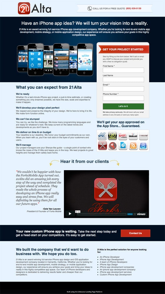
Here are the elements that stood out in the landing page (screenshot) above:
i) Clear and compelling headline: Brian Clark, founder of Copyblogger, said that 8 out of 10 people will read your headline and a poor headline will render your content useless. 5x as many people read the headline as the body copy.
Without a headline that nudges people to read the rest of your copy, your landing page may not convert well. If you’re not sure about your headline, you should split test two or more headlines together.
Looking at the landing page above, you can see that the headline, “Have an iPhone app idea? We’ll turn your vision into a reality” is clear, useful and relevant to the target audience.
ii) Catchy form title: Since the lead generation form is the focus, you have to give it a title that will draw people in.
Equally important, the title has to be relevant to the offer itself—and not just a piece of a sentence that doesn’t appeal to the ideal customer mouse pointer.
A form title should inspire you to take action, at least to supply the required information.
The title above the form, “GET YOUR PROJECT STARTED,” is exactly what the audience wants. They want to get their iPhone app designed as quickly as possible.
iii) Strong benefits: Although the benefits aren’t presented using bullet points, they still stood out because the headings were bolded and brief descriptions were given.
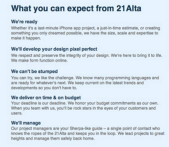
In copywriting, the bullet points simplify the features and benefits of a product, an offer or course.
Highlighting the benefits of your product (preferably, using bullet points) will provide emotional appeal for the readers.
iv) Client testimonial video and guarantee: You can increase conversions right now by using client testimonials and a guarantee.
The landing page above uses these emotional tools to improve perceived value and build greater trust with their future customers.
The best approach is to place your form where it complements the decision-making process of your prospects.
Though placing forms above the header is a common practice, you can’t be certain that it would work in your own case until you test it.
The optimal placement of your form is dependent on your offer, the timing and how motivated your visitors are.
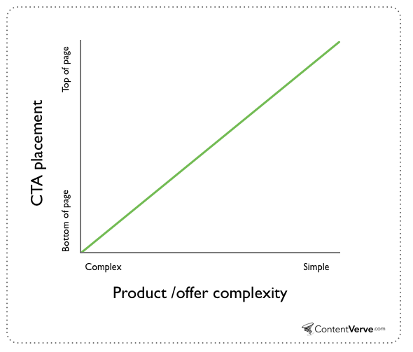
As a rule of thumb, if your offer is complex and the prospects need to read, digest and make decisions based on their present knowledge, then placing the lead generation form below the fold is probably more ideal.
On the other hand, if the offer on your landing page is simple and self-explanatory, and/or the prospect isn’t required to do much before taking action, then placing the form above-the-fold is probably the better move.
You can also use directional cues when you place forms and CTA above- or below-the-fold. This will guide people toward the right section of your page. You need to direct the eyes properly, otherwise the prospects will be distracted.
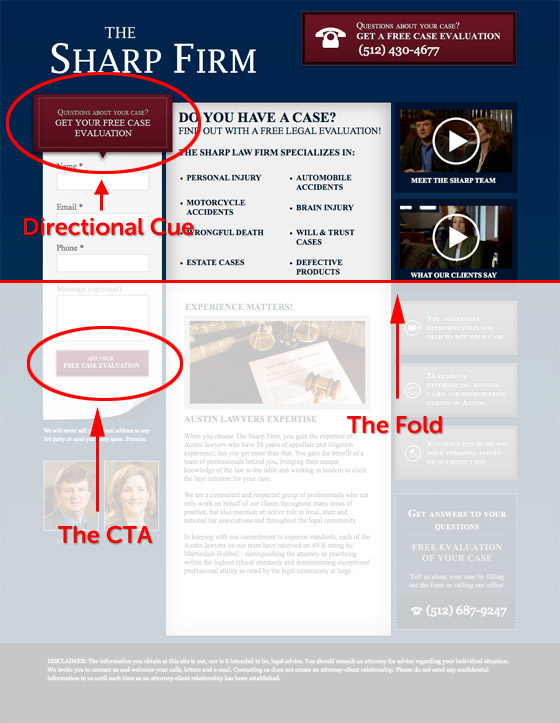
In web design, directional cues play an important role. It gives people a clue on what to do and how to do it. You may not use animated gifs or arrows, but you should nonetheless lead the prospect in the direction of the form.
If you have a long-form landing page, you need to create persuasive copy that compels people to scroll down and read more.
Here’s an example of an animated homepage from sidigital. In this case, the copy gradually leads the prospects step-by-step to the bottom of the landing page where the lead generation form is located.
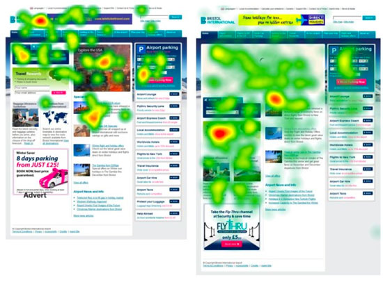
A recent heat map shows that when you place less content above-the-fold, people are more likely to scroll down the page to find more information.
One more thing: text areas are an essential part of any lead generation form. You have to ensure that you’re not giving prospects too much to do.
More than likely, when you’re asking for more information from several text areas in your form, your conversion rate will go down. In the case below, one text area yields a 20% conversion.
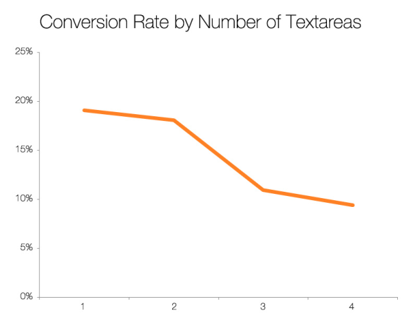
If the information you want to collect is critical, see if you can collect it with a cleaner radio button or checkbox www.netflix herunterladen. That way, you’re giving prospects the chance to check a box and get access to the offer, instead of having them inputting text from their keyboard. A huge relief!
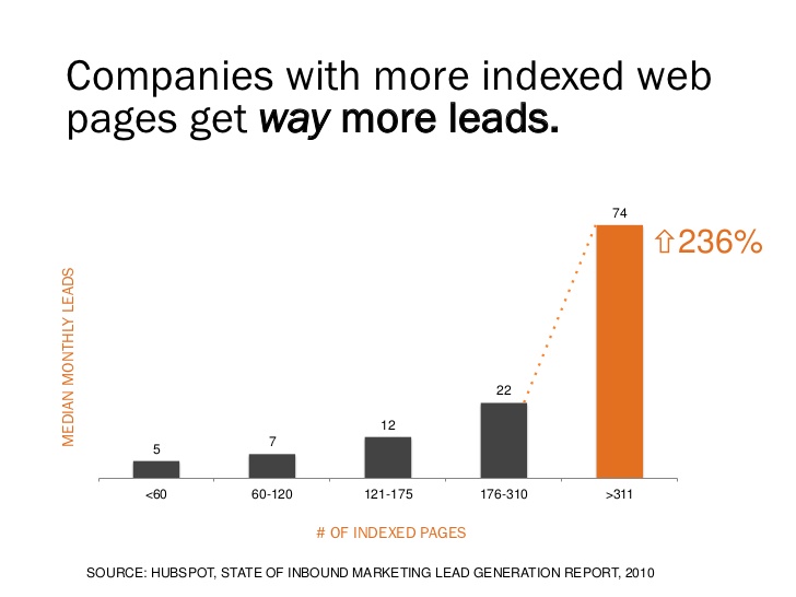
Blogging is a powerful way to generate leads, if you create useful content regularly and put the audience first.
Blogging also gives you more indexed web pages. With more indexed web pages, search users will find you in their search results and click through to your well-optimized landing pages. Hence you’ll drive 236% more leads.
You should create specific landing pages for your blog and include lead generation forms at advantageous locations (e.g., above-the-fold, middle of page, below-the-fold, right/left side).
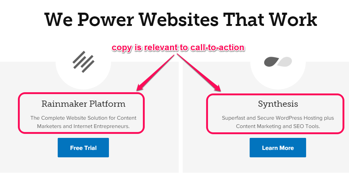
7. Align your CTA and form with landing page copy
Message agreement isn’t only useful for PPC advertisers, but also for content marketers.
If you generate leads through your landing page, you need to ensure that your CTA and form are in agreement with your page copy. Here’s an example:

Did you notice (in the screenshot above) that the title, the call-to-action and the image all speak the same language?
The title of your offer—whether it’s a free e-book, guide, online course, presentation, template or white paper—should align with the landing page title.
It’s an absolute must that your landing page, the CTA and offer should all bear a similar name.
For example, if you mention that people should download a free e-book on social media marketing and your CTA says the same thing, then you shouldn’t call it an online course on your landing page.
This may seem irrelevant, but these little things drive conversions on a landing page. Here’s an example: the offer, the landing page title, and call-to-action are in agreement.
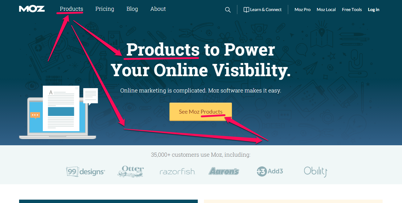
See how aligned Moz’s offer, landing page title and call-to-action copy are? The word “product” appears in all three instances.
Unbounce’s homepage is optimized with relevant words, too. The landing page title copy, and call to action are all in agreement.
People are busy online. You have to respect their time. If they have to figure out everything on your landing page and make the right decisions you need to better align your landing page elements.
Though your focus is on the form, you should always test to improve conversions.
Start by writing your landing page title first, then use the exact words in your CTA. Or you could simply summarize the title, while leaving the keywords intact.
Conclusion
There you have it–the proven strategies to optimize your lead generation form.
What’s the use of sending traffic to a landing page that’s not ready for the target audience? It’s a waste of time and money.
The goal of a landing page form is to capture the prospect’s personal information fortnite kostenlos herunterladen für handy. It’s not for selling a product. Marketing and sales are the by-product of nurtured leads.
Don’t place your forms and CTA in a cluttered area. It doesn’t matter how persuasive the copy is–do your best to leave enough white space around the form.
Give people some digital breathing space to help them to think clearly and make the right decisions.
Is your lead generation form optimized to convert visitors into leads, and customers? What steps did you take to make it work?