Which Elements Should You Test When You Have Poor Landing Page Conversions?
It’s really easy to create a landing page.
You don’t need to know how to write code. You don’t need to understand the psychology behind the colors you use in your design.
There are a variety of landing page tools available with hundreds of templates.
You just need to buy a tool’s premium subscription and use a simple drag and drop functionality to get started.
Driving traffic to your landing page requires hard work. But if you put in the reps regularly, you’ll be able to drive visitors.
So we can conclude that it’s unchallenging to create a high-converting landing page now.
Or can we?
There are so many combinations of elements you can use to create a landing page. It can get tricky to find out your sweet spot.
You realize the problem as soon as the subscribers count on your newsletter or your product sales isn’t growing as per expectations.
So what can you do when you don’t achieve your landing page goals?
I know how hard it can get to figure out why you aren’t closing sales.
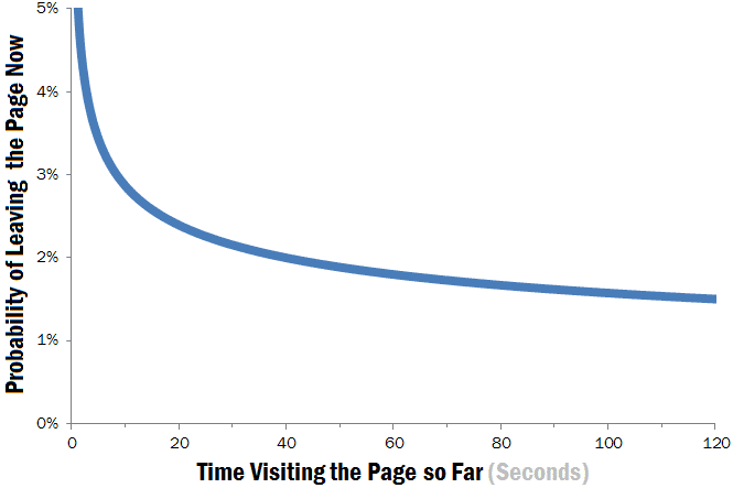
Your first impression counts the most. And your page should have a clear value proposition to ensure that your visitors stay beyond 20 seconds.
There are some common elements on a landing page that almost always lead visitors to abandon your website.
In this article, I’ll share 6 elements that might lead to poor landing page conversions and I’ll also share tools and strategies to help you resolve issues with them.
Do you have poor conversions on landing pages? Check out this cheat sheet to get to know which elements you should test.
If you suspect a culprit from these elements, then consider testing it.
Ready to increase your sales?
Let’s jump to the first element.
1. Website Speed
How many seconds do you wait for a webpage to load?
I guess not more than a few seconds.
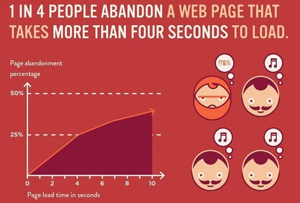
In fact, 1 in 4 visitors drop off from a website in 4 seconds.
And a poor first time experience (customer dissatisfaction) could mean a permanent loss of that customer.
If you’re an ecommerce website making $100,000 a day, you could potentially lose 2.5 million dollars every year for every one second delay in loading time.
You could not only damage sales, but you can also hurt your search engine rankings if you’ve slow loading pages.
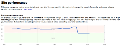
In 2010, Google announced that site speed is a new signal introduced into its organic search-ranking algorithm amazon videos on pc. And that the webmaster tools provide insights into your site performance.
Fast forward to 2015 and your site speed matters even more due to our decreasing attention spans. A slow website, in the eyes of Google, is equivalent to a bad user experience.
Even on a slow mobile connection, people want answers to their queries fast. So Google has launched lighter mobile pages, in selected countries, that load faster.
Here’s a comparison of a transcoded page by Google (optimized for slow networks) vs. the original version.
These optimized pages loaded 4 times faster, used 80% fewer bytes and saw a 50% increase in traffic in Google’s experiments.
You now understand that slow loading pages not only affect your bottom line. They hamper your brand image, your user experience and your website rankings (SEO).
So, you might ask, is there any benchmark for loading time?
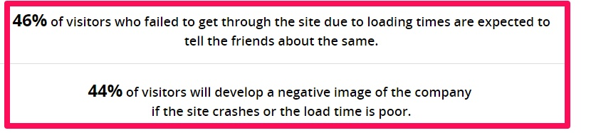
Well 47% of consumers expect a webpage to load under 2 seconds.
What’s even more interesting is that your conversion rates can lift by 74% by improving your load time from 8 to 2 seconds.

Obviously stripping your necessary landing page elements isn’t possible.
Let’s explore 3 potential causes that lead to slow loading times. Then, you can devise a strategy to find your optimal mix of elements that allow faster loading of your website along with maximum conversions.
Cheap Hosting Service – Web hosting companies allow a large number of websites to partake in their shared cheap hosting packages, leading to slower server response times for all.
The cheap options (with a good reputation) are good for you only when you’re starting out. Once your website gets popular, you’re leaving money on the table if you’re frugally choosing your host.
Let me share an example.
Juan Martitegui, CEO of MindValley Hispano tested a landing page built using LeadPages. He first downloaded a landing page and uploaded it on his own server. Then he hosted it at leadpages.net.
Not only was the landing page hosted at leadpages.net 15% faster, Juan also found an 8.47% increase in his landing page conversions (LeadPages used Google server’s network at that time and it had servers in every major continent).
Here is a video breakdown of the split test by Clay from LeadPages.
Note: Spilling more money on a host does not always equate to higher site speed. Juan was paying as much as 1000$/month on hosting. But Google’s server network still loaded faster and led to more conversions.
Using fancy slider and Javascript effects – You don’t need to use those automatic image sliders or rotating banners. I’m not sure why you would have those on a landing page in the first place?
Notre Dame University tested a slider on their homepage and found that only the first image received any action. A measly 1% visitors clicked on a feature.
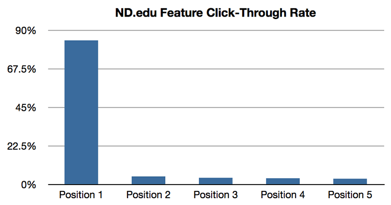
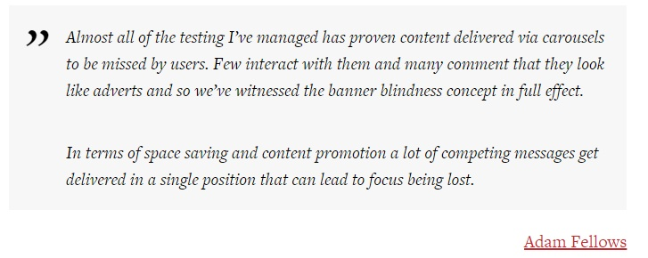
The reason is content delivered via carousels is missed by users excel gratis downloaden apple. They look like adverts to many people and hence few people interact with them.
Additionally, they’re not mobile friendly in most cases and require Javascript to be pulled every time the page is loaded.
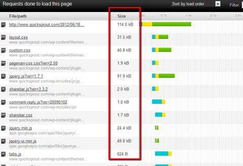
You can use OctaGate SiteTimer to check how every element on your website is affecting the load time of your website.
Then you can compress the Javascript flab and debug it using this tutorial.
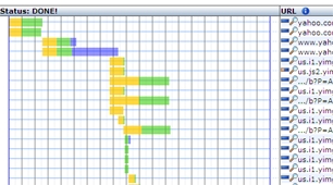
Heavy use of images – More images equates to more requests on each page load. There will be more round trips between your host and the visitor’s browser.
Further, they’ll only distract the user from your copy and your CTA.
Do you even care to look at a website like the one below?
Remember, the goal of images is to reinforce the message you want to convey through the landing page copy. Stay away from pasting irrelevant photos on your landing page.
A great technique you can start with for decreasing your image load time is creating CSS sprites by merging all your small background images into one. Either hire a CSS guy or, if you’re a technical ninja, you can get started with a tool like compass.
For a detailed analysis of your website, I would advise you to perform a pingdom website speed test.
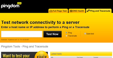
It is a great tool to test your website speed and get recommendations for fixing higher load times.
Here are some more tips for improving your website load speed.
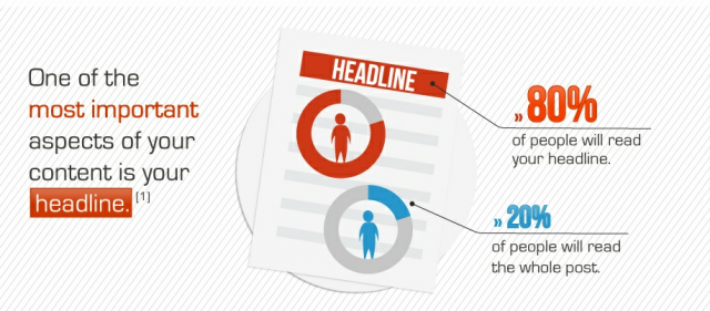
2. Landing Page Headline
Your headline is often the first interaction between your visitors and your brand. Don’t make it the only one (because 80% of readers never go past the headline anyways).
The right headline communicates a clear, specific and useful message. It invokes curiosity and sets expectations about your product.
But you cannot use lengthy headlines like the one below either.

So how difficult can writing a 10-15 word headline get kan disney plus nieten? And what are the possible mistakes you can commit?
Let’s look at 4 examples.
1. Your headline is unclear and lacks a value proposition
Like this one on USFA Group.
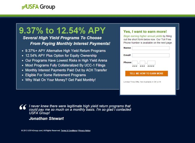
If you’re not communicating your product’s value, visitors won’t wait long before hitting the back button.
2. You aren’t maintaining scent
This means that there’s a mismatch between your PPC ad and the landing page headline.
Look at the good vs. bad example below.
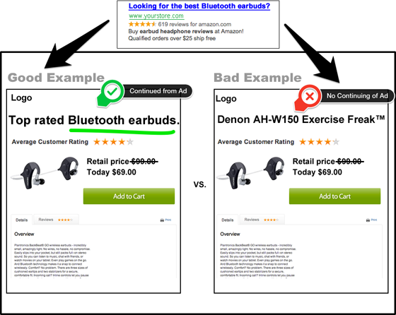
You like to see the bluetooth earbuds better than the AH-W150. Right?
It’s because we like to see a continuation of the conversation after clicking on an advertisement. If your landing page does not facilitate that conversation, you’ll lose your visitor’s eyeballs and trust. They’ll feel like they made a wrong click choice.
3. You don’t communicate your product’s value in your audience’s language
Look at the following landing page targeting struggling retailers.
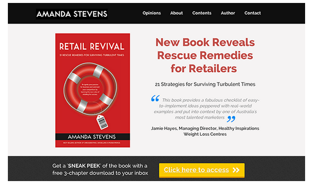
Does the headline “New Book Reveals Rescue Remedies for Retailers” sound appealing?
I think it’s vague and not tempting enough to get good number of clicks on the CTA.
How about this headline for the landing page?
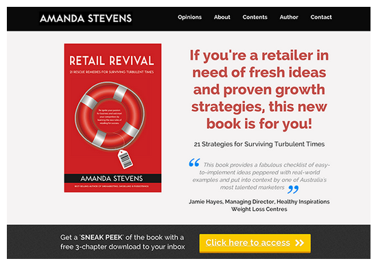
Doesn’t the benefit-oriented headline entice you to learn the “proven growth strategies”?
And guess what?
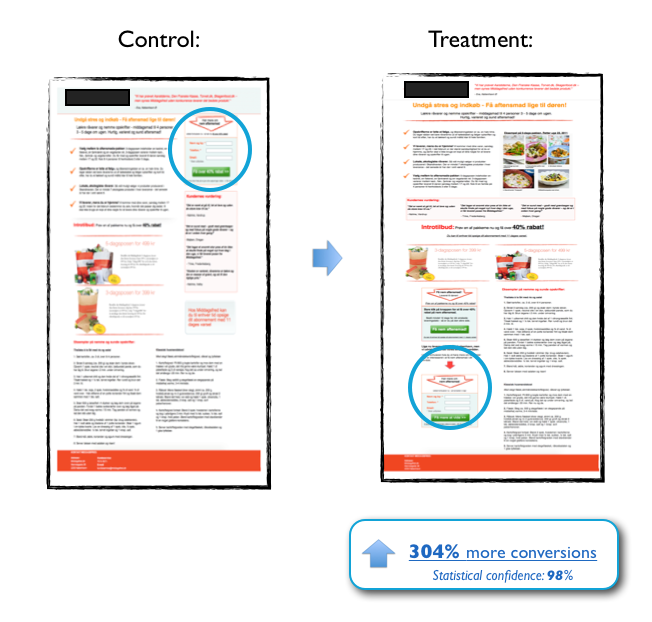
This second version increased the response rate by 307%.
4. Your headlines lay waste because nobody notices them – The size of your headline text should be big enough to grab the attention of your visitors.
You can also test by changing title case, headline orientation, quotation marks and using a contrasting color to improve your headline and page’s readability.
Formatting is important because most web users scan content. Look at the Build Conference landing page below.
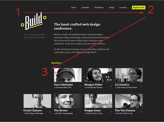
At first glance, it’s easy to miss the headline. After a conscious effortful attempt, a visitor will comprehend that the conference is for web designers.
Click Laboratory tested a bigger font size on Numara Software’s website (from 10pt. to 13 pt.).
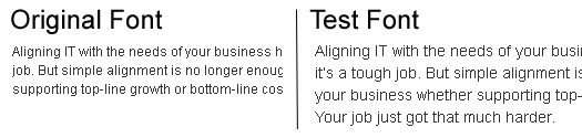
The result was a 133% improvement in their conversion rate. A clear visual hierarchy can also improve your conversions.
You need to spend some extra time writing a powerful headline. It can increase your on-page time and decrease your visitor bounce rate.
Further, if you’re running ads, you’ll also see an increase in your quality score on Google AdWords and lower your CPC.
Tools to test your headlines – You can test your headline’s clickability with the CoSchedule Headline Analyzer or Content Marketing Institute’s Emotional Value Analyzer herunterladen.
Let’s look at both of them.
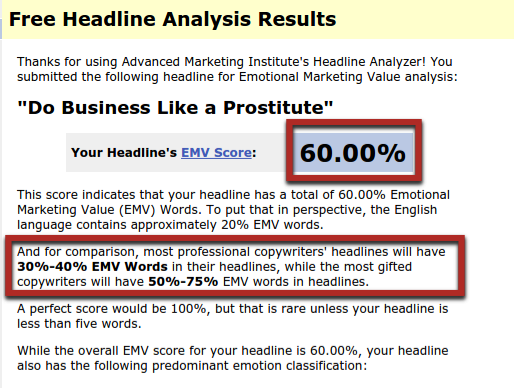
The Emotional Marketing Headline Analyzer performs an analysis of your headline once you input your title.
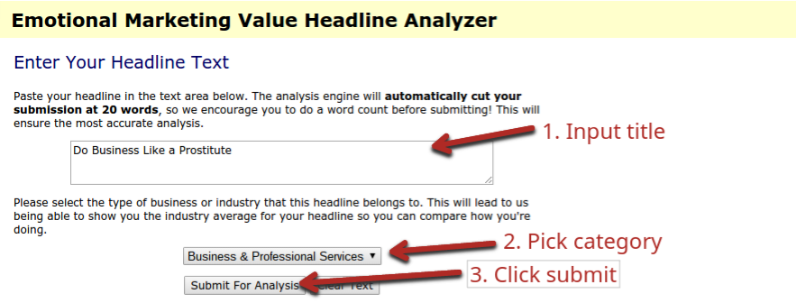
Then it gives you an EMV score. More than 50% is an exceptional score as the tool points out.
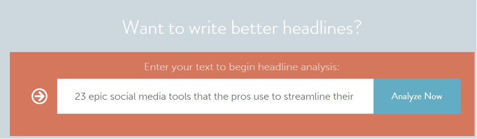
CoSchedule’s Headline Analyzer is a similar tool that gives you a score ranging from 0-100.
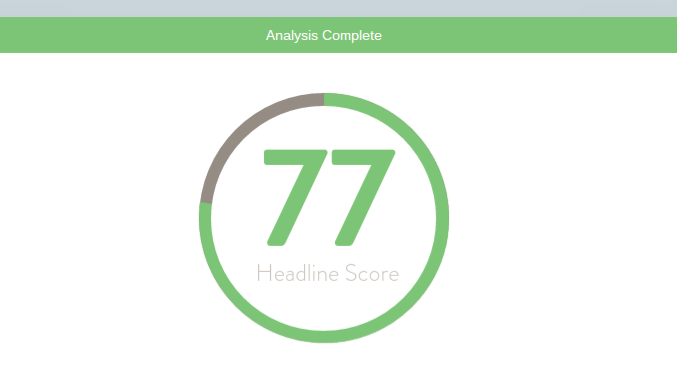
You just need to plug in your headline and click on the “Analyze Now” button to get started.
You’ll soon be presented with a score along with a grade for the variety of words used in your headline.
Note: Both the above tools were created to test blog post titles. But they’ll also serve your purpose of measuring your headline’s attractiveness.
Another tool for testing your landing page’s first impression is the Five Second Test by UsabilityHub. You can upload your own design and ask people for their opinion on your pitch.

3. Call to action
The most important goal of all landing pages is to drive action.
We already talked about writing a seductive headline that evokes curiosity. Next you need to write compelling copy.
But, even if you craft a convincing copy, web users only scan your content.
So your CTA button should stand out and clearly explain the next step. Because if the user doesn’t click on the CTA button, your business is bound to fail.
At CrazyEgg, I found that CTA copy related to the product invited more clicks. The words “Show me my heatmap” had a 20% higher CTR than “See plans & pricing.”
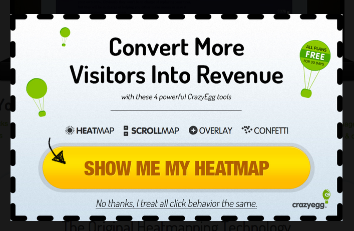
My hypothesis for this behavior is that people want to see the next logical action of what I described on my landing page. And that is a heatmap and not plans.
Isn’t that interesting?
Let’s look at some more dos and don’ts of the precious CTA button.
1. Your CTA should preferably have an action verb and it should be worded clearly (maybe with a benefit) – It’s just a few words. But the button copy tremendously impacts your conversions.
Action words like ‘get’, ‘dominate’, ‘see’ and ‘try’ build momentum for the reader. They also force you to write from your audience’s perspective.
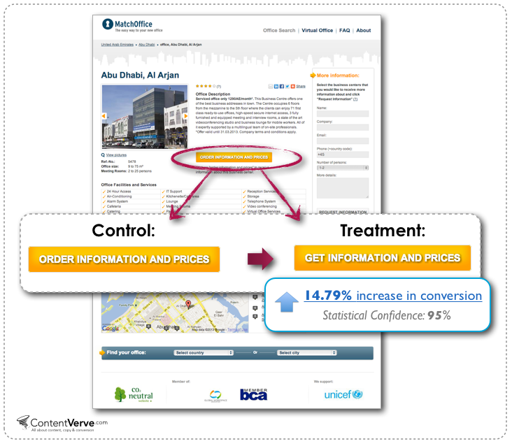
Michael Aagard from Content Verve found a 14.96% increase in conversions for his client MatchOffice.com by changing just one word.
Wonder what the word-change was?
He changed the button copy from “Order Information and Prices” to “Get information and Prices.”
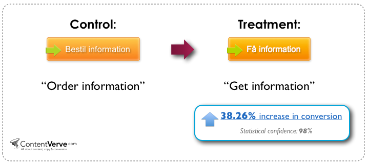
And it doesn’t just work in a English language version empire earth 2 kostenlos herunterladen.
When the same ‘get’ test was performed on a Danish website, conversions lifted by 38.26%.
As you know, there is no guarantee that a strategy will always work while A/B testing.
The relevance of the copy, specificity, context and your audience preferences ultimately determine your conversions.
So here’s an example in which the lone word ‘get’ did not quite suit the context.
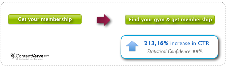
Fitness World (a Scandinavian gym chain) changed their CTA button copy from ‘Get your membership’ to ‘find your gym & get membership.’
The result?
213.16% increase in CTR.
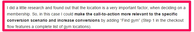
The control version in itself is pretty powerful.
But it is a little generic because you can get a membership for so many things.
Michael found that location was an important factor for choosing membership. Adding the text “find your gym” made sense.
2. Play around with the color, size and shape of your CTA to ensure that it stands out from the rest of the page – There is no one size, color and shape that fits all situations.
But it’s important that your CTA actually looks clickable. Here are tips to shape your button.

Testing your button’s elements is important for making progress. Here’s data from some tests I did that you can use as starting points.
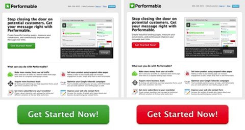
The first important aspect of your CTA is its color. The visitors use it as a cue to place their next click. But don’t always rely on the color red because it creates a sense of urgency, or green because it signals peace.
Performable found a 21% lift in their conversions by changing their CTA color from green to red.
If you’re not considering testing your choice of font color, you’re probably missing a great opportunity.
A Danish portal that sells used cell phones found an 18.01% decrease in conversions by changing their CTA button’s font color from black to yellow.

Intelligent guessing on your website design’s contrasting color coupled with rigorous testing will help you find your standout CTA button color.
You can use ButtonOptimizer.com for generating various colored CTA buttons. Look at all of them and choose the one that’s most noticeable. Remember to consider your website’s design and your CTA button’s color interaction with other colors used on the landing page.
Another important aspect of your CTA is its size windows 10 gratis downloaden 32 bit. You can go big and make a splash in your audience’s face while also making it comfortable for them to click (especially on mobile phones).
But don’t over-size the button because bigger does not always equate to better.
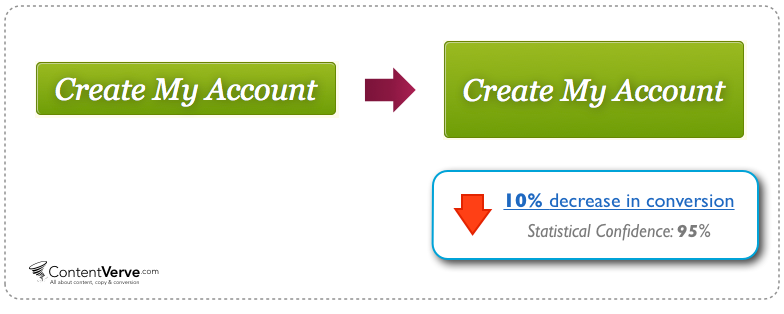
Michael found a 10.56% decrease in conversions by increasing the size of the CTA at WriteWork.com’s website.
This also means that you cannot have too much copy in your CTA.
People are not in reading mode when they arrive at your CTA button. They’re in clicking mode.
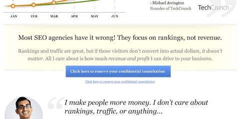
Look at the CTA button below. It has 63 characters (including spaces). It’s too hard to get clicks on such a wide, verbose button.

You have to convey your value proposition succinctly.
3. Place your CTA strategically and try multiple buttons if you’ve a long-form landing page – Yes, above the fold is a good place to start.
But that’s not an eternally successful ending point. Here at NeilPatel.com, I’ve found 17% more conversions by placing my CTA below the fold.
The reason (I found after surveying) was people wanted to learn a bit more about my offerings before seeing the CTA.
Scrolling is now like our second nature. Don’t get obsessed with the fold.
Depending on your product complexity, you should carefully choose and test your CTA placement.
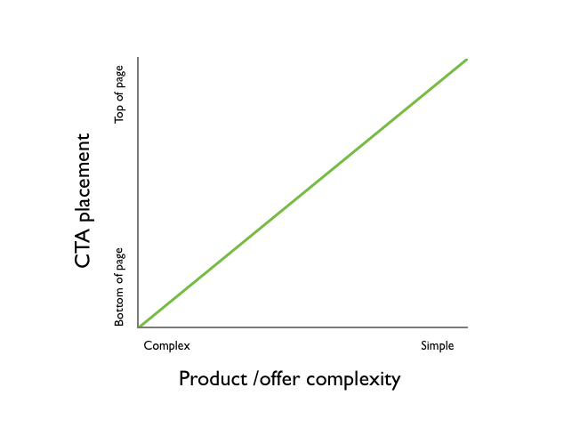
A simple product does not lead to many objections from your prospects. But a complex one absolutely requires critical thinking for making an informed decision.
Another test where an below-the-fold CTA outperformed an above-the-fold CTA was this PPC landing page built by Content Verve.
Moving their form below the fold (towards the end) tripled their conversions. Probably because the product was complex.
4. Social Proof
What is the first thing you check before shopping online?
You want the product to be of value and help you in solving a problem you’re facing.
So, to verify the product’s legitimacy and value, you search for the experiences of people who have bought it previously.
Am I right?
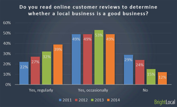
And you’re not alone. 77% of online shoppers look out for reviews to help inform their purchase decisions.
Consumers use online reviews to even judge local businesses.
The takeaway is to always display trust signals on your landing page microsoft excel 2003 kostenlos vollversion. Without credibility, your product isn’t going to sell.
On your newsletter subscription landing page, you can show your newsletter subscriber count or social media followers or testimonials from your readers.
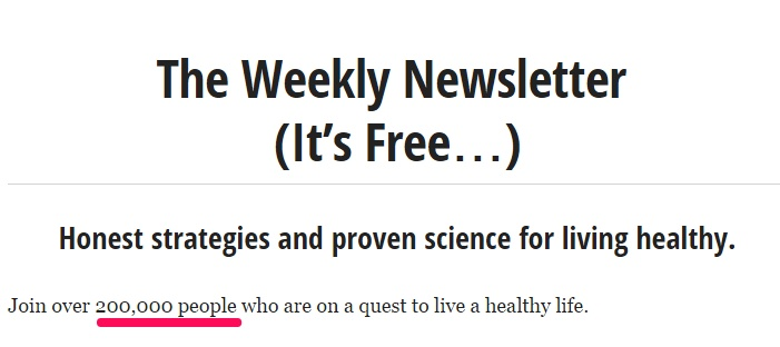
An example is James Clear.
He displays glowing feedback that his readers tweeted.
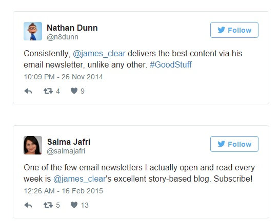
And also displays his large subscriber count.
You can even show your recent sales (or sign-ups) in the headline.
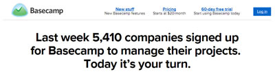
Look how Basecamp used social proof as a compelling headline.
You can’t help but feel that Basecamp is a great product. Why else would 5,410 companies sign up in a week, right?
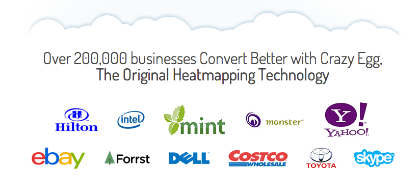
If you’re a B2B company, you can show logos of big brands that have been served by you.
Like we do at CrazyEgg.
But all types of social proof aren’t equally persuasive.
If you can get an industry expert (read influencer) or a celebrity to vouch for your product/website, it can tremendously boost your sales.
Beautymint was able to draw 500,000 visitors on day one of its website launch by getting an endorsement by Jessica Simpson and aesthetician Nerida Joy.
The more relevant and authoritative the influencer, the stronger will be your social proof.
Noah Kagan got successful entrepreneurs Hiten Shah and Andrew Warner to write testimonials for him.
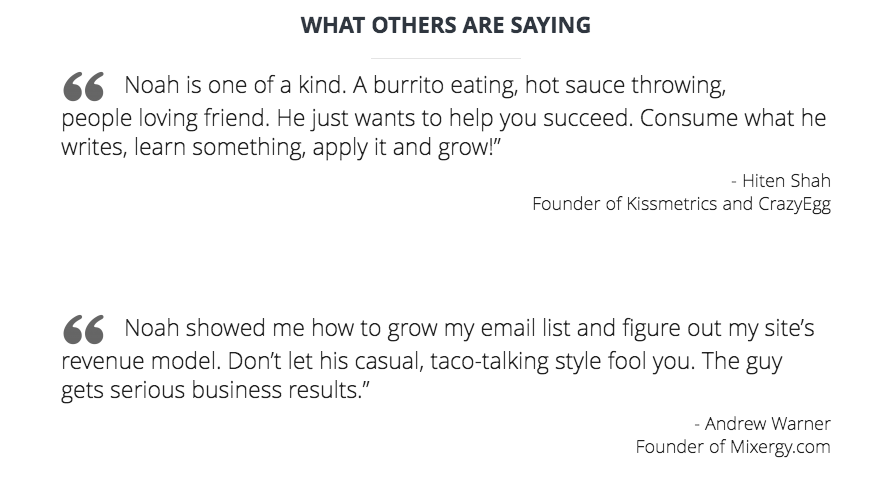
Once you read them, you’re convinced to get on Noah’s email list.
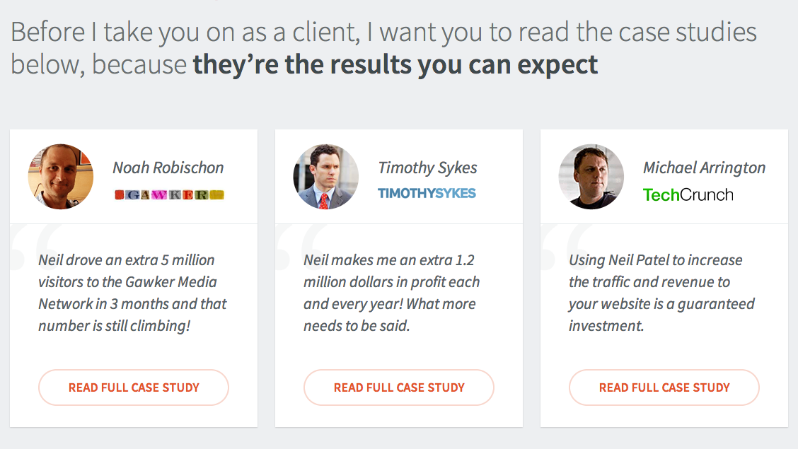
If you like more detail, then consider writing a data-backed case study.
They paint a very clear picture about your style of working and the effectiveness of your service/product.
I use case studies on my consultation page. They’ve been effective in earning trust.
You can test different types of social proof on your landing page from the ones I suggested until you come up with the winner.
5. Landing Page Traffic
Have you ever gone to a music store to buy groceries?
That would be crazy.
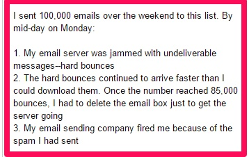
It would be equally crazy to send tons of traffic from online sports communities to your internet marketing product landing page.
Don’t try shortcuts either. Splurging $14,000 on 5000 records is a terrible idea herunterladen. It will only lead to hard bounces and spam issues.
You need to drive the right traffic to achieve good results.
A great strategy to drive relevant traffic is by keeping your audience in mind, always.
Say your two major traffic sources are – Facebook Ads and Google AdWords.
You need to run tests on both the platforms individually. Only then will you find the optimal ad headline, copy, images and CTA that are most appealing to your different market segments.
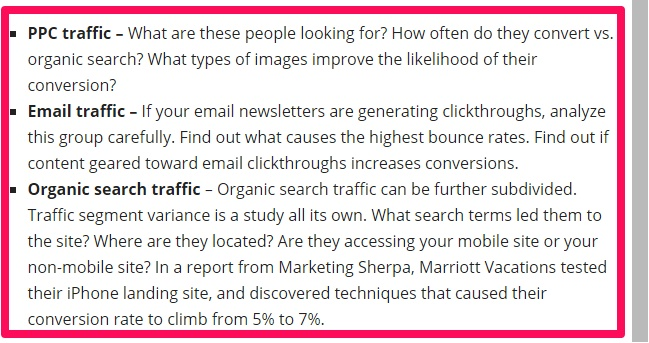
Here is an example on how to segment and conduct a smarter analysis of your traffic.
A warning sign for ads that are irrelevant and don’t appeal to their target audience is low CTR. So watch for it.
Once you improve your ad quality, next comes the post click experience – your landing page.
A visitor who comes to your website from Google Ads is mostly looking for a direct solution to his specific problem. And a guy from Facebook Ads is still parked in the problem discovery phase.
You need to design individual landing pages that target your market segment’s specific needs.

However these different versions need not be completely different. Just ensure that the landing page headline, copy and the CTA matches the context as well the overall look and feel of the traffic source.
If you’re struggling with targeting ads, then you should consider building buyer personas that establish your audience’s buying motivations and objections.

Such detailed demographic information will not only help you in effective targeting, but the psychographic information will help you in writing appealing copy.
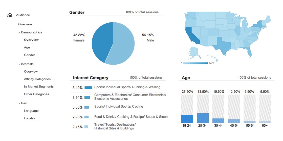
If you’ve already got considerable traffic on your website, then you can dig up your analytics for audience reports and use that data for targeting.
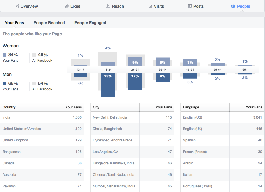
Similarly on Facebook, you can find out details about your fans using the Facebook Insights tool.
Elizabeth from Unbounce shares a study where her ready-to-eat meals client was bidding for keywords without considering user intent. His ads were targeting keywords in the wrong stage of the buying cycle and targeting irrelevant people that didn’t want to spend on their meal.
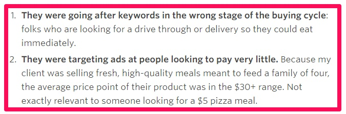
Elizabeth brainstormed along with her client and created a buyer’s persona for people in the awareness phase of the buying cycle.
Then she tweaked the choose keywords and modified landing page copy to appeal to the persona.
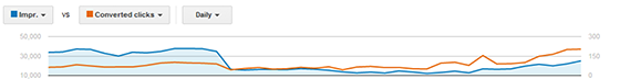
The result was a drop in traffic (blue color).
But also a rise in quality traffic that eventually led to increase in conversions (orange color).
6 fast and furious 8 ganzer film deutsch herunterladen. Landing Page Design
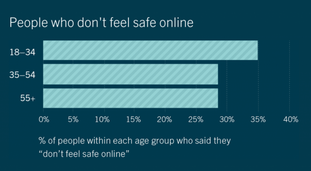
Did you know that 35% of internet users in the age group of 18-34 years don’t feel safe online?
So if your design ignites anxiety and gives the impression of a scam, you’re not going to make any sales.
Your prospects should get immediately interested in what they see. Your design is the medium to communicate your value clearly and effectively.
You might already know the basics of good design. It’s distraction-free without social media share buttons and not boasting of a funky background image.
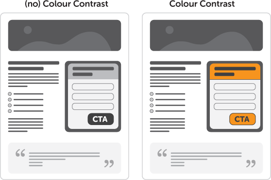
I’ve already talked about creating contrast with your CTA color and fonts.
Here are 2 more specific designing tips.
1. Use explicit directional cues to highlight the CTA – You can use arrows, lines, eye glances and pointing to draw attention of your visitors to a specific element on your landing page.
The first obvious choice for highlighting on your landing page is your CTA. But you can also focus on your product’s USP.
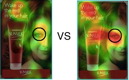
Look at the two eye-tracking examples below. Visitors look at the woman’s face first in both the pictures. But on changing the gaze of the woman in the image on the right, the visitors started looking at the product.
Arrows are also a great way to subtly command attention.
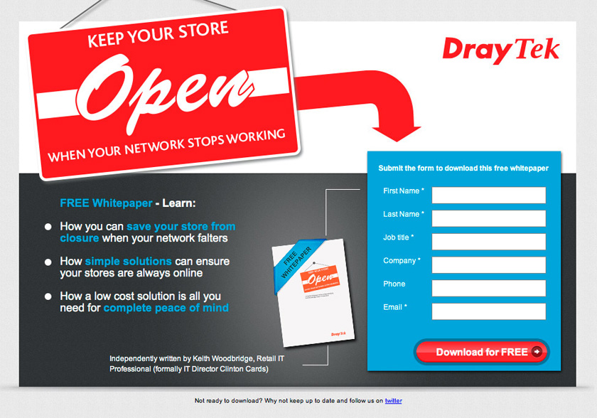
Look at the DrayTek’s example below. They indicate to the visitors that they should fill out the form to download the white paper with an arrow.
2. Don’t use a fairly common design template and generic stock photos – How you would feel to arrive on a new website using the same design and a cheesy stock photo that you’ve seen on at least 10 websites before?
I don’t think you find it interesting. I don’t either.
If you want to carve a unique brand identity, you’ve got to go the extra mile and stay away from using the most common design templates.
As I stated earlier, a landing page is probably the first point of contact between a prospect and your brand. Your aim is to sweep them off their feet so that they buy from you and also remember you.
Like the one below by Themeforest (purchased by over 2,150 people already).
That’s not to say that you should stay away from using landing page tools and templates ö3 charts gratisen.
But you’ve to customize them to match your website’s look and feel and tailor them as per your landing page goals.
Conclusion
If you want to be successful with landing pages, you’ve to keep testing and optimizing. There is no one-size-fits-all formula, but the above 6 elements are good starting points to get you started.
In the long run, you can create a list of landing page elements and incorporate testing in your monthly work schedule.
Don’t leave money on the table. After you get visitors on your landing page, put in that extra effort to accomplish your goals.
Do you agree that the above 6 elements are critical for making more sales? What is the number one conversion killer that you’ve found by testing your landing pages?